本文共 44831 字,大约阅读时间需要 149 分钟。
python中数据可视化
关于统计的几个概念
频率直方图
在统计数据时,按照频数分布表,在平面直角坐标系中,横轴标出每个组的端点(按类别统计时就是按类别分组),纵轴表示频数,每个矩形的高代表对应的频数,称这样的统计图为频率分布直方图。
密度分布曲线或曲面
在频率分布直方图中,当样本容量充分放大时,图中的组距就会充分缩短,这时图中的阶梯折线就会演变成一条光滑的曲线,这条曲线就称为总体的密度分布曲线。这条曲线(通常频率都已经归一化)排除了由于取样不同和测量不准所带来的误差,能够精确地反映总体的分布规律。
在数学中,连续型随机变量的概率密度函数(在不至于混淆时可以简称为密度函数)是一个描述这个随机变量的输出值,在某个确定的取值点附近的可能性的函数。而随机变量的取值落在某个区域之内的概率则为概率密度函数在这个区域上的积分。当概率密度函数存在的时候,累积分布函数是概率密度函数的积分。 若随机变量X服从一个数学期望为μ、方差为 σ 2 σ^2 σ2的正态分布,记为 N ( μ , σ 2 ) N(μ,σ^2) N(μ,σ2)。其概率密度函数为正态分布的期望值μ决定了其位置,其标准差σ决定了分布的幅度。当 μ = 0 , σ = 1 μ = 0,σ = 1 μ=0,σ=1时的正态分布是标准正态分布。置信区间
置信区间是指由样本统计量所构造的总体参数的估计区间。在统计学中,一个概率样本的置信区间(Confidence interval)是对这个样本的某个总体参数的区间估计。置信区间展现的是这个参数的真实值有一定概率落在测量结果的周围的程度。置信区间给出的是被测量参数的测量值的可信程度,即前面所要求的“一个概率”。
盒图(boxplot)
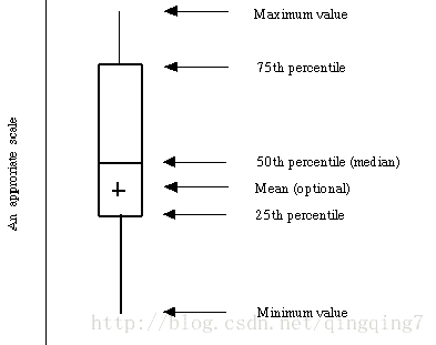
如上图所示由五个数值点组成:最小值(min),下四分位数(Q1),中位数(median),上四分位数(Q3),最大值(max)。也可以往盒图里面加入平均值(mean)。下四分位数、中位数、上四分位数组成一个“带有隔间的盒子”。上四分位数到最大值之间建立一条延伸线,这个延伸线成为“胡须(whisker)”。
由于现实数据中总是存在各式各样地“脏数据”,也成为“离群点”,于是为了不因这些少数的离群数据导致整体特征的偏移,将这些离群点单独汇出,而盒图中的胡须的两级修改成最小观测值与最大观测值。这里有个经验,就是最大(最小)观测值设置为与四分位数值间距离为1.5个IQR(中间四分位数极差)。即IQR = Q3-Q1,即上四分位数与下四分位数之间的差,也就是盒子的长度。 最小观测值为min = Q1 - 1.5IQR,如果存在离群点小于最小观测值,则胡须下限为最小观测值,离群点单独以点汇出。如果没有比最小观测值小的数,则胡须下限为最小值。 最大观测值为max = Q3 -1.5IQR,如果存在离群点大于最大观测值,则胡须上限为最大观测值,离群点单独以点汇出。如果没有比最大观测值大的数,则胡须上限为最大值。 通过盒图,在分析数据的时候,盒图能够有效地帮助我们识别数据的特征:- 直观地识别数据集中的异常值(查看离群点)。
- 1.箱体的左侧(下)边界代表第一四分位(Q1),而右侧(上)边界代表第三四分位(Q3)。至于箱体部分代表四分位距(IQR),也就是观测值的中间50%值。 2.在箱体中间的线代表的是数据的中位数值。 3.从箱体边缘延伸出去的直线称为触须(whisker).触须(whisker)的向外延伸表示了数据集中的最大和最小(异常点除外)。 4.极端值或异常点(outlier),用星号(*)来标识.如果一个值位于箱体外面(大于Q3或小于Q1),并且距离相应边界大于1.5倍的IQR,那么这个点就被认为是一个异常点(outlier)。 异常点(Outlier)-某个异常大或小的观测点。任何超过触须的值就是异常点。 默认情况下,箱体的顶端是第三四分位(Q3)-75%的数据值小于或等于这个值。 默认情况下,箱体的底部是第一四分位(Q1)-25%的数据值小于或等于这个值。 默认情况下,下部的触须会伸展到最小值,但一定位于下限范围内。 下限(Lower limit)=Q1-1.5(Q3-Q1) 中位数-数据的中间点。一半的观测值小于或等于它。 默认情况下,上部的触须会伸展到最大值,但一定位于上限范围内。 上限(Upper limit)=Q3+1.5(Q3-Q1)
- 判断数据集的数据离散程度和偏向(观察盒子的长度,上下隔间的形状,以及胡须的长度)。
- 使用箱形图来评估数据的对称性: 1.如果数据是明显对称,中位数值线将近似位于四分位距箱体的中间,上下触须(whisker)在长度上将近似相等。 2.如果数据是偏态的,中位数将可能不位于四分位距(IQR)箱体的中间,某一触须(whisker)将可能显著地比另一个长。 ## matplot.pyplot Matplotlib的图像组成部分详解可[参考](http://www.cnblogs.com/nju2014/p/5620776.html)


matplot.pyplot画图
… Function Description …Plot the autocorrelation of x. …Plot the angle spectrum. …Annotate the point xy with text s. …Add an arrow to the axes. …Autoscale the axis view to the data (toggle). …Add an axes to the figure. …Add a horizontal line across the axis. …Add a horizontal span (rectangle) across the axis. …Convenience method to get or set axis properties. …Add a vertical line across the axes. …Add a vertical span (rectangle) across the axes. …Make a bar plot. …Plot a 2-D field of barbs. …Make a horizontal bar plot. …Turn the axes box on or off. …Make a box and whisker plot. …Plot horizontal bars. …Clear the current axes. …Label a contour plot. …Clear the current figure. …Set the color limits of the current image. …Close a figure window. …Plot the coherence between x and y. …Add a colorbar to a plot. …Plot contours. …Plot contours. …Plot the cross-spectral density. …Remove an axes from the current figure. …Redraw the current figure. …Plot an errorbar graph. Plot identical parallel lines at the given positions. …Adds a non-resampled image to the figure. …Place a legend in the figure. … …Add text to figure. …Creates a new figure. …Plot filled polygons. …Make filled polygons between two curves. …Make filled polygons between two horizontal curves. …Find artist objects. …Get the current Axes instance on the current figure matching the given keyword args, or create one. …Get a reference to the current figure. …Get the current colorable artist. …Return a list of existing figure labels. …Return a list of existing figure numbers. …Turn the axes grids on or off. …Make a hexagonal binning plot. …Plot a histogram. …Make a 2D histogram plot. …Plot horizontal lines at each y from xmin to xmax. … …Read an image from a file into an array. …Save an array as in image file. …Display an image on the axes. …Install a repl display hook so that any stale figure are automatically redrawn when control is returned to the repl. …Turn interactive mode off. …Turn interactive mode on. … …Return status of interactive mode. …Places a legend on the axes. …Control behavior of tick locators. …Make a plot with log scaling on both the x and y axis. …Plot the magnitude spectrum. …Set or retrieve autoscaling margins. …Display an array as a matrix in a new figure window. …Remove minor ticks from the current plot. …Display minor ticks on the current plot. … …Pause for interval seconds. …Create a pseudocolor plot of a 2-D array. …Plot a quadrilateral mesh. …Plot the phase spectrum. …Plot a pie chart. …Plot lines and/or markers to the Axes. …A plot with data that contains dates. …Plot the data in a file. …Make a polar plot. …Plot the power spectral density. …Plot a 2-D field of arrows. …Add a key to a quiver plot. …Set the current rc params. …Return a context manager for managing rc settings. …Restore the rc params from Matplotlib’s internal defaults. …Get or set the radial gridlines on a polar plot. …Save the current figure. …Set the current Axes instance to ax. …Make a scatter plot of x vs y. …Set the current image. …Make a plot with log scaling on the x axis. …Make a plot with log scaling on the y axis. …Set the default colormap. …Set a property on an artist object. …Display a figure. …Plot a spectrogram. …Plot the sparsity pattern on a 2-D array. …Draws a stacked area plot. …Create a stem plot. …Make a step plot. …Draws streamlines of a vector flow. …Return a subplot axes at the given grid position. subplot2grid…Create an axis at specific location inside a regular grid. subplot_tool…Launch a subplot tool window for a figure. subplots…Create a figure and a set of subplots This utility wrapper makes it convenient to create common layouts of subplots, including the enclosing figure object, in a single call. subplots_adjust…Tune the subplot layout. suptitle…Add a centered title to the figure. switch_backend …Switch the default backend. table…Add a table to the current axes. text…Add text to the axes. thetagrids …Get or set the theta locations of the gridlines in a polar plot. tick_params…Change the appearance of ticks and tick labels. ticklabel_format…Change the ScalarFormatter used by default for linear axes. tight_layout…Automatically adjust subplot parameters to give specified padding. title…Set a title of the current axes. tricontour…Draw contours on an unstructured triangular grid. tricontourf…Draw contours on an unstructured triangular grid. tripcolor…Create a pseudocolor plot of an unstructured triangular grid. triplot…Draw a unstructured triangular grid as lines and/or markers. twinx …Make a second axes that shares the x-axis. twiny…Make a second axes that shares the y-axis. uninstall_repl_displayhook…Uninstalls the matplotlib display hook. violinplot …Make a violin plot. vlines …Plot vertical lines. xcorr …Plot the cross correlation between x and y. xkcd…Turns on xkcd sketch-style drawing mode. xlabel…Set the x axis label of the current axis. xlim…Get or set the x limits of the current axes. xscale…Set the scaling of the x-axis. xticks …Get or set the x-limits of the current tick locations and labels. ylabel…Set the y axis label of the current axis. ylim…Get or set the y-limits of the current axes. yscale …Set the scaling of the y-axis. yticks…Get or set the y-limits of the current tick locations and labels. …
pyplot.plot()的风格与matlab中的plot函数风格很像,通过不同的函数往画布上添加内容,使得图像内容更丰富。 函数格式:plot(*args,**kwagrs) 功能:画点图、线图
#最简单的是向pyplot.plot()传入y值,系统会自动补上x,然后在图上绘制这些点并将点连线,最后用pyplot.show()让图像显示出来。#b=np.arange(2,7)# plt.plot(b)# plt.show()
如下所示:
#我们也可以同时传入x和y,这样更便于控制。同时还可以给x轴和y轴打上标签。# a=np.arange(4,9)# plt.plot(a,b)# plt.xlabel("横坐标")# plt.ylabel("纵坐标")# plt.show()如下图所示
#上面画的图像中标签的中文无法正常显示,原因是python中默认并没有中文字体,所以我们要手动添加中文字体的名称#手动添加如下代码from matplotlib.font_manager import FontPropertieszhfont=FontProperties(fname='/usr/share/fonts/truetype/arphic/ukai.ttc')a=np.arange(4,9)b=np.arange(2,7)# plt.plot(a,b)# plt.xlabel(u'横坐标',fontproperties=zhfont)# plt.ylabel(u'纵坐标',fontproperties=zhfont)# plt.show()
如下所示
#我们还可以设置x轴和y轴的显示范围以及数据点和连线的样式,这与matlab中一模一样# plt.plot(a,b,'ro')# plt.axis([0,10,0,10])# plt.xlabel(u'横坐标',fontproperties=zhfont)# plt.ylabel(u'纵坐标',fontproperties=zhfont)# plt.show()
如下所示
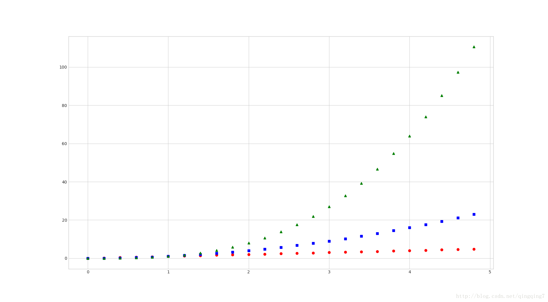
#还可以同时画多条曲线# t = np.arange(0., 5., 0.2)# plt.plot(t,t,'ro',t,t**2,'bs',t,t**3,'g^')# plt.show()
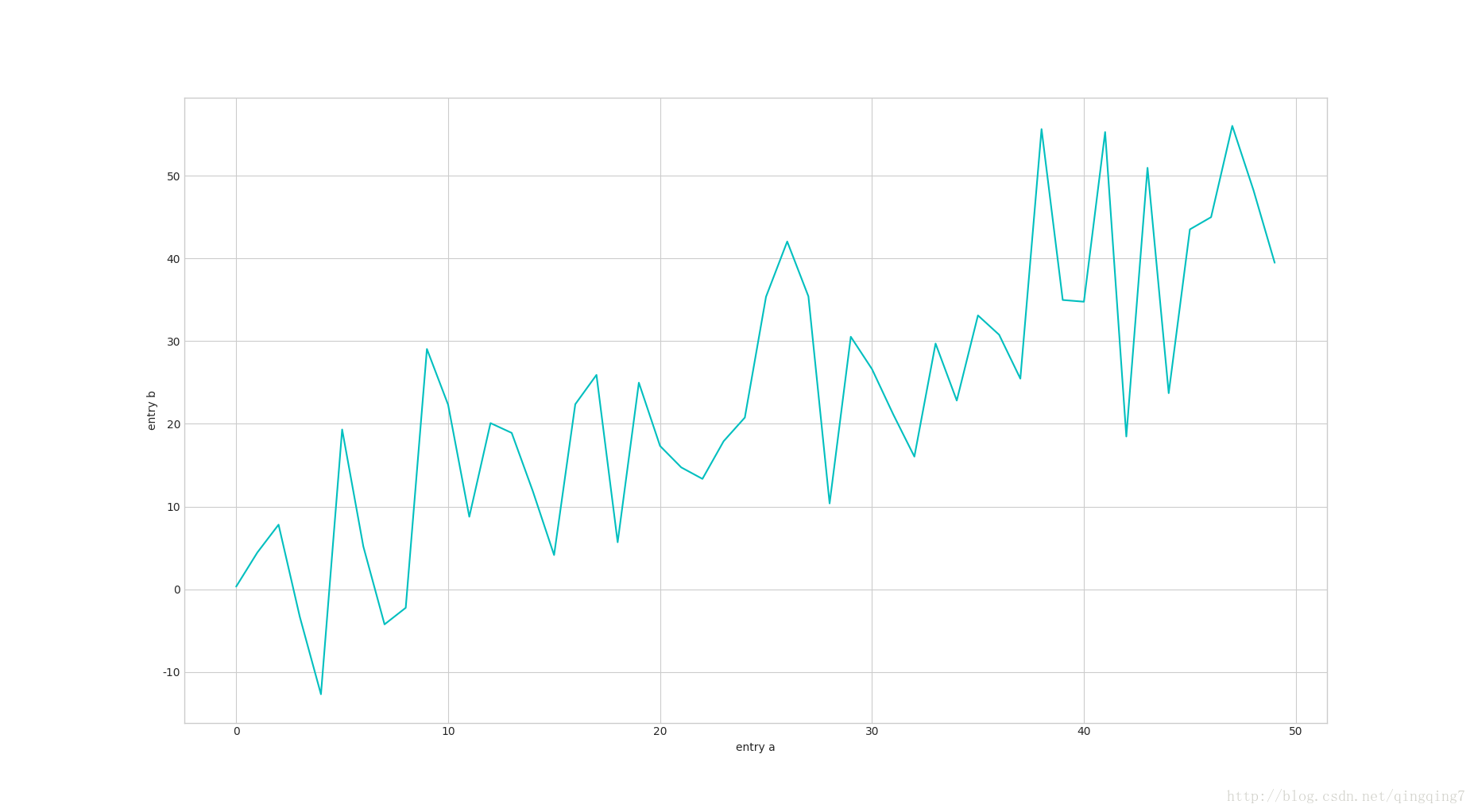
#我们除了可以将列表或数组作为参数传递给plot()函数外,也可以将numpy.recarray或都pandas.dataframe作为参数传递给画图函数。data = { 'a': np.arange(50),'c': np.random.randint(0, 50, 50),'d': np.random.randn(50)}data['b'] = data['a'] + 10 * np.random.randn(50)data['d'] = np.abs(data['d']) * 100print(data)plt.plot('a', 'b', c='c', data=data)plt.xlabel('entry a')plt.ylabel('entry b')plt.show()结果如下:
{'a': array([ 0, 1, 2, 3, 4, 5, 6, 7, 8, 9, 10, 11, 12, 13, 14, 15, 16, 17, 18, 19, 20, 21, 22, 23, 24, 25, 26, 27, 28, 29, 30, 31, 32, 33, 34, 35, 36, 37, 38, 39, 40, 41, 42, 43, 44, 45, 46, 47, 48, 49]), 'c': array([26, 32, 45, 39, 2, 1, 4, 9, 41, 17, 38, 32, 8, 3, 2, 12, 0, 4, 27, 32, 10, 12, 10, 36, 23, 11, 42, 18, 37, 45, 14, 43, 31, 44, 5, 37, 26, 35, 43, 5, 45, 31, 12, 49, 37, 26, 25, 11, 14, 29]), 'd': array([ 1.22083272e-01, 1.78439879e+01, 2.29783352e+02, 8.40916992e+01, 7.95474992e+01, 4.76662632e+01, 6.93810964e+01, 1.12336788e+02, 2.01802430e+02, 1.19177008e+02, 1.31071300e+01, 6.45164400e+01, 4.80412825e+01, 8.83283537e+00, 8.28560367e+01, 9.76050748e+00, 7.33602035e+01, 5.72575326e+01, 3.24925094e+01, 1.07727857e+02, 7.94003587e+01, 1.16468758e+02, 2.27274117e+02, 8.82586786e+01, 4.85581553e+01, 8.67951289e+01, 1.01248943e+02, 9.76599161e+01, 1.38962489e+02, 5.85852243e+00, 1.87686146e+01, 5.03863190e+01, 9.83664599e+01, 1.37589988e+02, 7.32801664e+01, 7.81689500e+01, 4.92668463e+01, 1.14667144e+02, 3.10072167e+01, 3.21267035e+01, 7.46797393e+01, 4.25972111e+01, 1.36098818e+02, 2.62367002e+01, 5.97591546e+00, 2.78358717e+01, 7.87738283e+01, 7.54362694e+01, 5.70029162e+01, 4.69017084e+01]), 'b': array([ 0.32196695, 4.44679005, 7.80649333, -3.30747811, -12.6937013 , 19.31074646, 5.17006608, -4.245033 , -2.24110886, 29.04232774, 22.3062057 , 8.7644089 , 20.08358342, 18.8999558 , 11.83399583, 4.13486575, 22.36307765, 25.90949635, 5.68361081, 24.96937435, 17.32381062, 14.73049264, 13.34270053, 17.89529685, 20.7534755 , 35.35709401, 42.03469385, 35.40389803, 10.37549346, 30.52072482, 26.61493397, 21.15293271, 16.03295347, 29.70243431, 22.81049385, 33.10067163, 30.76116424, 25.45689058, 55.62302644, 34.96587424, 34.7585544 , 55.26475006, 18.46266292, 50.94161702, 23.70363566, 43.50253867, 44.9809545 , 56.01418569, 48.24030035, 39.46781572])}pyplot.plot()的相关属性如下:
属性 功能描述 xdata 1D array ydata 1D array marker A valid marker style markeredgecolor or mec any matplotlib color markeredgewidth or mew float value in points markerfacecolor or mfc any matplotlib color markerfacecoloralt or mfcalt any matplotlib color markersize or ms float markevery [None | int | length-2 tuple of int | slice | list/array of int | float | length-2 tuple of float] linestyle or ls [‘solid’ | ‘dashed’, ‘dashdot’, ‘dotted’ | (offset, on-off-dash-seq) | '-' | '--' | '-.' | ':' | 'None' | ' ' | ''] color or c any matplotlib color linewidth or lw float value in points agg_filter a filter function, which takes a (m, n, 3) float array and a dpi value, and returns a (m, n, 3) array alpha float (0.0 transparent through 1.0 opaque) animated bool antialiased or aa [True | False] clip_box a Bbox instance clip_on bool clip_path [(Path, Transform) | Patch | None] contains a callable function dash_capstyle [‘butt’ | ‘round’ | ‘projecting’] dash_joinstyle [‘miter’ | ‘round’ | ‘bevel’] dashes sequence of on/off ink in points drawstyle [‘default’ | ‘steps’ | ‘steps-pre’ | ‘steps-mid’ | ‘steps-post’] figure a Figure instance fillstyle [‘full’ | ‘left’ | ‘right’ | ‘bottom’ | ‘top’ | ‘none’] gid an id string label object path_effects AbstractPathEffect picker float distance in points or callable pick function fn(artist, event) pickradius float distance in points rasterized bool or None sketch_params (scale: float, length: float, randomness: float) snap bool or None solid_capstyle [‘butt’ | ‘round’ | ‘projecting’] solid_joinstyle [‘miter’ | ‘round’ | ‘bevel’] transform a matplotlib.transforms.Transform instance url a url string visible bool zorder float 点和线的样式如下:
'-' solid line style'--' dashed line style'-.' dash-dot line style':' dotted line style'.' point marker',' pixel marker'o' circle marker'v' triangle_down marker'^' triangle_up marker'<' triangle_left marker'>' triangle_right marker'1' tri_down marker'2' tri_up marker'3' tri_left marker'4' tri_right marker's' square marker'p' pentagon marker'*' star marker'h' hexagon1 marker'H' hexagon2 marker'+' plus marker'x' x marker'D' diamond marker'd' thin_diamond marker'|' vline marker'_' hline marker
设置颜色的参数如下:
‘b’ blue‘g’ green‘r’ red‘c’ cyan‘m’ magenta‘y’ yellow‘k’ black‘w’ white
操纵坐标轴和增加网格及标签的函数
plt.grid(True) ##增加格点plt.axis('tight') # 坐标轴适应数据量 axis 设置坐标轴plt.xlim 和 plt.ylim 设置每个坐标轴的最小值和最大值
plt.xlim(-1,20)plt.ylim(np.min(y.cumsum())- 1, np.max(y.cumsum()) + 1)
添加标题和标签 plt.title, plt.xlabe, plt.ylabel 离散点, 线
plt.figure(figsize=(7,4)) #画布大小plt.plot(y.cumsum(),'b',lw = 1.5) # 蓝色的线plt.plot(y.cumsum(),'ro') #离散的点plt.grid(True)plt.axis('tight')plt.xlabel('index')plt.ylabel('value')plt.title('A simple Plot')控制坐标标签字旋转
plt.setp(plt.gca().get_xticklabels(),rotation=30) #日期倾斜
添加图例 plt.legend(loc = 0)
plt.legend(loc = 0) #图例位置自动,会显示1st,2st,……#也可以自己指定plt.legend(['2018','2019'])
使用2个 Y轴(左右)fig, ax1 = plt.subplots() ax2 = ax1.twinx()
fig, ax1 = plt.subplots() # 关键代码1 plt first data set using first (left) axisplt.plot(y[:,0], lw = 1.5,label = '1st')plt.plot(y[:,0], 'ro')plt.grid(True)plt.legend(loc = 0) #图例位置自动plt.axis('tight')plt.xlabel('index')plt.ylabel('value')plt.title('A simple plot')ax2 = ax1.twinx() #关键代码2 plt second data set using second(right) axisplt.plot(y[:,1],'g', lw = 1.5, label = '2nd')plt.plot(y[:,1], 'ro')plt.legend(loc = 0)plt.ylabel('value 2nd')plt.show()使用两个子图(上下,左右)plt.subplot(211)
plt.figure(figsize=(7,5))plt.subplot(211) #两行一列,第一个图plt.plot(y[:,0], lw = 1.5,label = '1st')plt.plot(y[:,0], 'ro')plt.grid(True)plt.legend(loc = 0) #图例位置自动plt.axis('tight')plt.ylabel('value')plt.title('A simple plot')plt.subplot(212) #两行一列.第二个图plt.plot(y[:,1],'g', lw = 1.5, label = '2nd')plt.plot(y[:,1], 'ro')plt.grid(True)plt.legend(loc = 0)plt.xlabel('index')plt.ylabel('value 2nd')plt.axis('tight')plt.show()左右子图
plt.figure(figsize=(10,5))plt.subplot(121) #两行一列,第一个图plt.plot(y[:,0], lw = 1.5,label = '1st')plt.plot(y[:,0], 'ro')plt.grid(True)plt.legend(loc = 0) #图例位置自动plt.axis('tight')plt.xlabel('index')plt.ylabel('value')plt.title('1st Data Set')plt.subplot(122)plt.bar(np.arange(len(y)), y[:,1],width=0.5, color='g',label = '2nc')plt.grid(True)plt.legend(loc=0)plt.axis('tight')plt.xlabel('index')plt.title('2nd Data Set')plt.show()及:
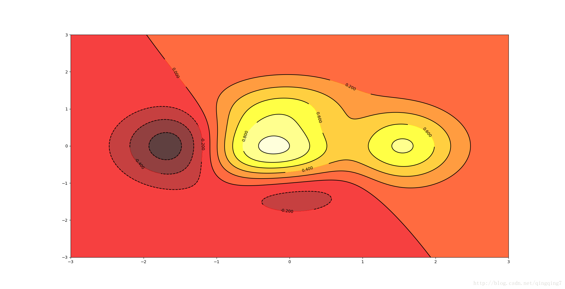
contour和contourf都是画三维等高线图的,不同点在于contourf会对等高线间的区域进行填充。
等高线由x,y给出坐标位置,第三个参数给出点的高程from matplotlib.pyplot import *def f(x,y): return (1-x/2+x**5+y**3)*np.exp(-x**2-y**2)n = 256x = np.linspace(-3,3,n)#点的一系列x坐标y = np.linspace(-3,3,n)#点的一系列y坐标X,Y = np.meshgrid(x,y)#将x和y组成的点阵变换成x的一组一组坐标和y的一组一组坐标contourf(X, Y, f(X,Y), 8, alpha=.75, cmap=cm.hot)#等高线间颜色填充C = contour(X, Y, f(X,Y), 8, colors='black', linewidth=.5)#画等高线clabel(C, inline=1, fontsize=10)#标注高程show()
结果如下:
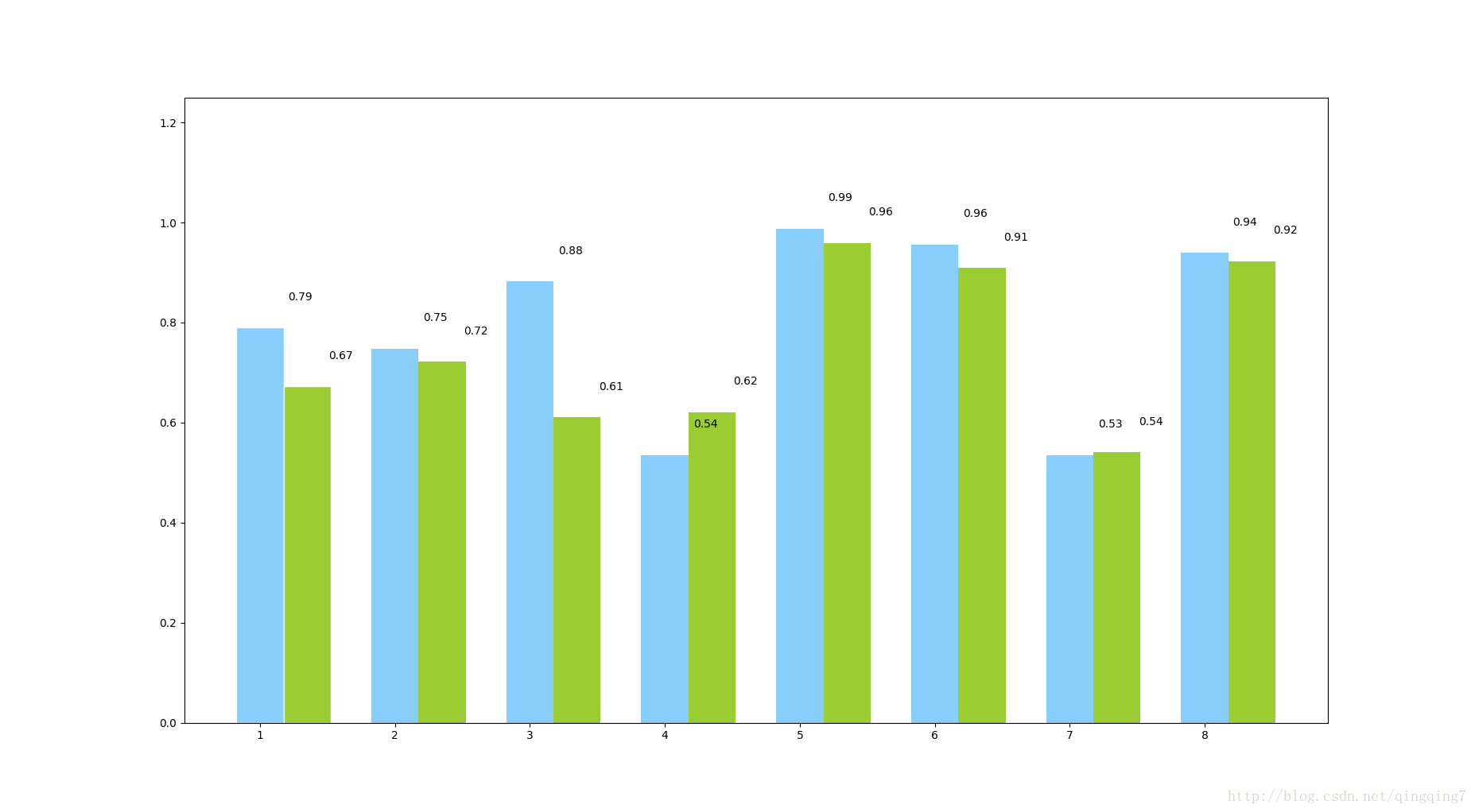
:画柱状图
# -*- coding: utf-8 -*-import numpy as npfrom matplotlib import pyplot as pltplt.figure(figsize=(9, 6))n = 8X = np.arange(n) + 1# X是1,2,3,4,5,6,7,8,柱的个数# numpy.random.uniform(low=0.0, high=1.0, size=None), normal# uniform均匀分布的随机数,normal是正态分布的随机数,0.5-1均匀分布的数,一共有n个Y1 = np.random.uniform(0.5, 1.0, n)Y2 = np.random.uniform(0.5, 1.0, n)plt.bar(X, Y1, width=0.35, facecolor='lightskyblue', edgecolor='white')# width:柱的宽度plt.bar(X + 0.35, Y2, width=0.35, facecolor='yellowgreen', edgecolor='white')# 水平柱状图plt.barh,属性中宽度width变成了高度height# 打两组数据时用+# facecolor柱状图里填充的颜色# edgecolor是边框的颜色# 想把一组数据打到下边,在数据前使用负号# plt.bar(X, -Y2, width=width, facecolor='#ff9999', edgecolor='white')# 给图加textfor x, y in zip(X, Y1): plt.text(x + 0.3, y + 0.05, '%.2f' % y, ha='center', va='bottom')for x, y in zip(X, Y2): plt.text(x + 0.6, y + 0.05, '%.2f' % y, ha='center', va='bottom')plt.ylim(0, +1.25)plt.show()
结果如下所示:
直方图 plt.hist
np.random.seed(2000)y = np.random.standard_normal((1000, 2))plt.figure(figsize=(7,5))plt.hist(y,label=['1st','2nd'],bins=25)plt.grid(True)plt.xlabel('value')plt.ylabel('frequency')plt.title('Histogram')plt.show()散点图(plt.scatter)
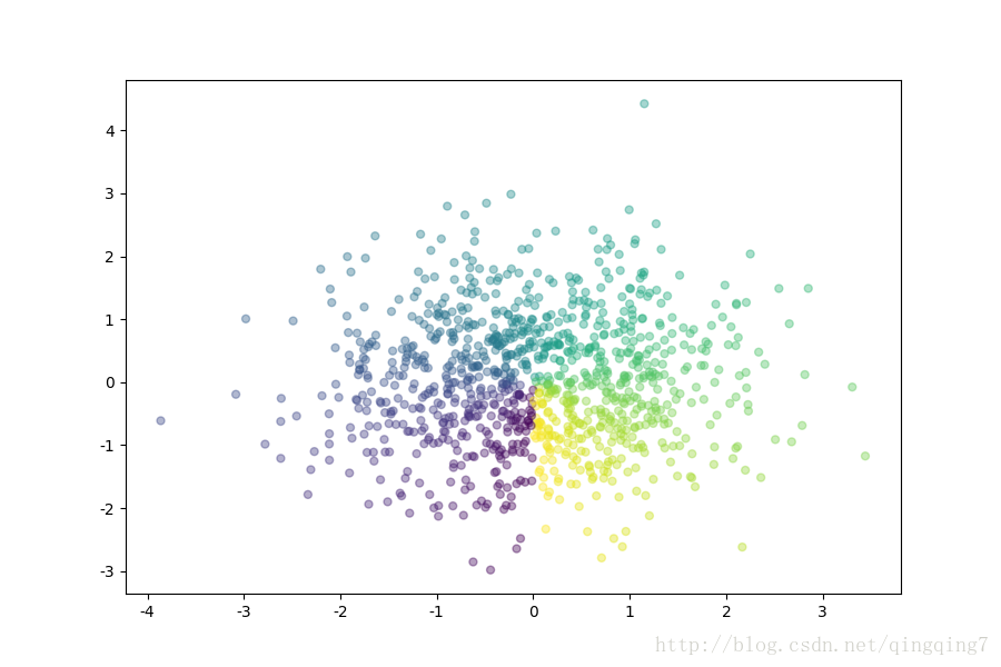
# -*- coding: utf-8 -*-import numpy as npfrom matplotlib import pyplot as pltplt.figure(figsize=(9,6))n=1000 #rand 均匀分布和 randn高斯分布x=np.random.randn(1,n)y=np.random.randn(1,n)T=np.arctan2(x,y)plt.scatter(x,y,c=T,s=25,alpha=0.4,marker='o')#T:散点的颜色#s:散点的大小#alpha:是透明程度plt.show()
结果如下:
绘制函数
from matplotlib.patches import Polygonimport numpy as npimport matplotlib.pyplot as plt#1. 定义积分函数def func(x): return 0.5 * np.exp(x)+1#2.定义积分区间a,b = 0.5, 1.5x = np.linspace(0, 2 )y = func(x)#3.绘制函数图形fig, ax = plt.subplots(figsize=(7,5))plt.plot(x,y, 'b',linewidth=2)plt.ylim(ymin=0)#4.核心, 我们使用Polygon函数生成阴影部分,表示积分面积:Ix = np.linspace(a,b)Iy = func(Ix)verts = [(a,0)] + list(zip(Ix, Iy))+[(b,0)]poly = Polygon(verts,facecolor='0.7',edgecolor = '0.5')ax.add_patch(poly)#5.用plt.text和plt.figtext在图表上添加数学公式和一些坐标轴标签。plt.text(0.5 *(a+b),1,r"$\int_a^b f(x)\mathrm{d}x$", horizontalalignment ='center',fontsize=20)plt.figtext(0.9, 0.075,'$x$')plt.figtext(0.075, 0.9, '$f(x)$')#6. 分别设置x,y刻度标签的位置。ax.set_xticks((a,b))ax.set_xticklabels(('$a$','$b$'))ax.set_yticks([func(a),func(b)])ax.set_yticklabels(('$f(a)$','$f(b)$'))plt.grid(True)matplotlib绘图设置坐标轴刻度、文本
参考 matplotlib绘图填充图和点阵图 http://www.jb51.net/article/112805.htm matplotlib更详细的可参考 https://blog.csdn.net/sunshine_in_moon/article/details/46573117 matplotlib.pyplot.imshow如何显示灰度图? https://www.zhihu.com/question/24058898关于matplotlib画图时无法显示中文的问题
根源在于matplotlib的默认字体并非中文字体,所以我们要手动添加中文字体。网上有好些解决的方案,试了其中一些没成功。现在其他成功的一种记录如下。
第一步:查看ubuntu系统中的中文字体fc-list :lang=zh-cn#注意:号前有一个空格
会看到如下的内容:
/usr/share/fonts/truetype/arphic/uming.ttc: AR PL UMing TW MBE:style=Light/usr/share/fonts/opentype/noto/NotoSansCJK-Bold.ttc: Noto Sans CJK JP,Noto Sans CJK JP Bold:style=Bold,Regular/usr/share/fonts/truetype/arphic/ukai.ttc: AR PL UKai CN:style=Book/usr/share/fonts/truetype/arphic/ukai.ttc: AR PL UKai HK:style=Book/usr/share/fonts/truetype/arphic/ukai.ttc: AR PL UKai TW:style=Book/usr/share/fonts/opentype/noto/NotoSansCJK-Bold.ttc: Noto Sans Mono CJK KR,Noto Sans Mono CJK KR Bold:style=Bold,Regular/usr/share/fonts/opentype/noto/NotoSansCJK-Black.ttc: Noto Sans CJK TC,Noto Sans CJK TC Black:style=Black,Regular/usr/share/fonts/opentype/noto/NotoSansCJK-Black.ttc: Noto Sans CJK KR,Noto Sans CJK KR Black:style=Black,Regular/usr/share/fonts/opentype/noto/NotoSansCJK-Bold.ttc: Noto Sans Mono CJK JP,Noto Sans Mono CJK JP Bold:style=Bold,Regular/usr/share/fonts/opentype/noto/NotoSansCJK-Medium.ttc: Noto Sans CJK JP,Noto Sans CJK JP Medium:style=Medium,Regular/usr/share/fonts/opentype/noto/NotoSansCJK-Regular.ttc: Noto Sans CJK JP,Noto Sans CJK JP Regular:style=Regular/usr/share/fonts/opentype/noto/NotoSansCJK-Light.ttc: Noto Sans CJK KR,Noto Sans CJK KR Light:style=Light,Regular/usr/share/fonts/opentype/noto/NotoSansCJK-Black.ttc: Noto Sans CJK SC,Noto Sans CJK SC Black:style=Black,Regular/usr/share/fonts/opentype/noto/NotoSansCJK-Bold.ttc: Noto Sans Mono CJK TC,Noto Sans Mono CJK TC Bold:style=Bold,Regular/usr/share/fonts/opentype/noto/NotoSansCJK-Regular.ttc: Noto Sans CJK KR,Noto Sans CJK KR Regular:style=Regular/usr/share/fonts/opentype/noto/NotoSansCJK-Light.ttc: Noto Sans CJK SC,Noto Sans CJK SC Light:style=Light,Regular/usr/share/fonts/opentype/noto/NotoSansCJK-Medium.ttc: Noto Sans CJK KR,Noto Sans CJK KR Medium:style=Medium,Regular/usr/share/fonts/opentype/noto/NotoSansCJK-Bold.ttc: Noto Sans Mono CJK SC,Noto Sans Mono CJK SC Bold:style=Bold,Regular/usr/share/fonts/opentype/noto/NotoSansCJK-Regular.ttc: Noto Sans Mono CJK JP,Noto Sans Mono CJK JP Regular:style=Regular/usr/share/fonts/opentype/noto/NotoSansCJK-Bold.ttc: Noto Sans CJK TC,Noto Sans CJK TC Bold:style=Bold,Regular/usr/share/fonts/opentype/noto/NotoSansCJK-DemiLight.ttc: Noto Sans CJK JP,Noto Sans CJK JP DemiLight:style=DemiLight,Regular/usr/share/fonts/opentype/noto/NotoSansCJK-Thin.ttc: Noto Sans CJK JP,Noto Sans CJK JP Thin:style=Thin,Regular/usr/share/fonts/opentype/noto/NotoSansCJK-Light.ttc: Noto Sans CJK JP,Noto Sans CJK JP Light:style=Light,Regular/usr/share/fonts/opentype/noto/NotoSansCJK-Thin.ttc: Noto Sans CJK KR,Noto Sans CJK KR Thin:style=Thin,Regular/usr/share/fonts/opentype/noto/NotoSansCJK-Regular.ttc: Noto Sans Mono CJK KR,Noto Sans Mono CJK KR Regular:style=Regular/usr/share/fonts/opentype/noto/NotoSansCJK-Thin.ttc: Noto Sans CJK SC,Noto Sans CJK SC Thin:style=Thin,Regular/usr/share/fonts/opentype/noto/NotoSansCJK-Bold.ttc: Noto Sans CJK SC,Noto Sans CJK SC Bold:style=Bold,Regular/usr/share/fonts/opentype/noto/NotoSansCJK-DemiLight.ttc: Noto Sans CJK TC,Noto Sans CJK TC DemiLight:style=DemiLight,Regular/usr/share/fonts/opentype/noto/NotoSansCJK-Regular.ttc: Noto Sans CJK SC,Noto Sans CJK SC Regular:style=Regular/usr/share/fonts/opentype/noto/NotoSansCJK-DemiLight.ttc: Noto Sans CJK SC,Noto Sans CJK SC DemiLight:style=DemiLight,Regular/usr/share/fonts/opentype/noto/NotoSansCJK-Medium.ttc: Noto Sans CJK TC,Noto Sans CJK TC Medium:style=Medium,Regular/usr/share/fonts/opentype/noto/NotoSansCJK-Black.ttc: Noto Sans CJK JP,Noto Sans CJK JP Black:style=Black,Regular/usr/share/fonts/opentype/noto/NotoSansCJK-Medium.ttc: Noto Sans CJK SC,Noto Sans CJK SC Medium:style=Medium,Regular/usr/share/fonts/opentype/noto/NotoSansCJK-Regular.ttc: Noto Sans CJK TC,Noto Sans CJK TC Regular:style=Regular/usr/share/fonts/opentype/noto/NotoSansCJK-DemiLight.ttc: Noto Sans CJK KR,Noto Sans CJK KR DemiLight:style=DemiLight,Regular/usr/share/fonts/truetype/arphic/ukai.ttc: AR PL UKai TW MBE:style=Book/usr/share/fonts/opentype/noto/NotoSansCJK-Regular.ttc: Noto Sans Mono CJK TC,Noto Sans Mono CJK TC Regular:style=Regular/usr/share/fonts/truetype/arphic/uming.ttc: AR PL UMing TW:style=Light/usr/share/fonts/truetype/arphic/uming.ttc: AR PL UMing CN:style=Light/usr/share/fonts/opentype/noto/NotoSansCJK-Regular.ttc: Noto Sans Mono CJK SC,Noto Sans Mono CJK SC Regular:style=Regular/usr/share/fonts/truetype/arphic/uming.ttc: AR PL UMing HK:style=Light/usr/share/fonts/opentype/noto/NotoSansCJK-Thin.ttc: Noto Sans CJK TC,Noto Sans CJK TC Thin:style=Thin,Regular/usr/share/fonts/opentype/noto/NotoSansCJK-Light.ttc: Noto Sans CJK TC,Noto Sans CJK TC Light:style=Light,Regular/usr/share/fonts/opentype/noto/NotoSansCJK-Bold.ttc: Noto Sans CJK KR,Noto Sans CJK KR Bold:style=Bold,Regular
我们可以利用这些中文字体来设置matplotlib
**第二步:在程序中临时为matplotlib指定中文字体 **from matplotlib.font_manager import FontPropertieszhfont=FontProperties(fname='/usr/share/fonts/truetype/arphic/ukai.ttc')a=np.arange(4,9)b=np.arange(2,7)plt.plot(a,b)plt.xlabel(u'横坐标',fontproperties=zhfont)plt.ylabel(u'纵坐标',fontproperties=zhfont)plt.show()
图例中显示中文
plt.legend(['样本1','样本2'],prop =zhfont)
matplotlib绘制三维图
在jupyter notebook中由于无法交互式拖拽,所以需要用代码来控制角度,但在pycharm中可以直接拖拽,就更方便了。ax=plt.subplot(projection='3d')#似乎这里只能用subplot,不能用plotax.scatter(df["AAAA"].astype(float).values,df["BBBBB"].astype(float).values,df["CCCC"].astype(float).values)ax.set_xlabel("AAAA")ax.set_ylabel("BBBBB")ax.set_zlabel("CCCC")plt.show()seaborn库
python中最常用的绘图工具包是matplotlib库,但是matplotlib中很多参数需要自己设置,灵活但繁琐,而且常常不知道如何设置(太多要设置的了)。一般来说,seaborn能满足数据分析90%的绘图需求,够用了,如果需要复杂的自
定义图形,还是要matplotlit。这里主要对库进行介绍。几个概念,
- 分组绘图
- 不同的组分别用不同的颜色加以区分。在seaborn中用hue参数控制分组绘图。
- 分面绘图
- 就是在一张纸上划分不同的区域,比如2*2的子区域,在不同的子区域上绘制不同的图形,在matplotlib中就是 add_subplot(2,2,1),在seaborn中用col参数控制,col的全称是columns,不是color,如果辅助col_wrap参数会更好些。后来发现,co l可以控制columns的子图,那么row可以控制rows的子图排列。如果需要分面绘图,应该使用seaborn的FacetGrid对象,seaborn的一般的绘图函 数是没有分面这个参数的。
- 统计函数
- 分组绘图的时候,会对分组变量先要用统计函数,然后绘图,比如先计算变量的均值,然后绘制该均值的直方图。统计绘图参数是 estimator,很多情况下默认是numpy.mean。 如果不适用统计绘图,就需要先用pandas进行groupby分组汇总,然后用seaborn绘图,多此一举了。 ### 图形分类 seaborn中图形大概分这么几类,因子变量绘图,数值变量绘图,两变量关系绘图,时间序列图,热力图,分面绘图等。 **一、因子变量绘图** 箱线图boxplot 小提琴图violinplot 散点图striplot 带分布的散点图swarmplot 条形图barplot(应该叫均值条形图更切合实际) 频数的直方图countplot 两变量关系图factorplot **二、回归图** 探讨两连续数值变量的变化趋势情况,绘制x-y的散点图和回归曲线。 线性回归图lmplot 线性回归图regplot **三、分布图** 包括单变量核密度曲线,直方图,双变量多变量的联合直方图,和密度图 **四、热力图** heatmap **五、聚类图** clustermap **六、时间序列图** 时间序列图tsplot 时序图plot_ts_d , plot_ts_m **七、分面绘图** FacetGrid
因子变量绘图
一、
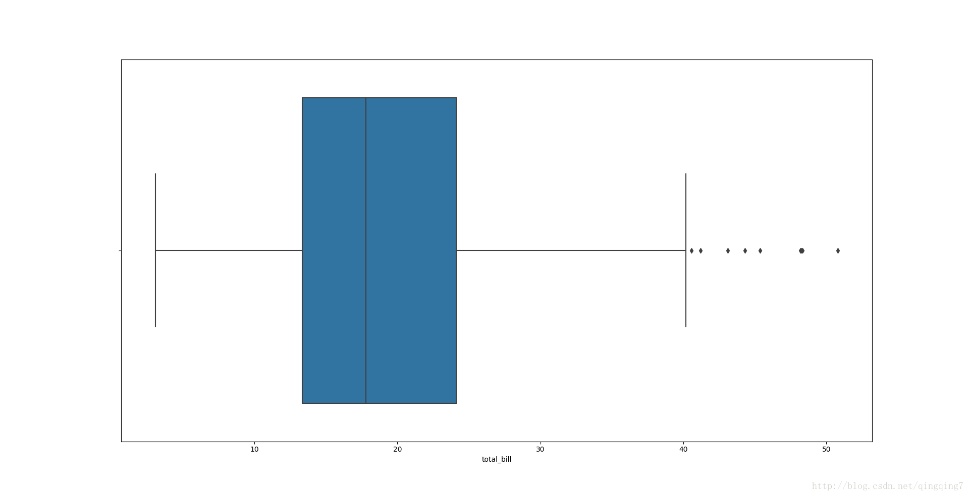
个人感觉在因子变量图里只要有countplot和boxplot就行,boxplot对数据的简单特点展示最全面,再配合countplot或者后面的密度曲线就能说明很多问题。 **boxplot( x=None, y=None, hue=None, data=None, order=None,hue_order=None, orient=None, color=None, palette=None, saturation=0.75,width=0.8, dodge=True, fliersize=5, linewidth=None, whis=1.5, notch=False,ax=None, kwargs )# -*- coding: utf-8 -*-import matplotlib.pyplot as pltimport seaborn as snstips=sns.load_dataset("tips")#应该是数据框的形式sns.set_style("whitegrid")#可以设置更多样式,但也可以不管,为了不增加记忆负担应该先不管,等想要更漂亮图的时候再来查询即可#横着放的箱线图sns.boxplot(x=tips["total_bill"])#只传入了x参数,只会对这个参数统计,并且沿着x轴展示结果plt.show()结果如下:
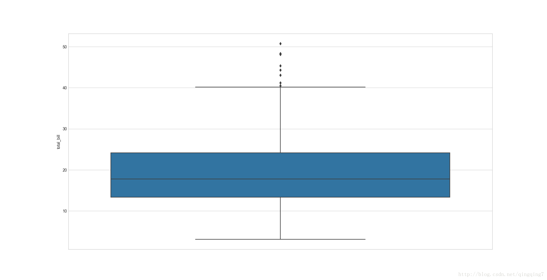
#竖着放的箱线图,就是将数据赋给ysns.boxplot(y=tips["total_bill"])#只传入了y参数,只会对这个参数统计,并且沿着y轴展示结果plt.show()
结果如下:
#分组绘制箱线图,x为分组因子,y为被统计变量sns.boxplot(x="day",y="total_bill",data=tips)#注意之前是直接给出了对应的变量赋给了x或y,没指明data;这里是将变量名赋给x,y,然后将整个数据赋给dataplt.show()
结果如下:
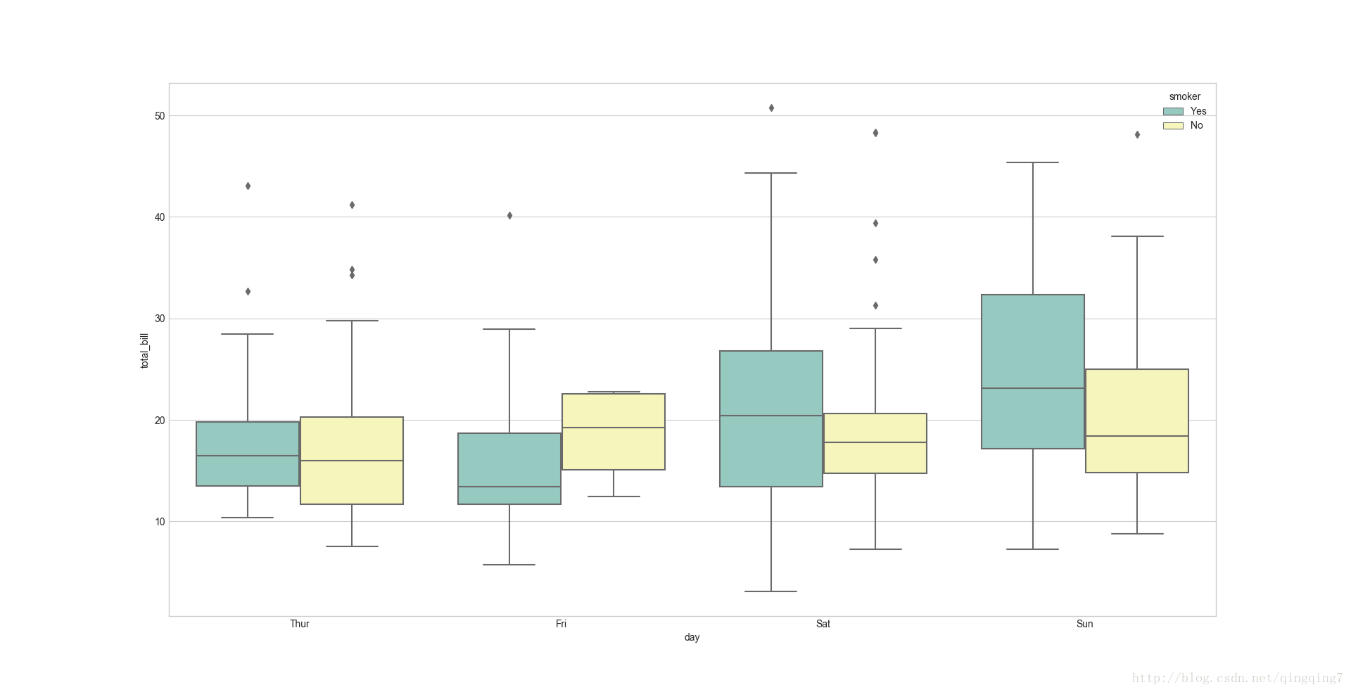
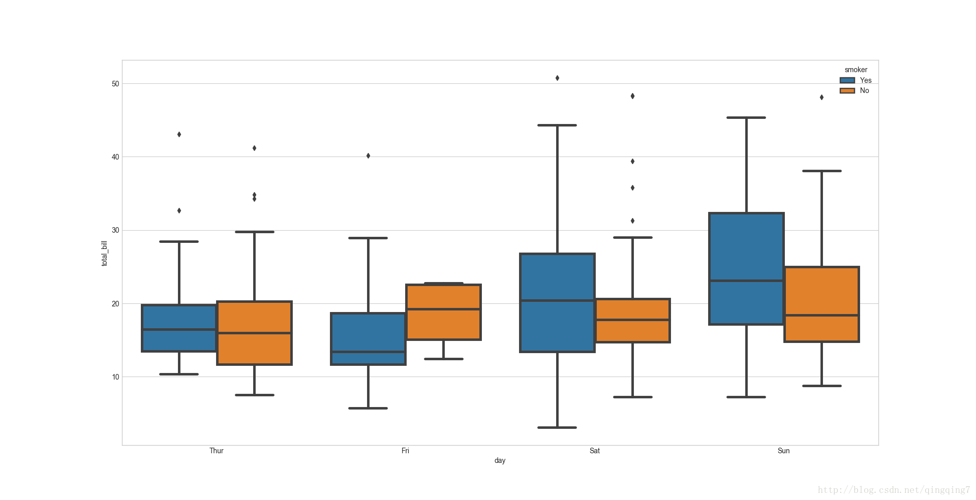
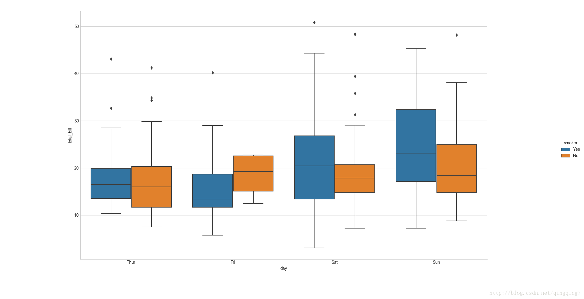
#如果需要进一步分组,可以再加上huesns.boxplot(x="day",y="total_bill",hue="smoker",data=tips)plt.show()
结果如下:
#修改色调sns.boxplot(x="day",y="total_bill",hue="smoker",data=tips,palette="Set3")plt.show()
结果如下:
# 改变线宽,linewidth参数sns.boxplot(x="day",y="total_bill",hue="smoker",data=tips,linewidth=3.5)plt.show()
结果如下:
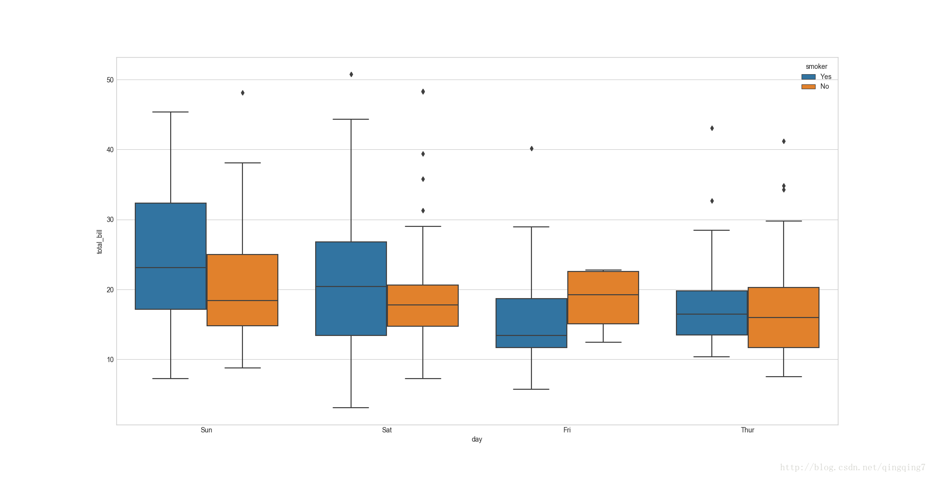
# 改变x轴顺序,order参数ax=sns.boxplot(x="day",y="total_bill",hue="smoker",data=tips,order=["Sun","Sat","Fri","Thur"])plt.show()
结果如下:
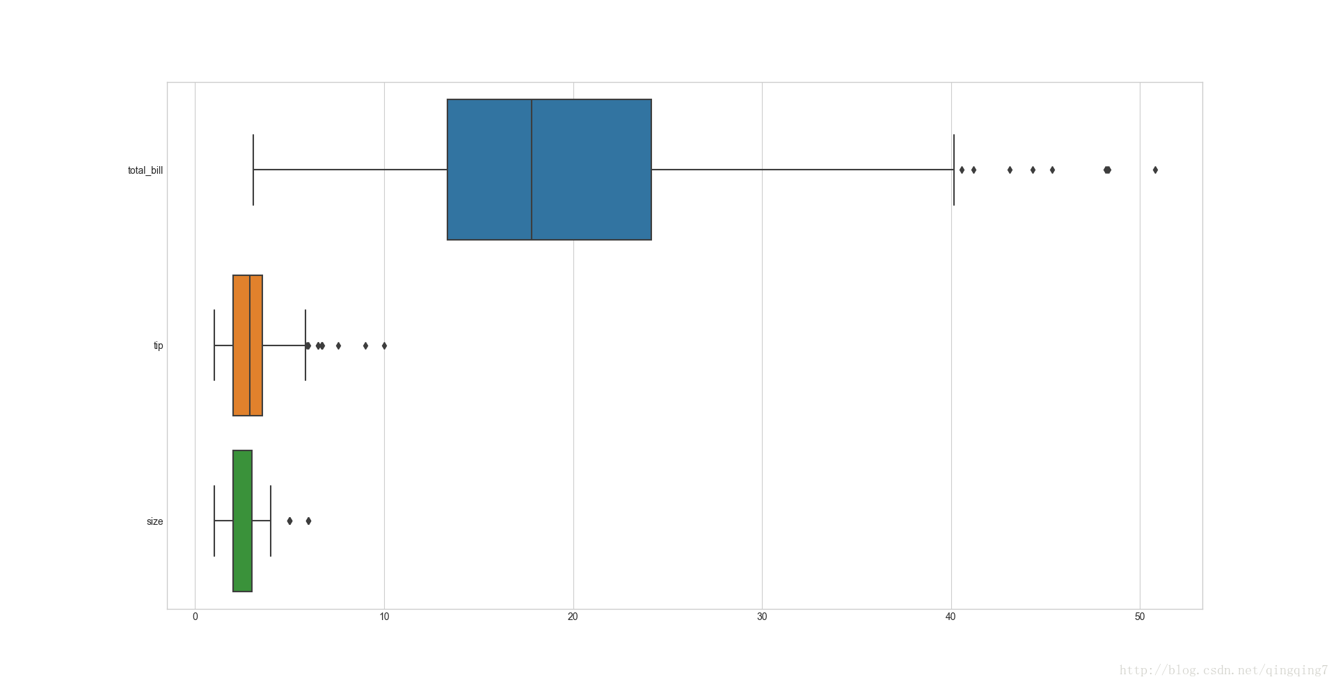
# 对dataframe的每个变量都绘制一个箱线图,水平放置ax=sns.boxplot(data=tips,orient="h")#可以看到不传入x,y参数,就对所有变量进行统计,并画箱线图plt.show()
结果如下:
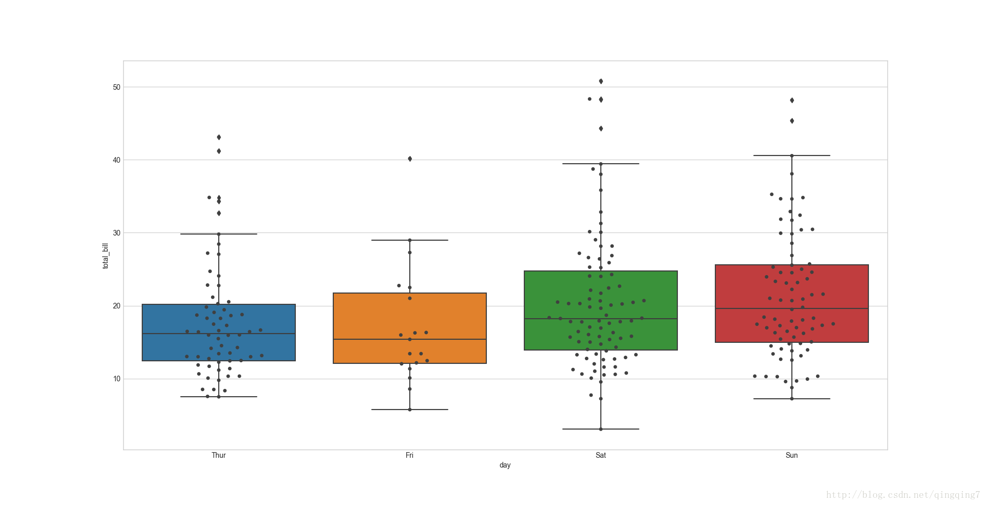
# 箱线图+有分布趋势的散点图# 图形组合也就是两条绘图语句一起运行就可以了,会在之前的图的基本上继续画图,最后就是叠加效果,更复杂的叠加可以通过参数ax进行控制ax=sns.boxplot(x="day",y="total_bill",data=tips)ax=sns.swarmplot(x="day",y="total_bill",data=tips,color="0.25")#注意两个图形的变量名相同,其实就是同一个画板;同时为了区分,需要重新设置绘图颜色,要不然会没用上面的颜色,对比就不明显plt.show()
结果如下:
像下面这样效果也是一样的,但是可以进行更好的控制
# 箱线图+有分布趋势的散点图# 图形组合也就是两条绘图语句一起运行就可以了,会在之前的图的基本上继续画图,最后就是叠加效果,更复杂的叠加可以通过参数ax进行控制g=sns.boxplot(x="day",y="total_bill",data=tips)ax=sns.swarmplot(x="day",y="total_bill",data=tips,color="0.25",ax=g)#注意两个图形的变量名相同,其实就是同一个画板;同时为了区分,需要重新设置绘图颜色,要不然会没用上面的颜色,对比就不明显plt.show()
二、
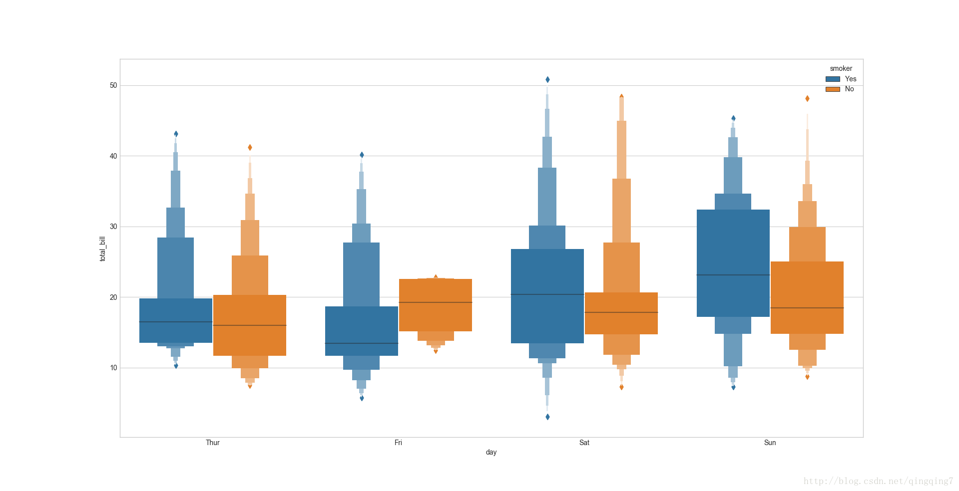
小提琴图其实是箱箱线图与核核密 图的结合,箱线图展示了分位数的位置,小提琴图则展示了任意位置的密度,通过小提琴图可以知道哪些位置的密度较高。在图中,白点是中位数,黑色盒型的范围是下四分位点到上四分位点,细黑线表示须。外部形状即为核密度估计(在概率论中用来估计未知的密度函数,属于非参数检验方法之一)。**violinplot(x=None, y=None, hue=None, data=None, order=None, hue_order=None, bw=‘scott’, cut=2, scale=‘area’, scale_hue=True, gridsize=100, width=0.8, inner=‘box’, split=False, dodge=True, orient=None, linewidth=None, color=None, palette=None, saturation=0.75, ax=None, kwargs)
violinplot与boxplot的使用方法一模一样,下面只举一个例子#分组展示violinplotax=sns.violinplot(x="day",y="total_bill",hue="smoker",data=tips)plt.show()
结果如下:
注意看violinplot中的白点即中位数,粗线两端即为上下四分位数,细线即为胡须,外边包裹的图案即显示了数据的密度分布。其实用boxplot和swarmplot叠加效果一样,显示的还更清晰。
三、
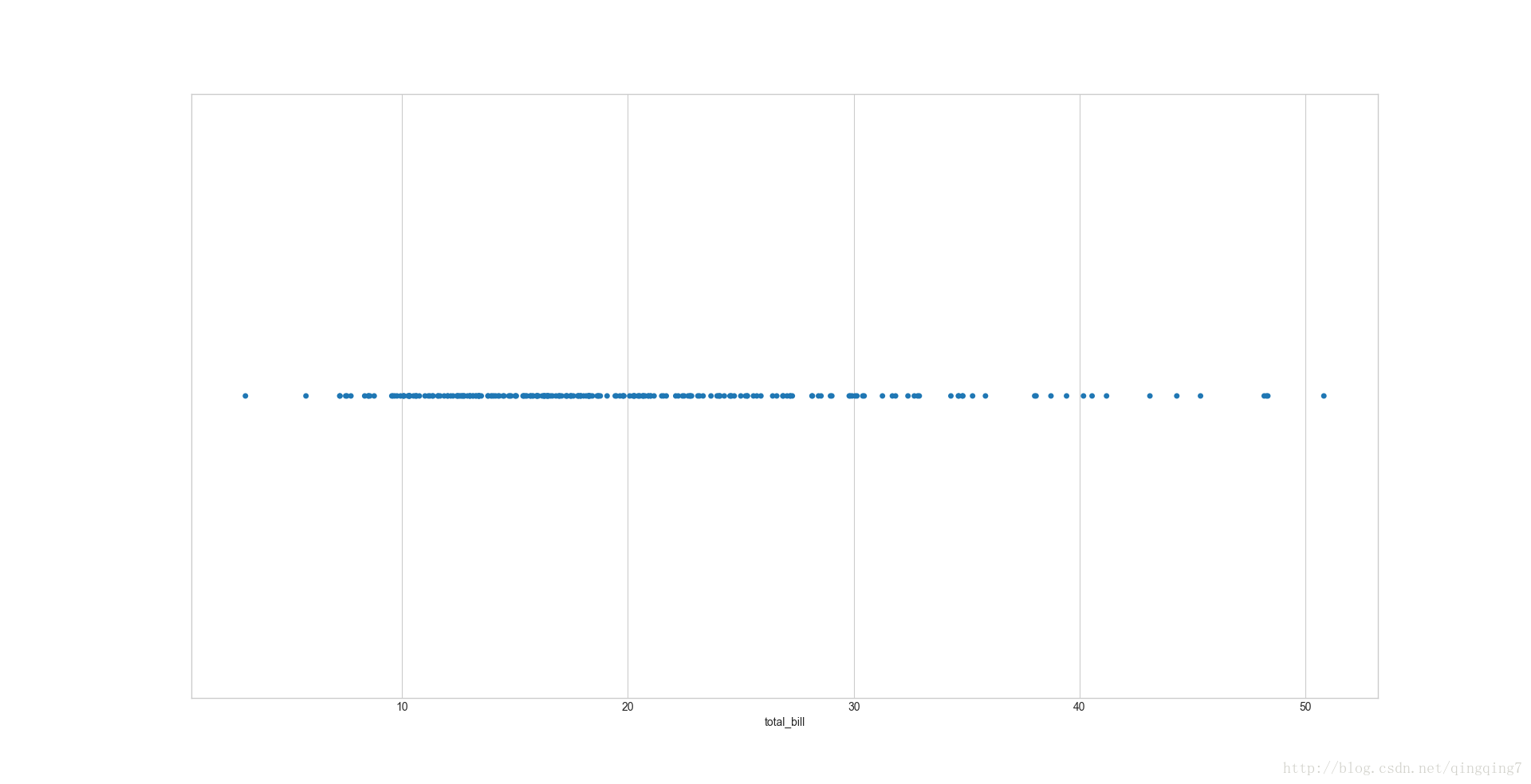
seaborn中有两个散点图,一个是普通的散点图即stripplot,另一个是可以看出分布密度的散点图即swarmplot。其实stripplot也能一定程序上反映出密度分布,swarmplot相当于是二维的点,而stripplot相当于是swarmplot在一维上的投影 stripplot([x, y, hue, data, order, …]#水平设置的一维散点图ax=sns.stripplot(x=tips["total_bill"])plt.show()
结果如下:
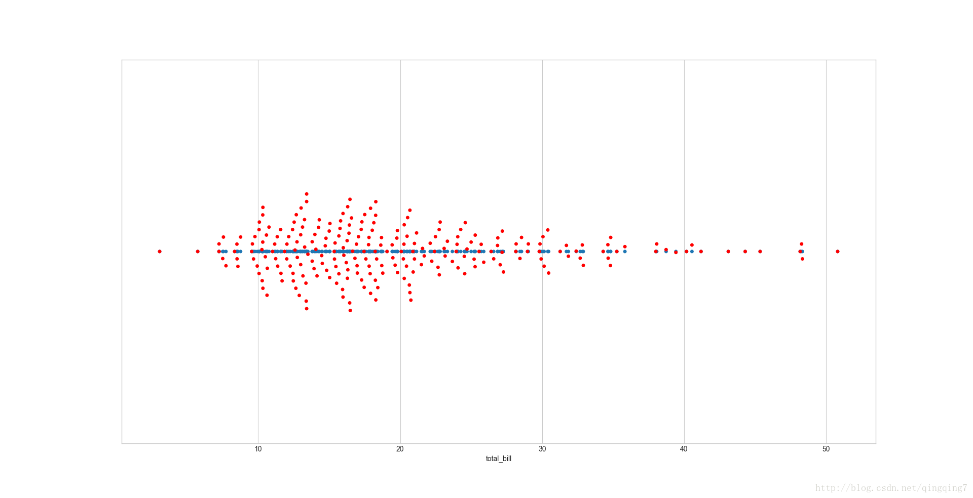
#水平设置的一维散点图ax1=sns.stripplot(x=tips["total_bill"])# 我们可以将两种散点画在一起进行对比(带分布密度的散点图)ax2 = sns.swarmplot(x=tips["total_bill"],color="r")plt.show()
结果如下:
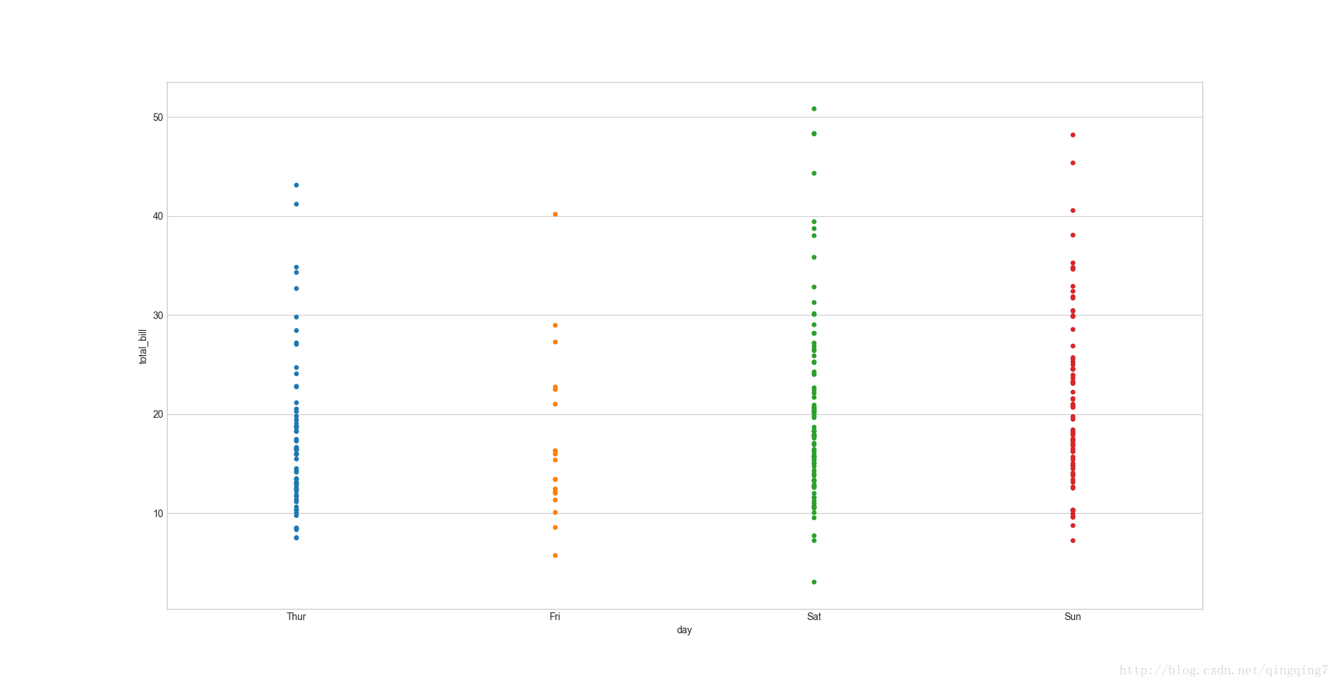
# 分组的散点图ax=sns.stripplot(x="day",y="total_bill",data=tips)plt.show()
# 添加抖动项的散点图,jitter可以是0.1,0.2...这样的小数,表示抖动的程度大小。但是不理解为要抖动,我们画图不就是为了展示数据本来的特点吗?ax=sns.stripplot(x="day",y="total_bill",data=tips,jitter=True)plt.show()
结果如下:
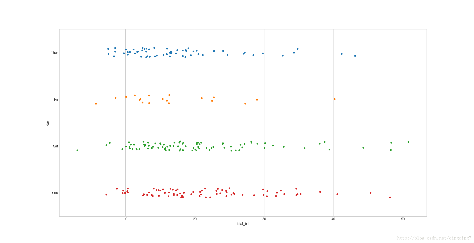
#将图像横着显示只要对调x,y的值,即可ax=sns.stripplot(x="total_bill",y="day",data=tips,jitter=True)plt.show()
结果如下:
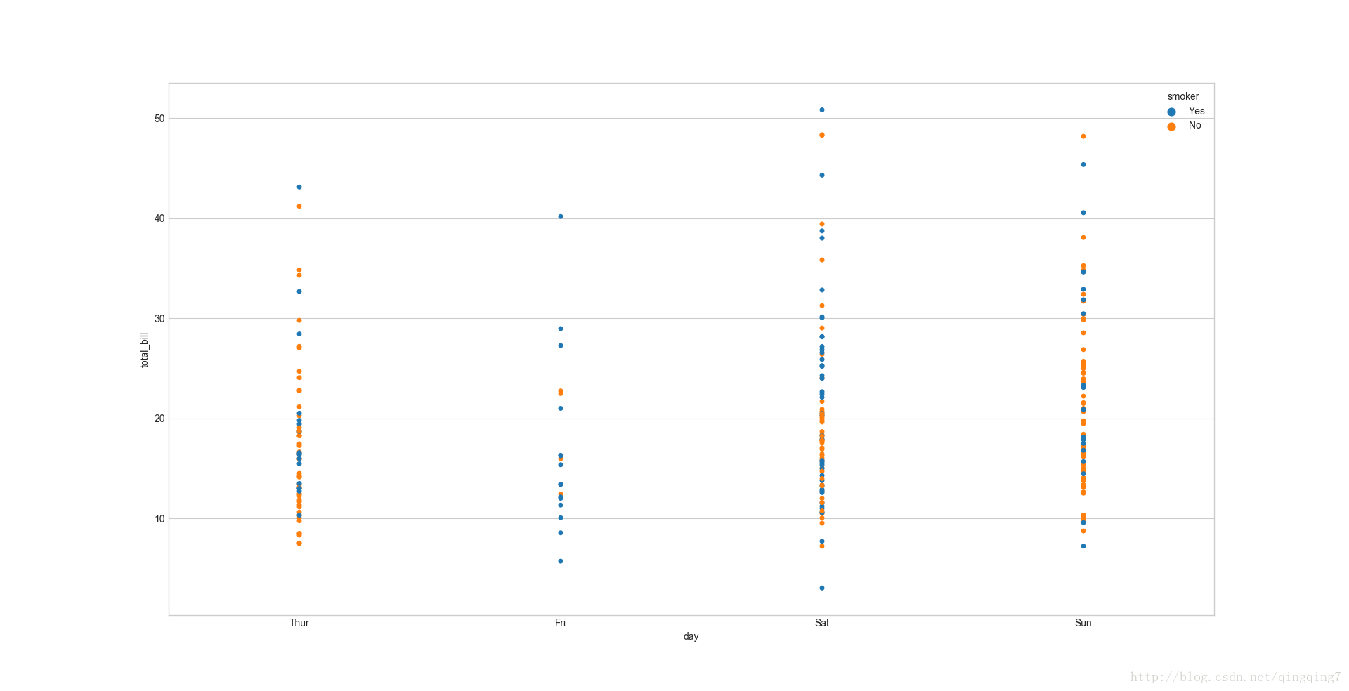
#分组后再分开,方法同之前,再加上hue即可,同时可以通过split参数控制组内分组是堆在一起用颜色来区分还是组内分组也分开。#组内分给不分开,以颜色区分ax=sns.stripplot(x="day",y="total_bill",hue="smoker",data=tips)plt.show()
结果如下:
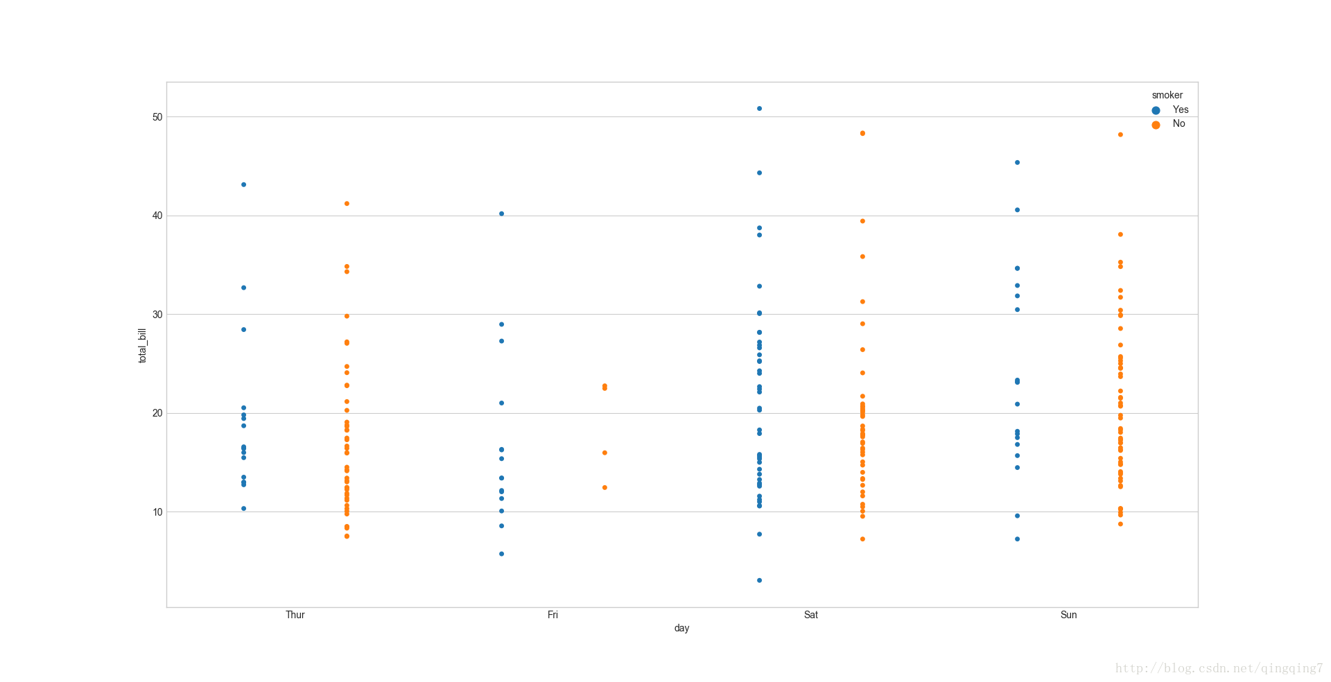
#组内分组分开ax=sns.stripplot(x="day",y="total_bill",hue="smoker",data=tips,split=True)#注意在boxplot中是默认分开的,而在stripplot中需要自己设置plt.show()
结果如下:
# 散点图+小提起图ax=sns.stripplot(x="day",y="total_bill",data=tips)ax=sns.violinplot(x="day",y="total_bill",data=tips,color="0.8")plt.show()
结果如下:
个人还是觉得boxplot+swarmplot是能观察得最清楚的。
四、
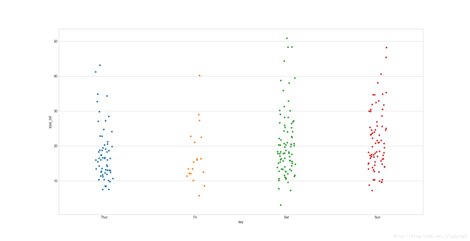
数据点不像stripplot一样会产生重叠,swarmplt的参数和用法和stripplot的用法是一样的,只是表现形式不一样而已。 **swarmplot(x=None, y=None, hue=None, data=None, order=None, hue_order=None, dodge=False, orient=None, color=None, palette=None, size=5, edgecolor=‘gray’, linewidth=0, ax=None, kwargs) 这里也只举一个例子。# 箱线图+散点图ax=sns.boxplot(x="day",y="total_bill",data=tips)ax=sns.swarmplot(x="day",y="total_bill",data=tips,color="0.2")plt.show()
结果如下:
五、
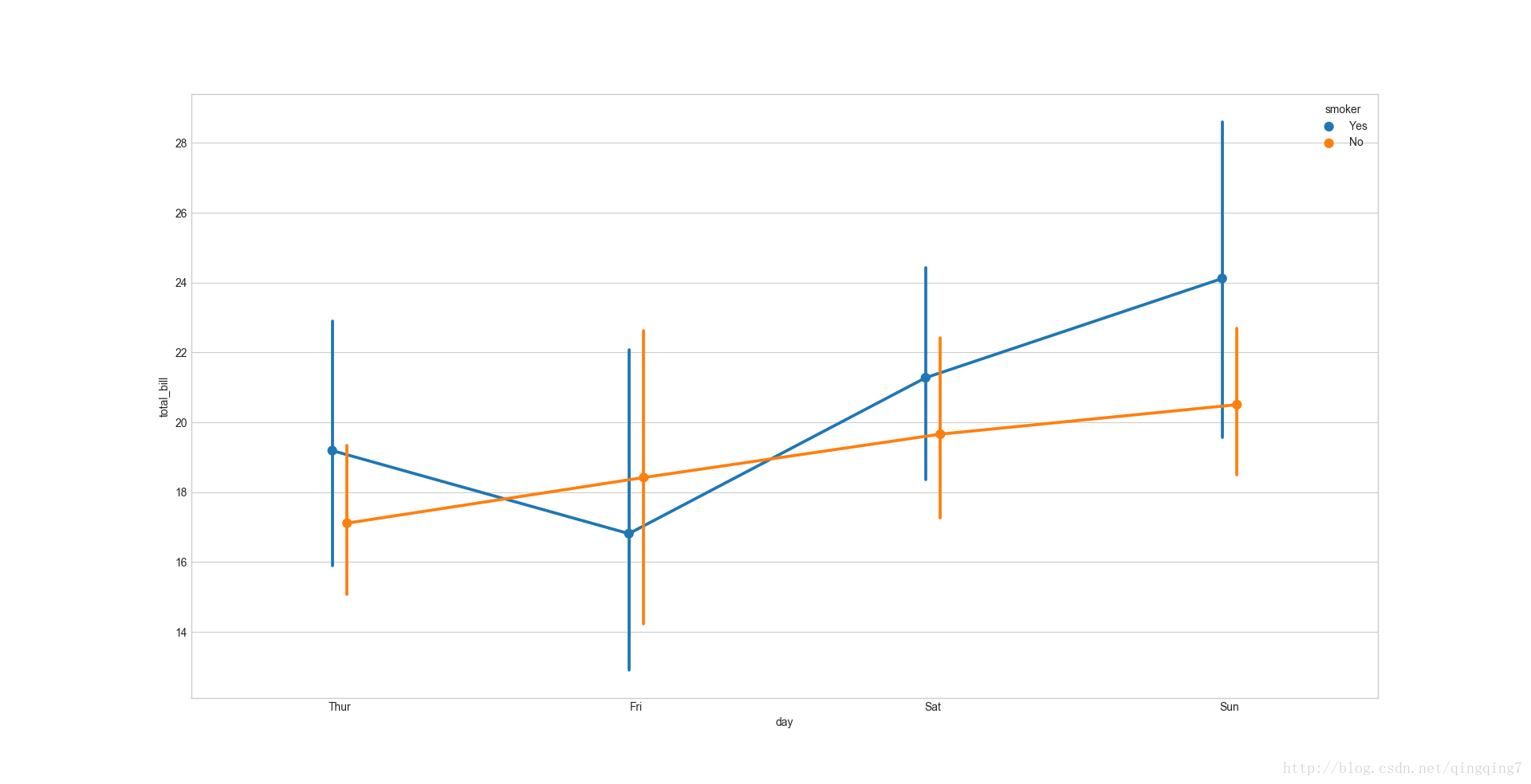
统计指标点图,显示某统计变量值和置信区间(误差范围)。 **pointplot(x=None, y=None, hue=None, data=None, order=None, hue_order=None, estimator=, ci=95, n_boot=1000, units=None, markers=‘o’, linestyles=’-’, dodge=False, join=True, scale=1, orient=None, color=None, palette=None, errwidth=None, capsize=None, ax=None, kwargs) 默认绘制的是变量的均值和均值的置信区间 estimator=np.mean,可以自己设置成中值。max、median、min 等,与barplot功能类似,但是比barplot给出的信息更丰富,比如不同组之间均值的变化趋势,同时也更便于肉眼观察差别。#统计指标点图#先看最简单的情形ax=sns.pointplot(x=tips["total_bill"])plt.show()
结果如下:
#分组再分组,再分组错开图ax=sns.pointplot(x="day",y="total_bill",hue="smoker",data=tips,dodge=True)#dodge参数表示分组错开plt.show()
六、
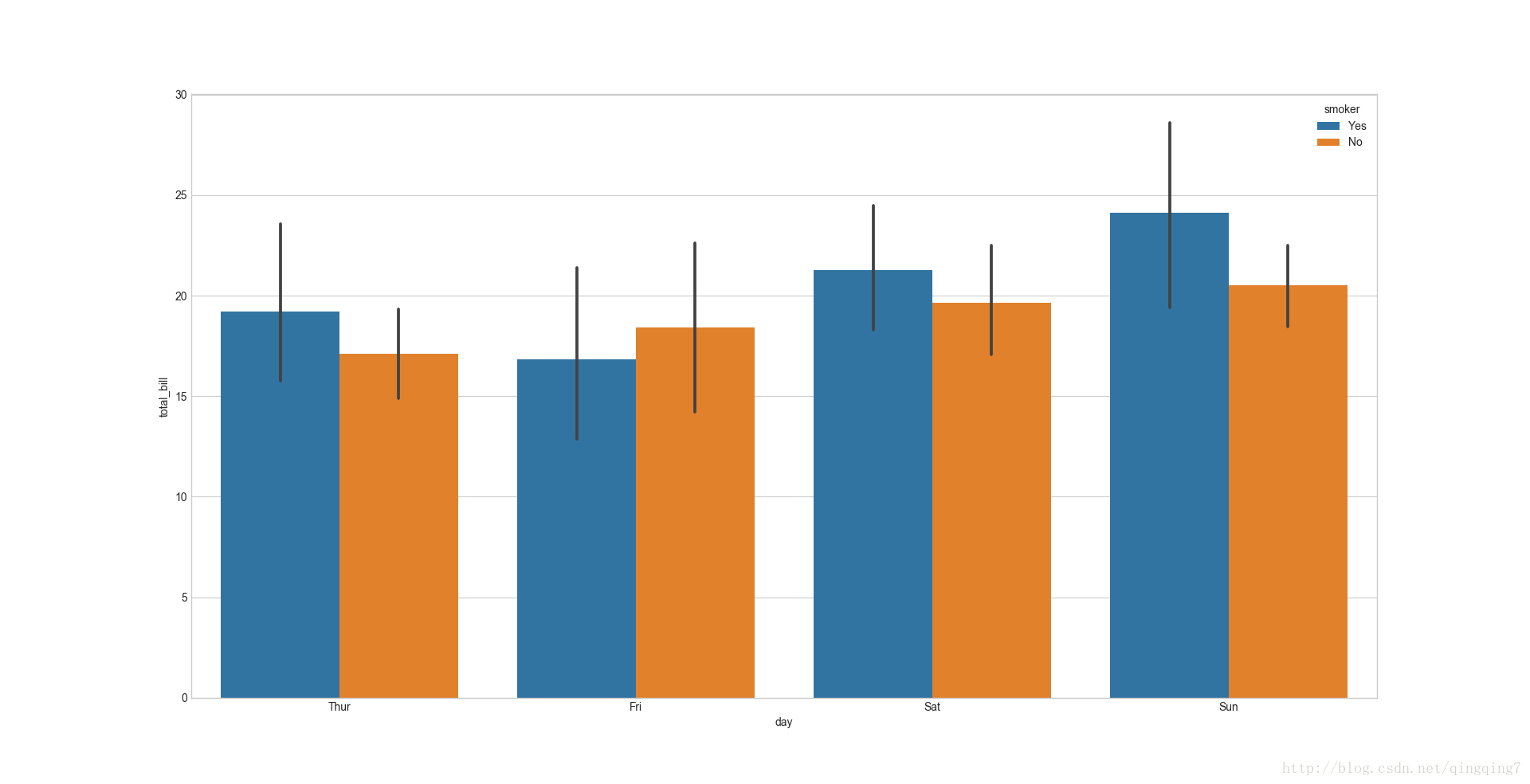
默认绘制的是变量的均值和均值的置信区间 estimator=np.mean,可以自己设置成中值。max、median、min 等 设置ci=0可以使上方的置信区间线不显示。 **barplot( x=None, y=None, hue=None, data=None, order=None,hue_order=None, estimator= , ci=95, n_boot=1000, units=None,orient=None, color=None, palette=None, saturation=0.75, errcolor=’.26’,errwidth=None, capsize=None, dodge=True, ax=None, kwargs ) 这里也只举一个例子# 分组的条形图ax=sns.barplot(x="day",y="total_bill",hue="smoker",data=tips)plt.show()
七、
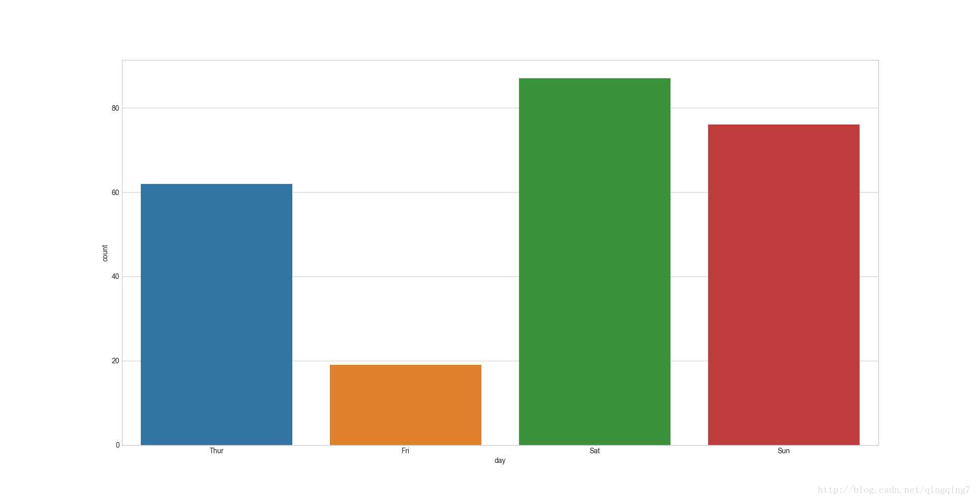
对因子变量(分组)计数,然后绘制条形图。 **countplot( x=None, y=None, hue=None, data=None, order=None,hue_order=None, orient=None, color=None, palette=None, saturation=0.75,dodge=True, ax=None, kwargs )#先绘制一个最简单的频率直方图ax=sns.countplot(x="day",data=tips)plt.show()
结果如下:
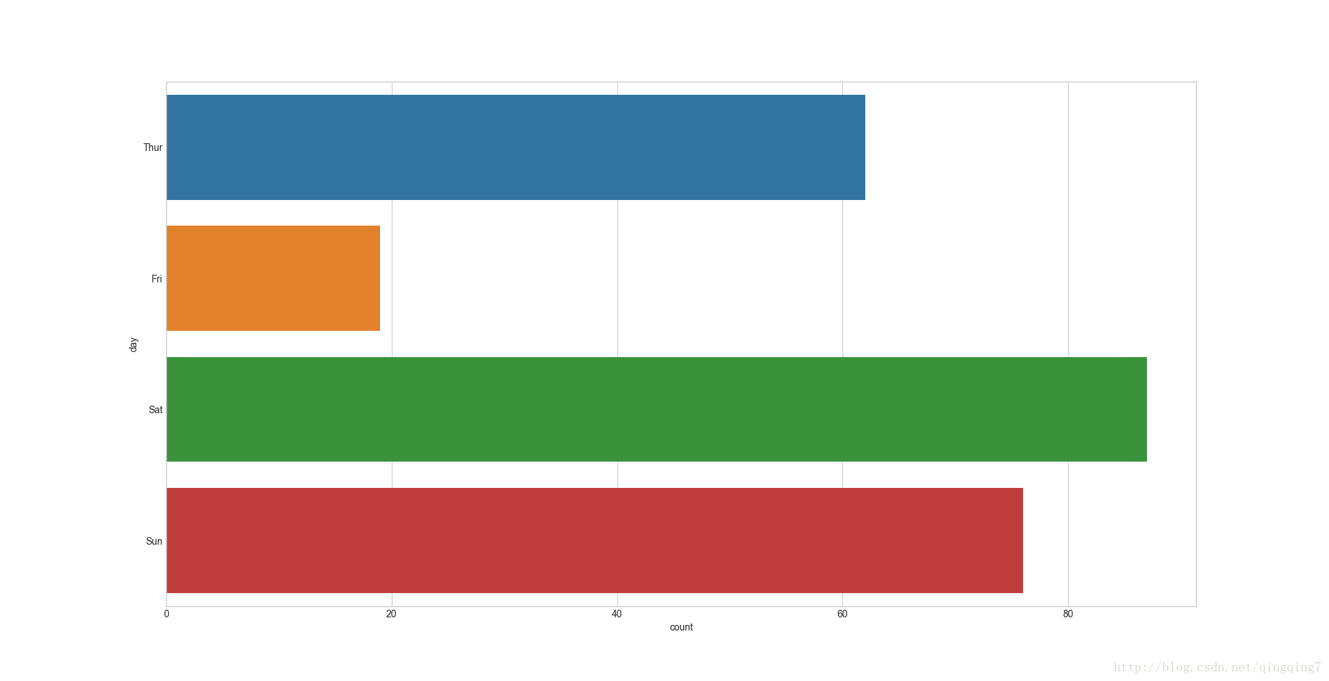
#横着绘制ax=sns.countplot(y="day",data=tips)plt.show()
结果如下:
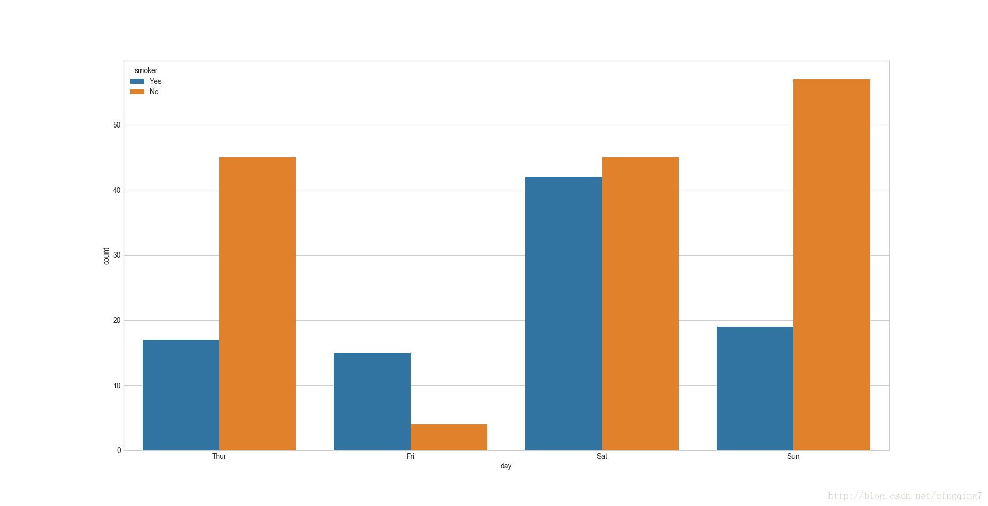
#分组绘制ax=sns.countplot(x="day",hue="smoker",data=tips)#注意与其他因子变量不同,countplot不能同时给x、y赋值,之前的函数同时有xy时,是按x的分组来统计y的分布,再加上hue来分组;而countplot是对x或y进行个数统计,再加上hue来区分组别plt.show()
结果如下:
八、
**lvplot( x=None, y=None, hue=None, data=None, order=None,hue_order=None, orient=None, color=None, palette=None, saturation=0.75,width=0.8, dodge=True, k_depth=‘proportion’, linewidth=None, scale=‘exponential’,outlier_prop=None, ax=None, kwargs )#lvpolt的功能与boxplot和violinplot类似,但是更容易绘制,函数的使用方法也一样,这里只举一个例子ax=sns.lvplot(x="day",y="total_bill",hue="smoker",data=tips)plt.show()
结果如下:
九、
这是一类重要的变量联合绘图。绘制因子变量-数值变量的分布情况图。通过设置kind参数可以绘制不同的图形。相当于它综合了其他因子变量绘图函数的功能,其实观察这些绘图函数会发现它们传入的参数,参数功能几乎一样(除了countplot不能同时传x、y),只是完成的统计功能不一样; **factorplot(x=None, y=None, hue=None, data=None, row=None, col=None, col_wrap=None, estimator=, ci=95, n_boot=1000, units=None, order=None, hue_order=None, row_order=None, col_order=None, kind=‘point’, size=4, aspect=1, orient=None, color=None, palette=None, legend=True, legend_out=True, sharex=True, sharey=True, margin_titles=False, facet_kws=None, kwargs)#不设置kind参数查看factorplot会图出什么样的图ax=sns.factorplot(x="day",y="total_bill",hue="smoker",data=tips)plt.show()
结果如下:
可以看到默认情况下,它画的是pointplot图
#我们也可以画其他类型的图ax=sns.factorplot(x="day",y="total_bill",hue="smoker",data=tips,kind="box")plt.show()
结果如下:
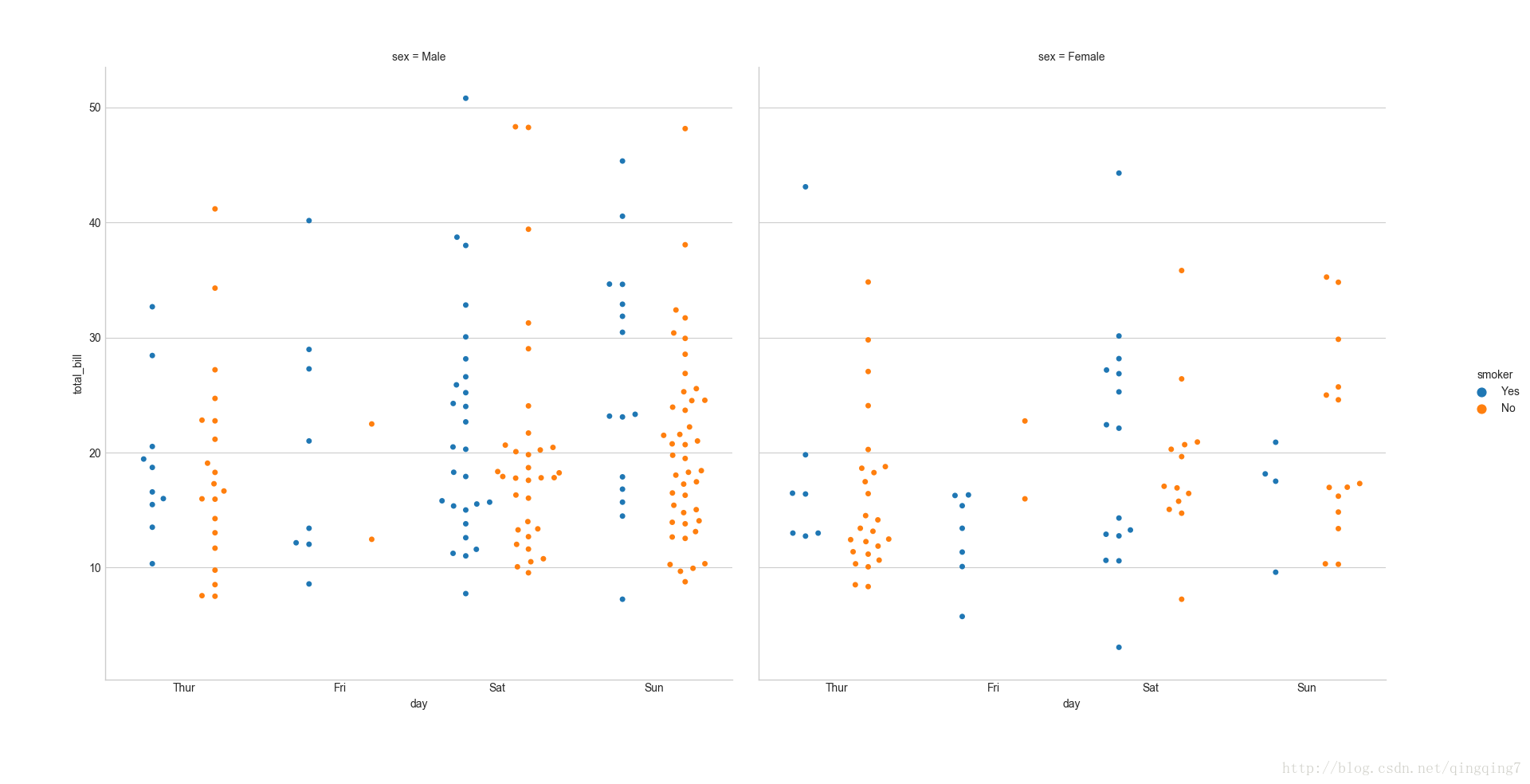
#通过加入参数col可以实现绘图的分校,相当于在分组的基础上再分组,然后再分组,而且是与并排的两幅图的形式展现ax=sns.factorplot(x="day",y="total_bill",hue="smoker",col="sex",data=tips,kind="swarm",split=True)plt.show()
结果如下:
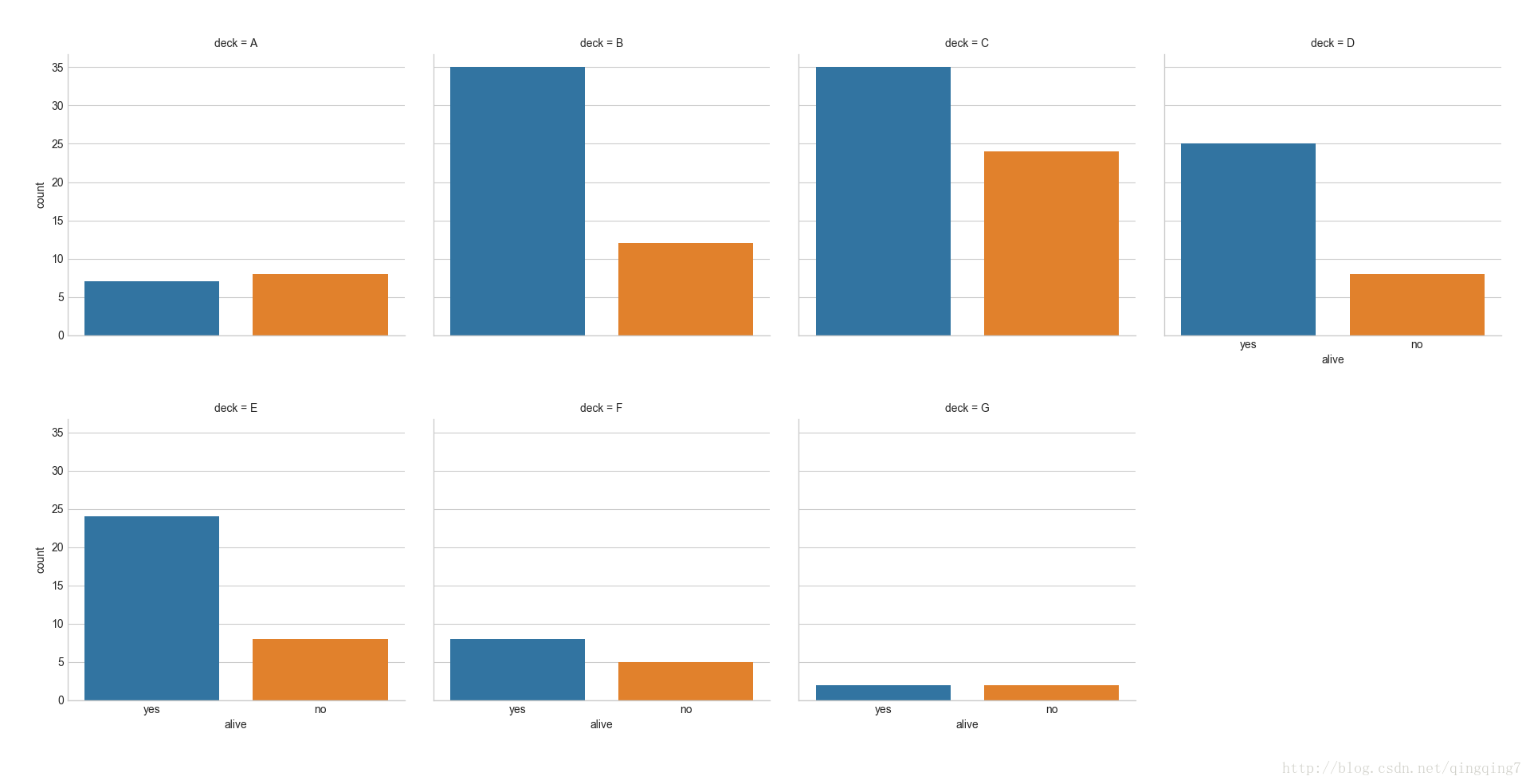
#col_wrap控制每行画图个数titanic = sns.load_dataset("titanic")g = sns.factorplot(x="alive", col="deck", col_wrap=4, data=titanic[titanic.deck.notnull()],kind="count", size=2.5, aspect=.8)plt.show()结果如下:
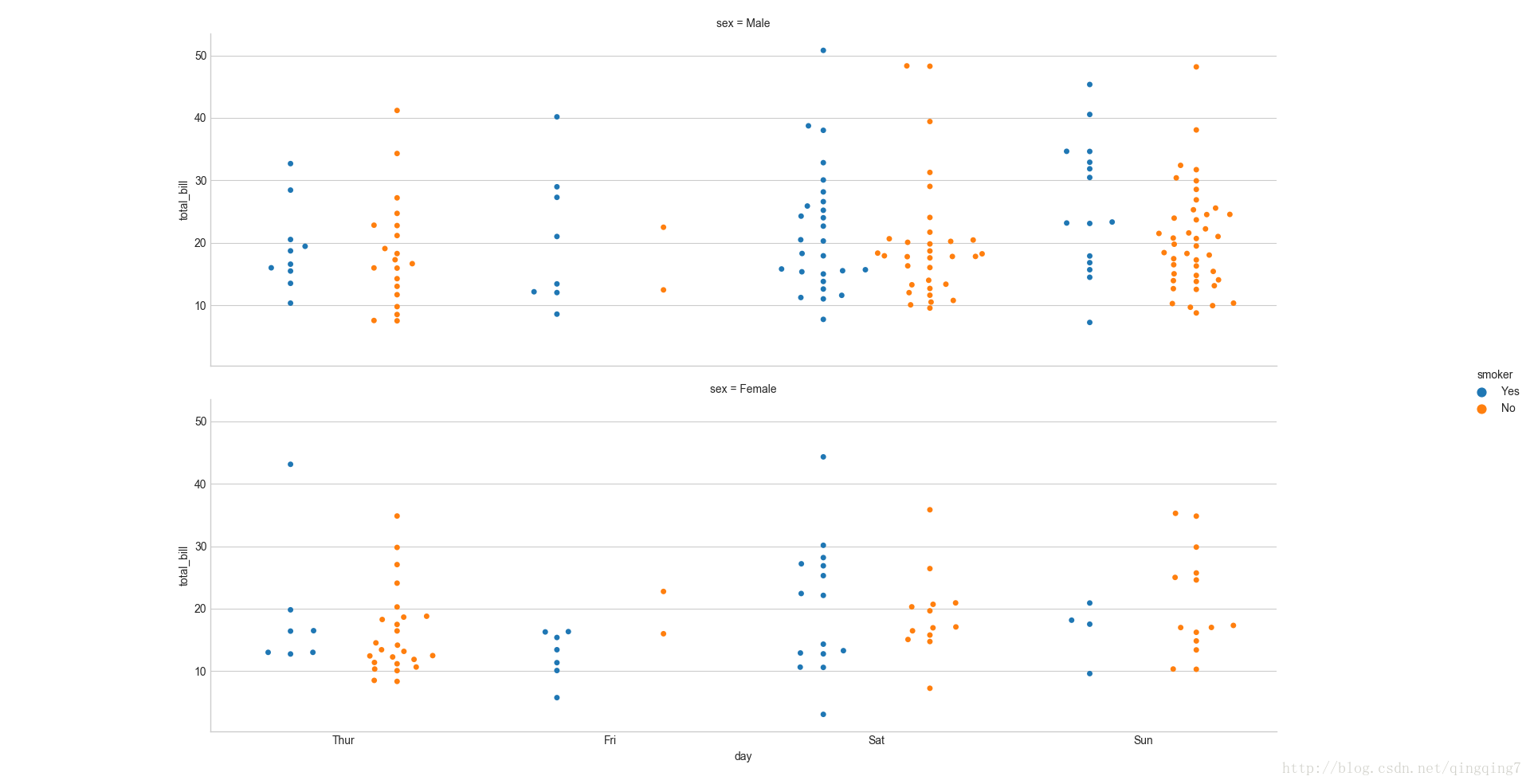
#通过row参数设置子图为横排,与col参数相对应ax=sns.factorplot(x="day",y="total_bill",hue="smoker",row="sex",data=tips,kind="swarm",split=True)plt.show()
结果如下:
当然还可以进一步的设置样本,达到更好的效果
回归图
一、
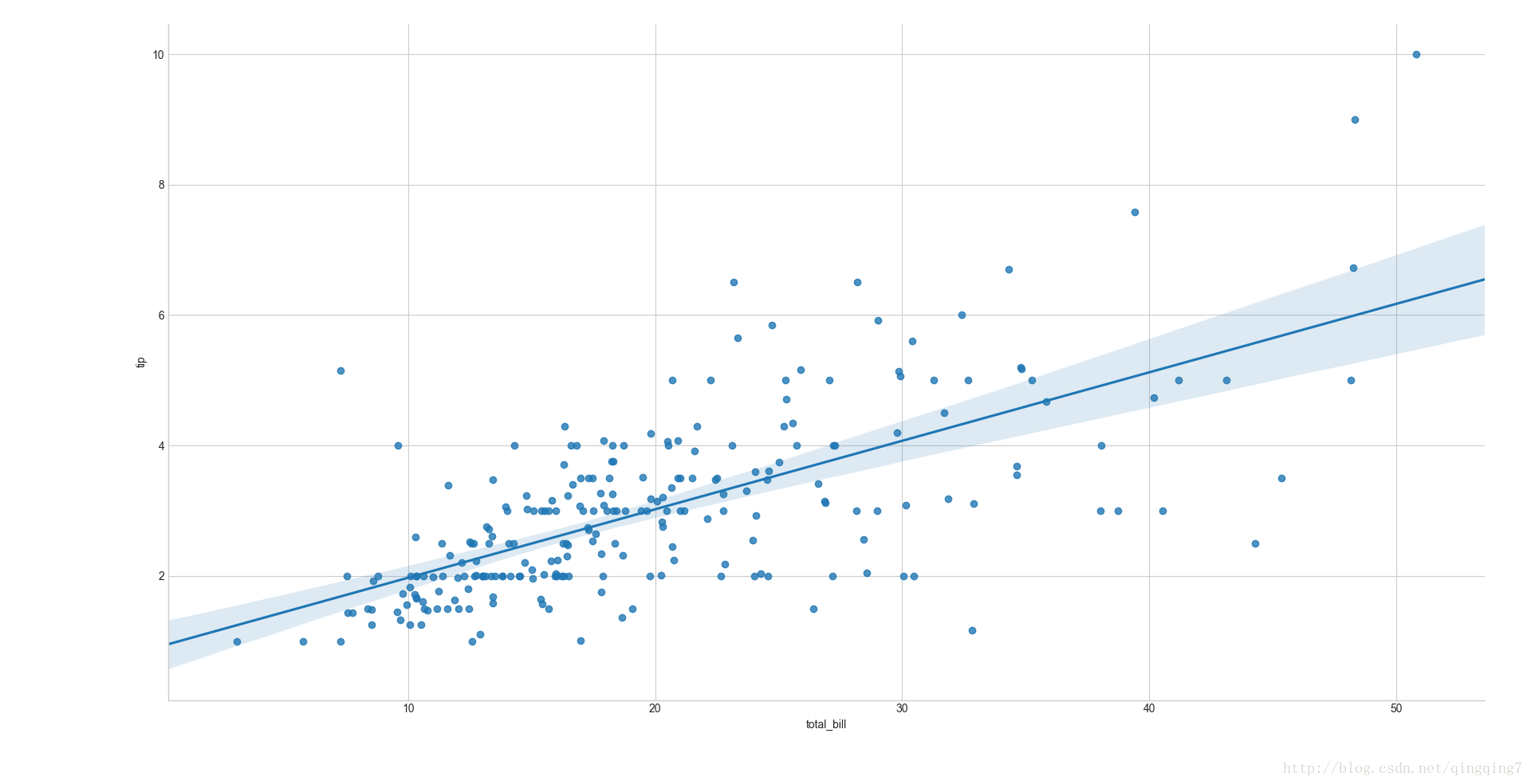
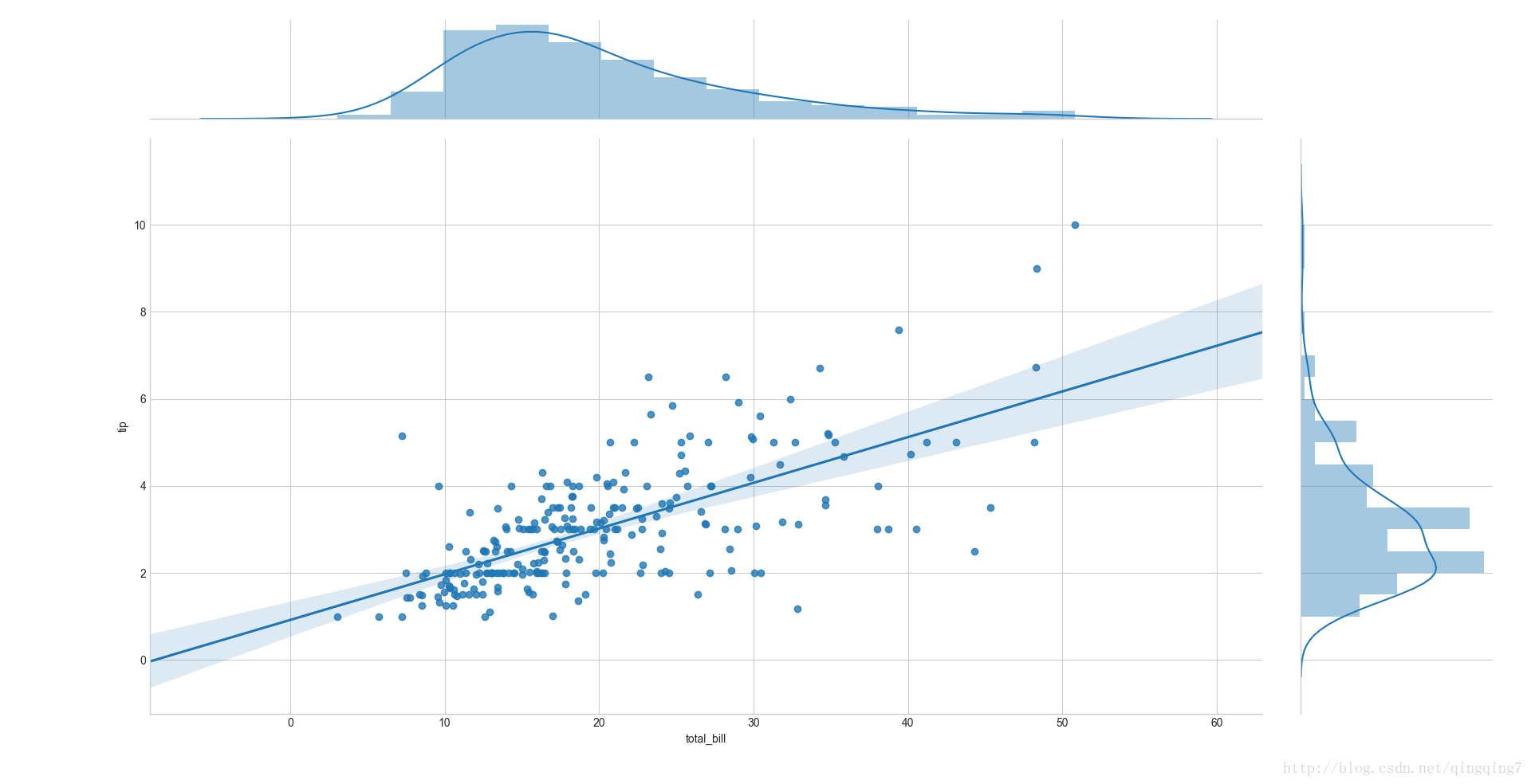
lmplot( x, y, data, hue=None, col=None, row=None, palette=None,col_wrap=None, size=5, aspect=1, markers=‘o’, sharex=True, sharey=True,hue_order=None, col_order=None, row_order=None, legend=True,legend_out=True,x_estimator=None, x_bins=None, x_ci=‘ci’, scatter=True, fit_reg=True, ci=95,n_boot=1000, units=None, order=1, logistic=False, lowess=False, robust=False,logx=False, x_partial=None, y_partial=None, truncate=False, x_jitter=None,y_jitter=None, scatter_kws=None, line_kws=None ) 画原始数据的散点图和线性回归曲线。#画线性回归图ax=sns.lmplot(x="total_bill",y="tip",data=tips)#其实还可以通过order参数来选择回归模型,一阶就是线性,2阶就是抛物线型plt.show()
结果如下:
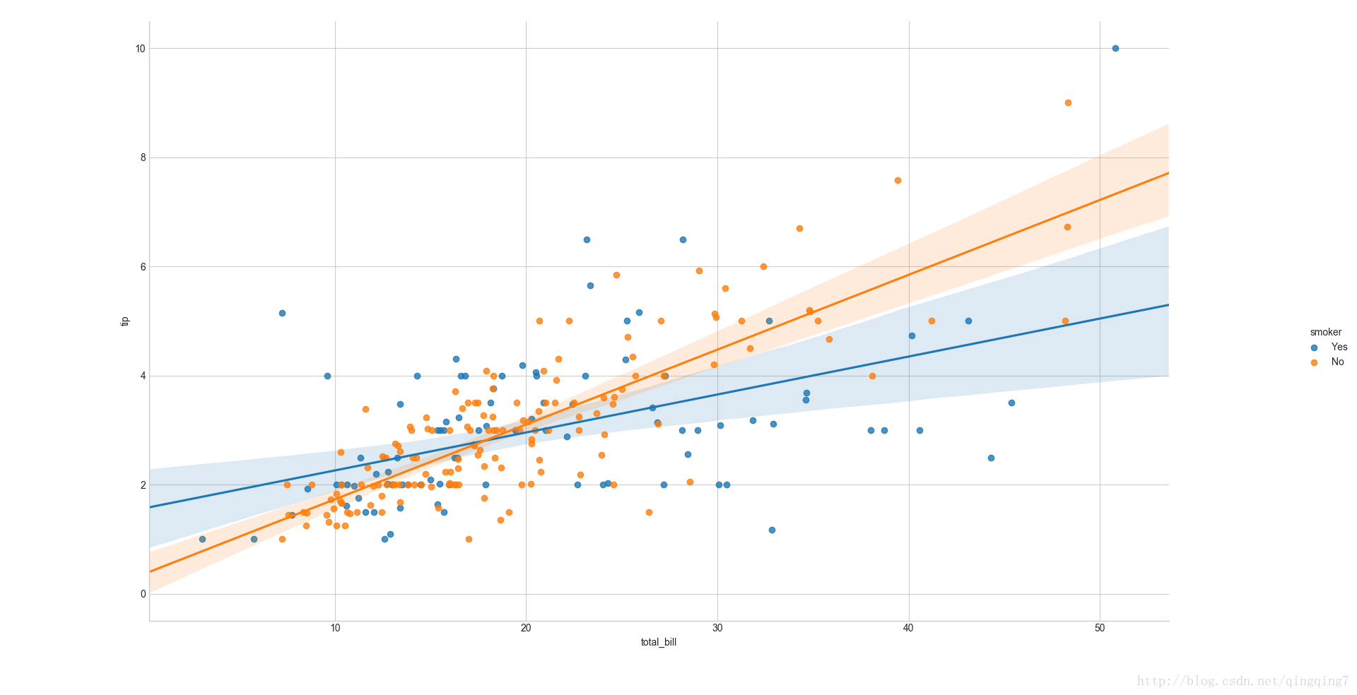
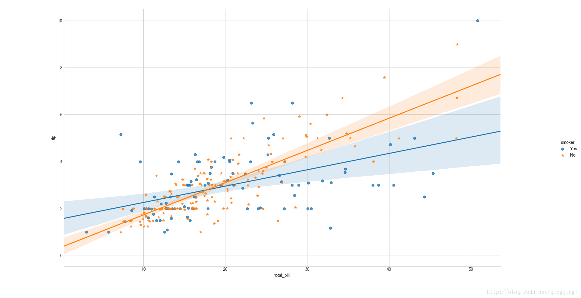
## 分组的线性回归图,通过hue参数控制ax=sns.lmplot(x="total_bill",y="tip",hue="smoker",data=tips)plt.show()
结果如下:
#整个seaborn里不同组默认都会用不同颜色来标识,但也可以再通过markers来用不同形状来标识。ax=sns.lmplot(x="total_bill",y="tip",hue="smoker",data=tips,markers=["o","*"])plt.show()
结果如下:
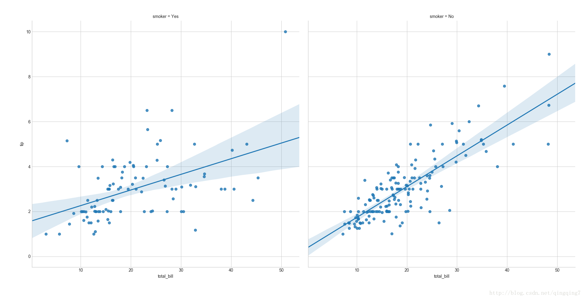
#也可以通过用col参数控制来用不同子图来显示不同分组ax=sns.lmplot(x="total_bill",y="tip",col="smoker",data=tips)plt.show()
结果如下:
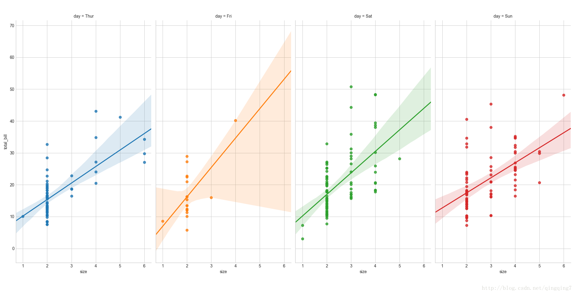
#col+hue 双分组参数,既分组,又分子图绘制ax=sns.lmplot(x="size",y="total_bill",hue="day",col="day",data=tips)#感觉多此一举啊,只是颜色多一点plt.show()
结果如下:
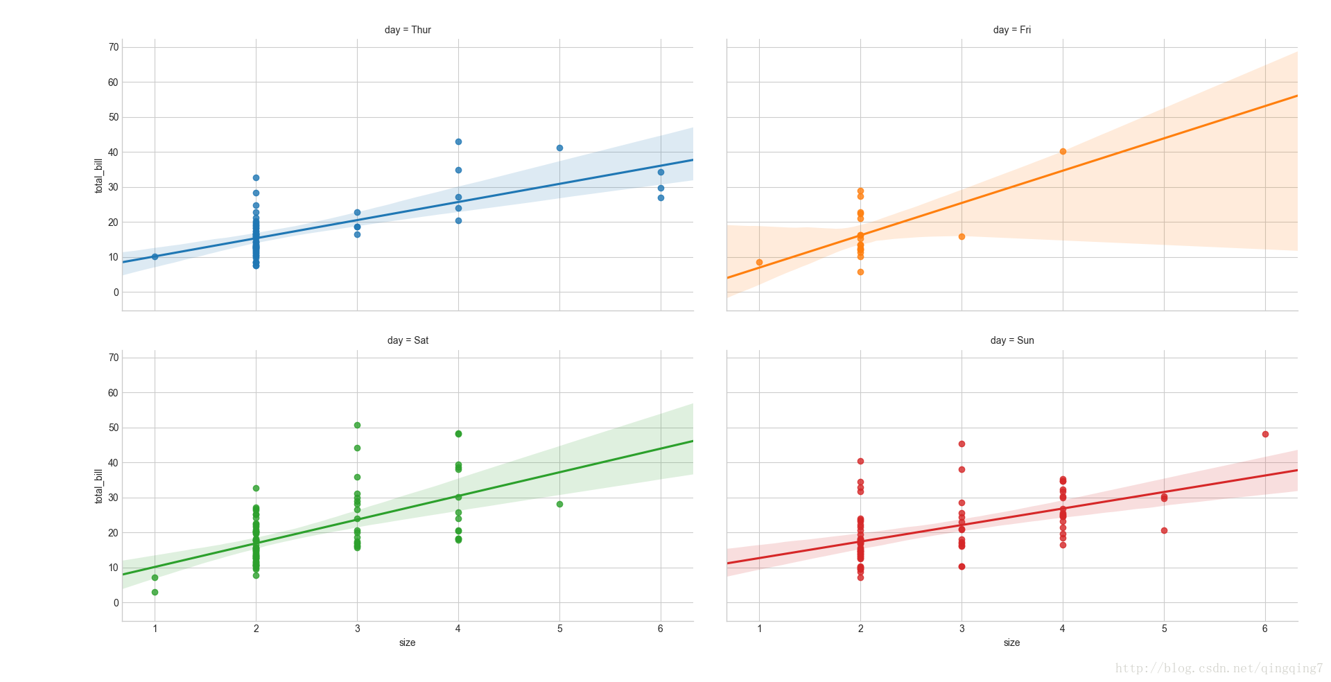
#同样可以通过l_wrap来显示每行显示的子图个数, size来控制子图的尺寸ax=sns.lmplot(x="size",y="total_bill",hue="day",col="day",data=tips,col_wrap=2,size=3)plt.show()
结果如下:
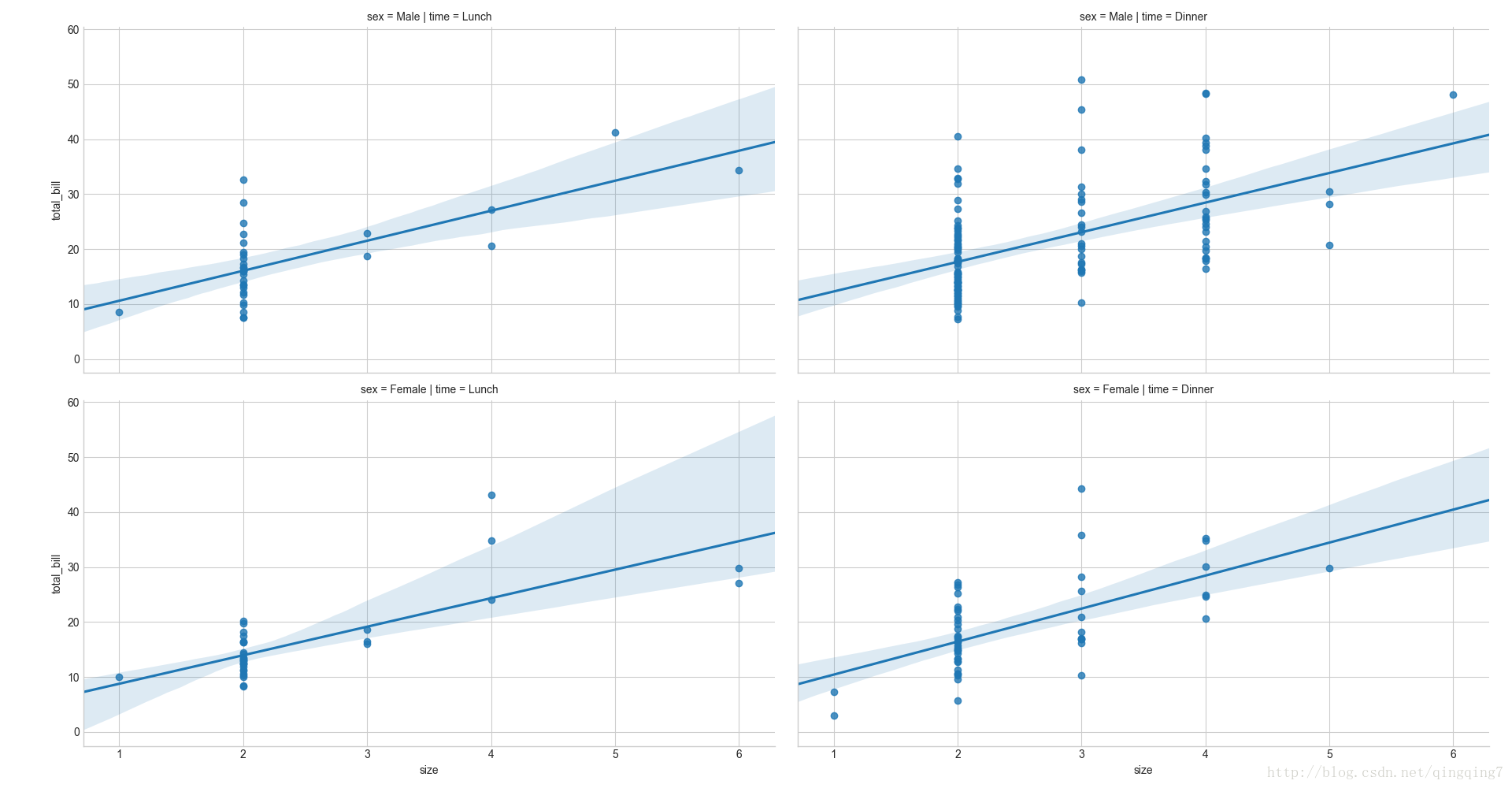
#同时使用row和col来控制子图ax=sns.lmplot(x="size",y="total_bill",row="sex",col="time",data=tips)plt.show()
结果如下:
二、
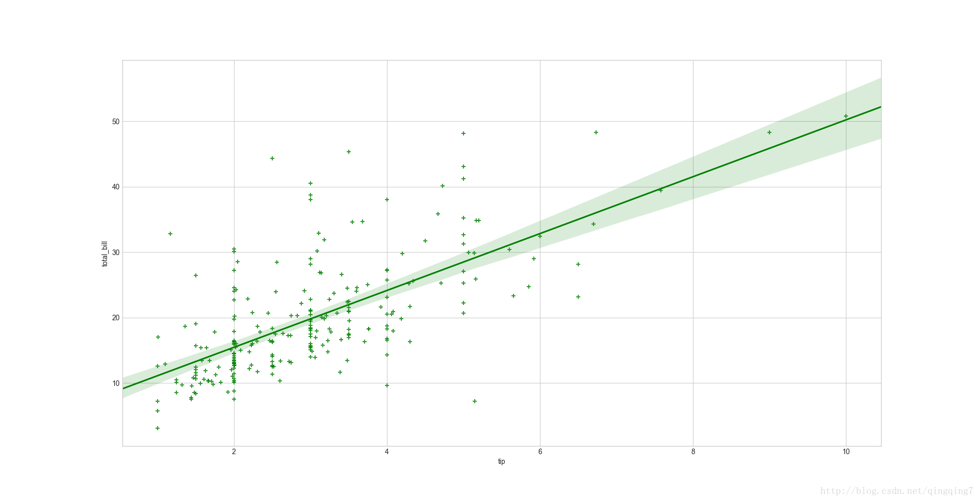
regplot(x, y, data=None, x_estimator=None, x_bins=None, x_ci=‘ci’, scatter=True, fit_reg=True, ci=95, n_boot=1000, units=None, order=1, logistic=False, lowess=False, robust=False, logx=False, x_partial=None, y_partial=None, truncate=False, dropna=True, x_jitter=None, y_jitter=None, label=None, color=None, marker=‘o’, scatter_kws=None, line_kws=None, ax=None) 绘制两变量的回归曲线#regplot的用法同lmplotax=sns.regplot(x="tip",y="total_bill",data=tips,color="g",marker="+")plt.show()
结果如下:
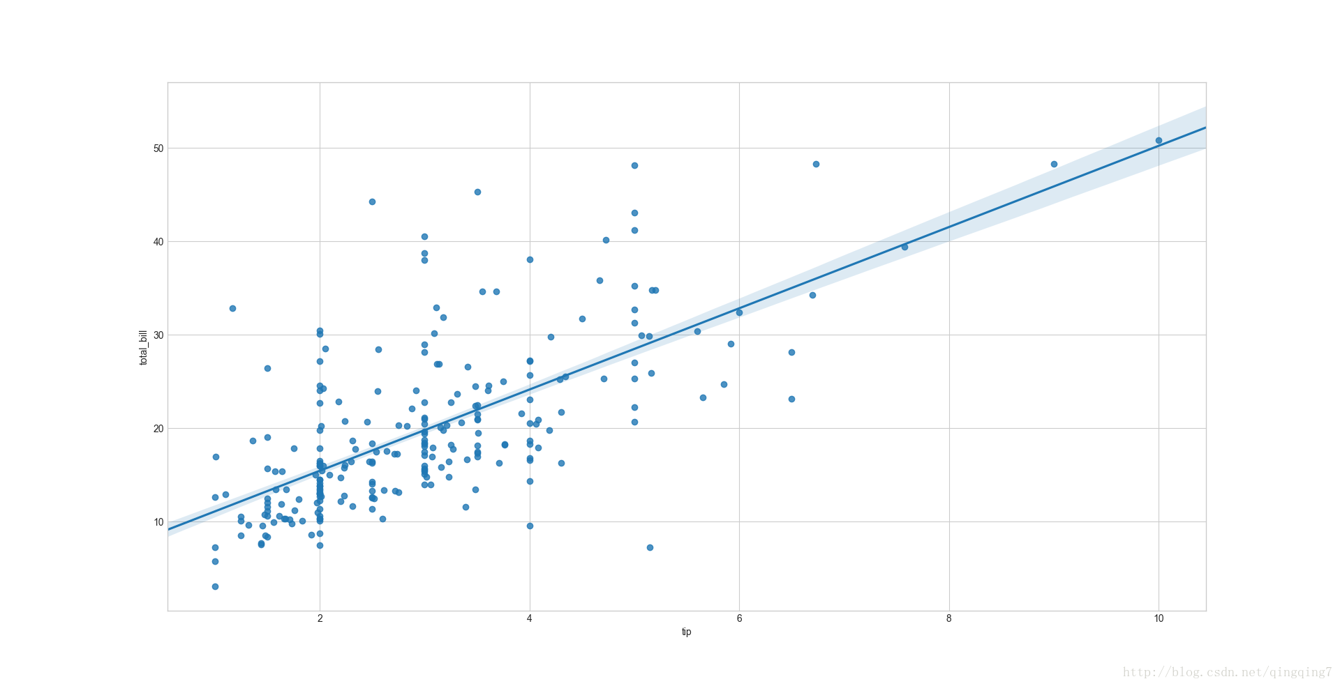
#通过参数ci控制回归的置信度,拟合直线的外面的面积会有变化ax=sns.regplot(x="tip",y="total_bill",data=tips,ci=68)plt.show()
结果如下:
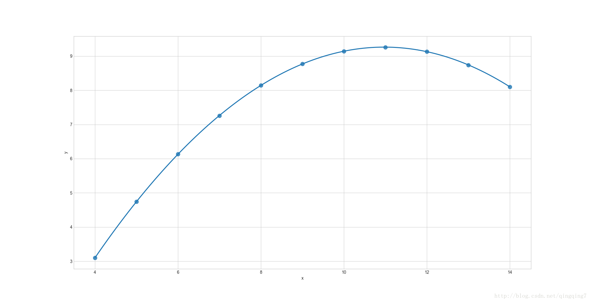
# 上面的都是拟合一次曲线,拟合二次曲线通过order=2设置,# 拟合一次曲线相当于 order=1ans = sns.load_dataset("anscombe")ax = sns.regplot(x="x", y="y", data=ans.loc[ans.dataset == "II"],scatter_kws={ "s": 80},order=2, ci=None, truncate=True)plt.show()结果如下:
数值分布绘图
一、
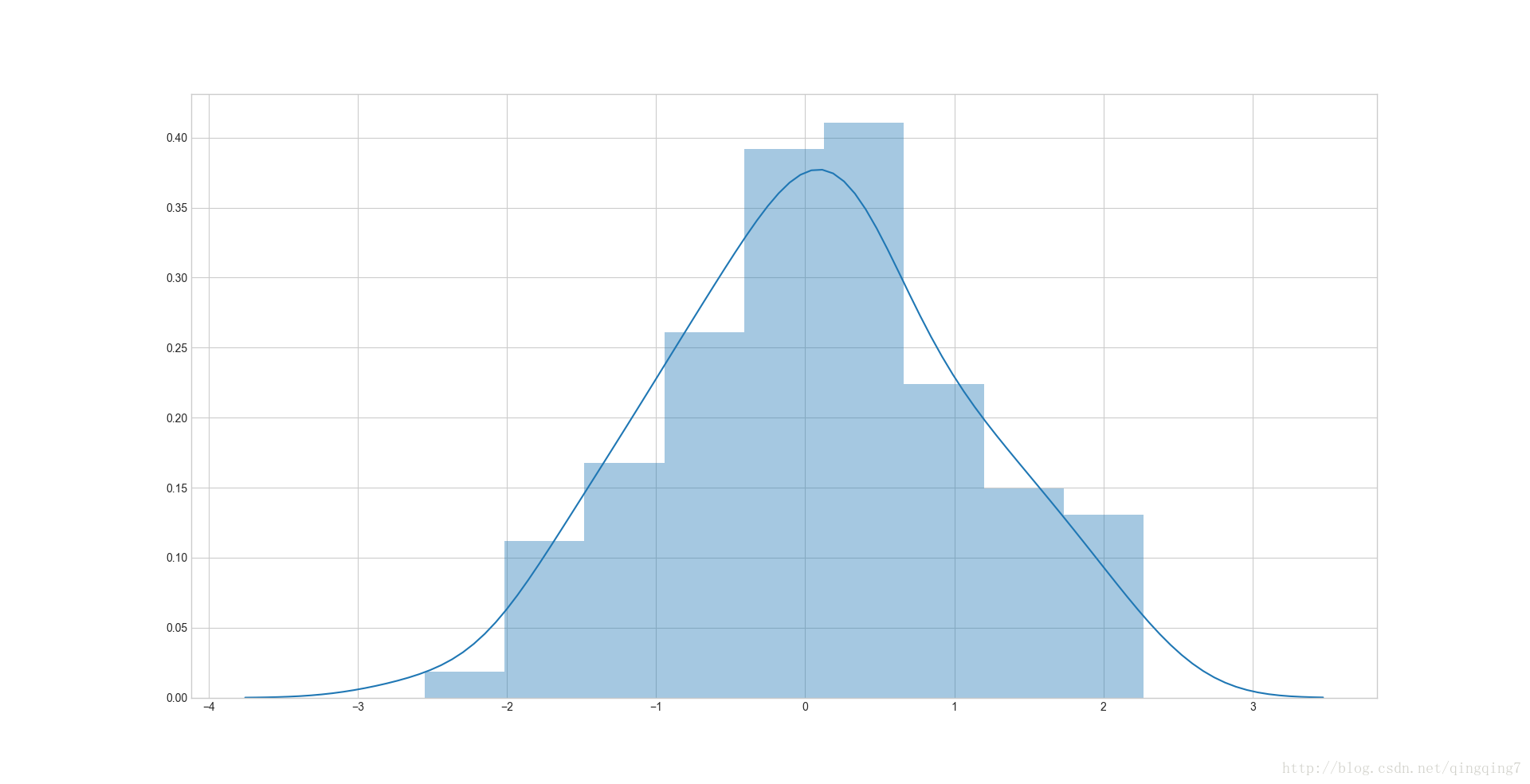
distplot( a, bins=None, hist=True, kde=True, rug=False, fit=None,hist_kws=None, kde_kws=None, rug_kws=None, fit_kws=None, color=None,vertical=False, norm_hist=False, axlabel=None, label=None, ax=None ) Flexibly plot a univariate distribution of observations. 默认情况直方图hist=True,核密度曲线kde=True# 默认既绘制核密度曲线,也绘制直方图import seaborn as sns, numpy as npnp.random.seed(0)x=np.random.randn(100)ax=sns.distplot(x)#distplot跟之前的因子变量图和回归曲线不一样,这里数据参数只有x,没有y和data。a的数据类型可以为Series, 1d-array, or list.plt.show()
结果如下:
#更改数据类型为pandas.seriesimport pandas as pdx=pd.Series(x,name="x variable")ax=sns.distplot(x)plt.show()
结果如下:
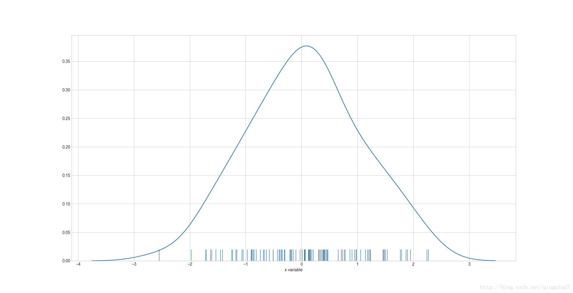
#画密度曲线和须边,不知道这须边干嘛用的ax=sns.distplot(x,rug=True,hist=False)plt.show()
结果如下:
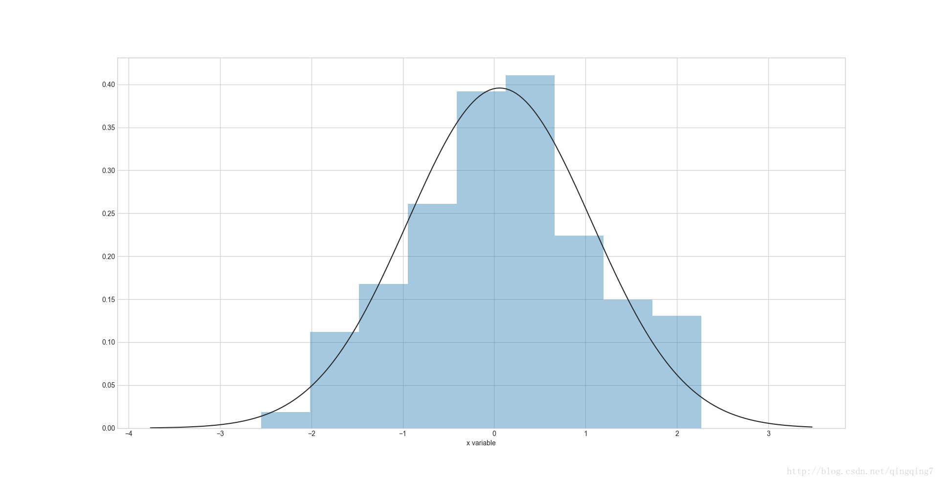
#将密度曲线拟合成高斯分布from scipy.stats import normax=sns.distplot(x,fit=norm)#可以看到同时有两条密度曲线plt.show()
结果如下:
#只画高斯曲线,去除默认密度曲线from scipy.stats import normax=sns.distplot(x,fit=norm,kde=False)#可以看到同时有两条密度曲线plt.show()
结果如下:
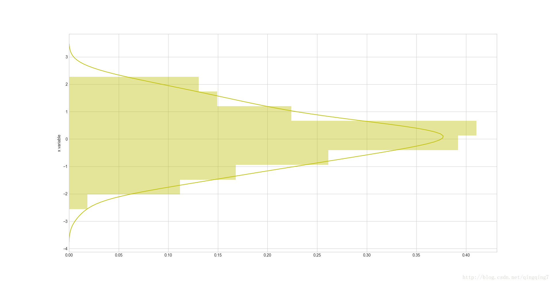
#将图形倒置并设置颜色ax=sns.distplot(x,vertical=True,color="y")plt.show()
如果如下:
二、
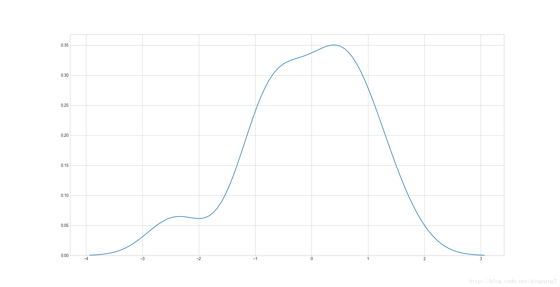
**kdeplot( data, data2=None, shade=False, vertical=False, kernel=‘gau’,bw=‘scott’, gridsize=100, cut=3, clip=None, legend=True, cumulative=False,shade_lowest=True, cbar=False, cbar_ax=None, cbar_kws=None, ax=None,kwargs )#画核密度图mean, cov = [0, 2], [(1, .5), (.5, 1)]x, y = np.random.multivariate_normal(mean, cov, size=50).Tax=sns.kdeplot(x)#最简单的情形plt.show()
结果如下:
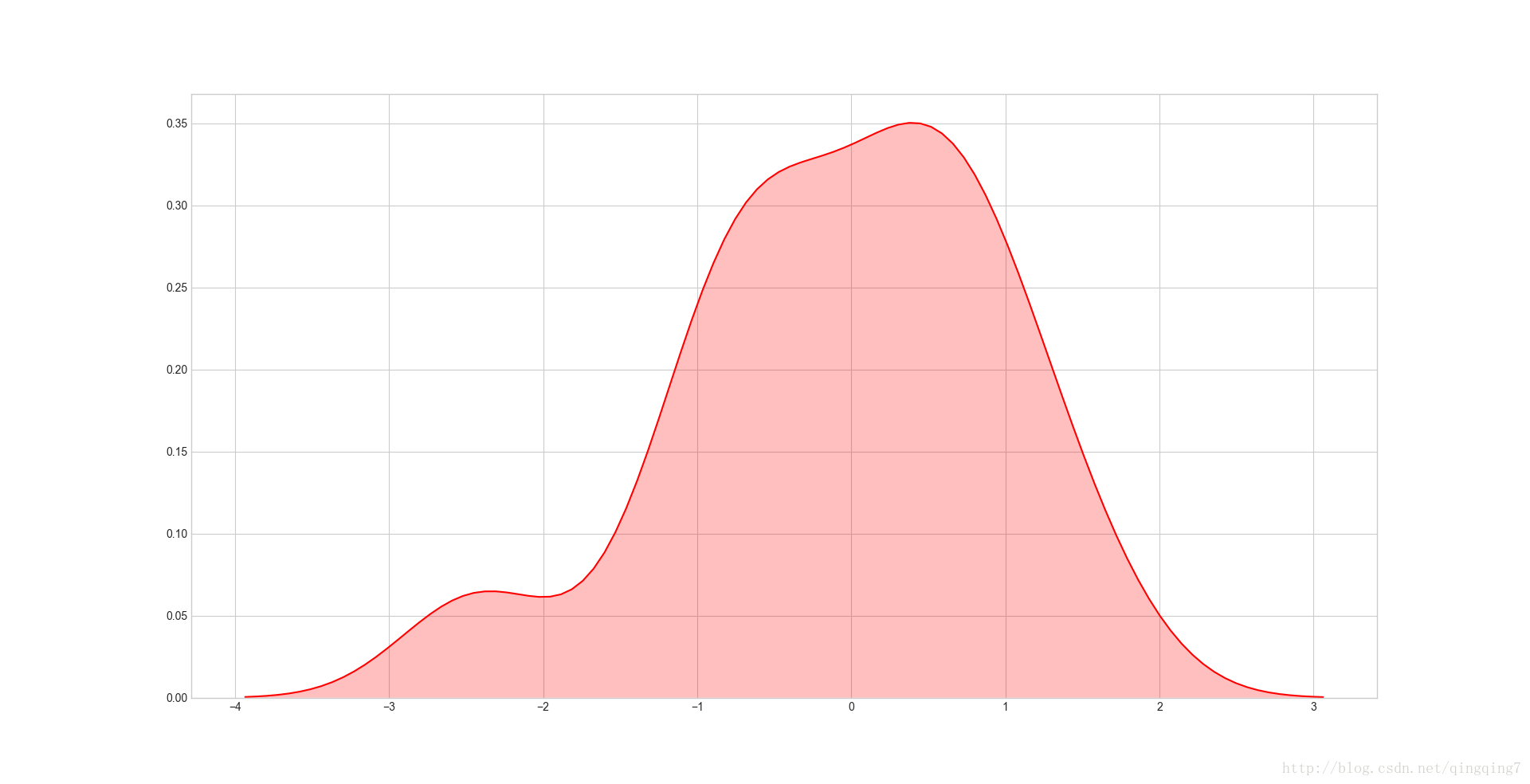
#加阴影并改变颜色ax=sns.kdeplot(x,shade=True,color="r")plt.show()
结果如下:
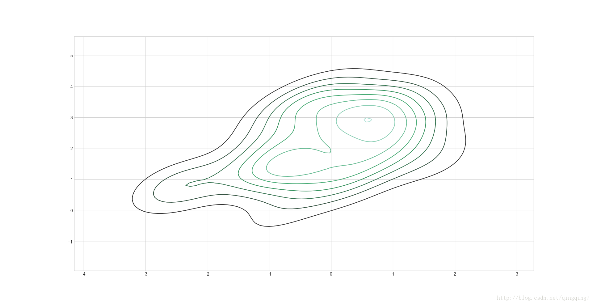
#还可以画二维的密度图ax=sns.kdeplot(x,y)#可以相像成等高线图,越密的地方数据点越多plt.show()
结果如下:
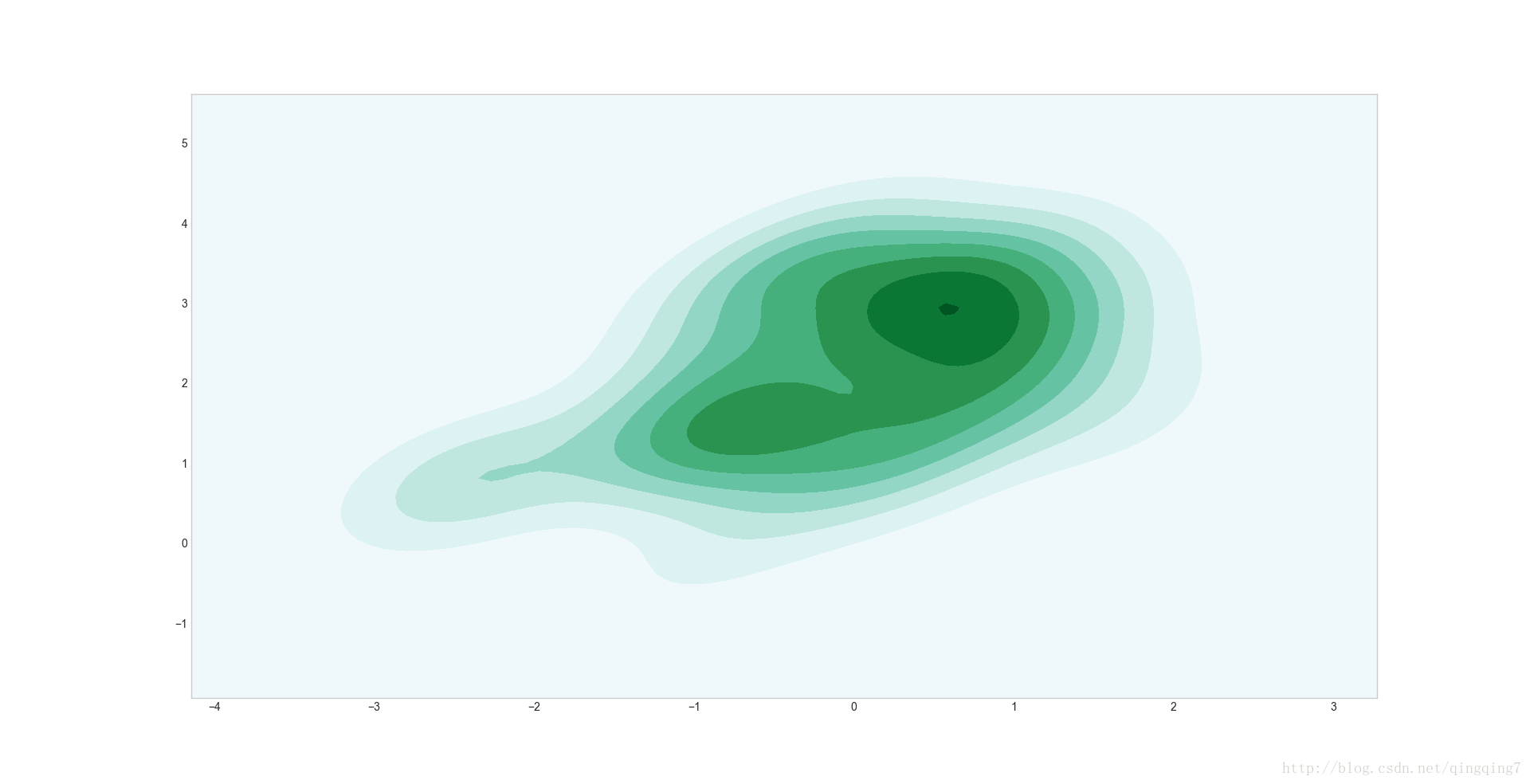
#加上阴影ax=sns.kdeplot(x,y,shade=True)#二维密度曲线加上阴影就相当漂亮了plt.show()
结果如下:
还可以进行更复杂的设置,请参考官网
三、 **rugplot(a, height=0.05, axis=‘x’, ax=None, kwargs) Plot datapoints in an array as sticks on an axis.四、
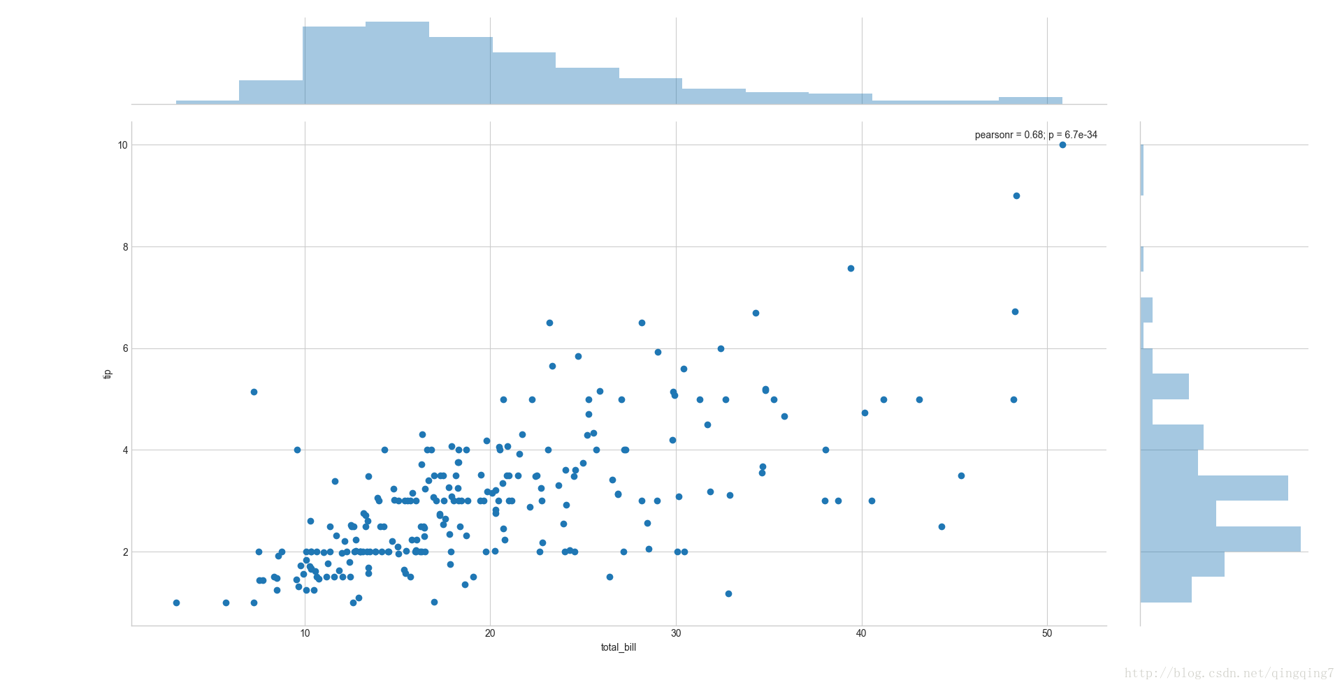
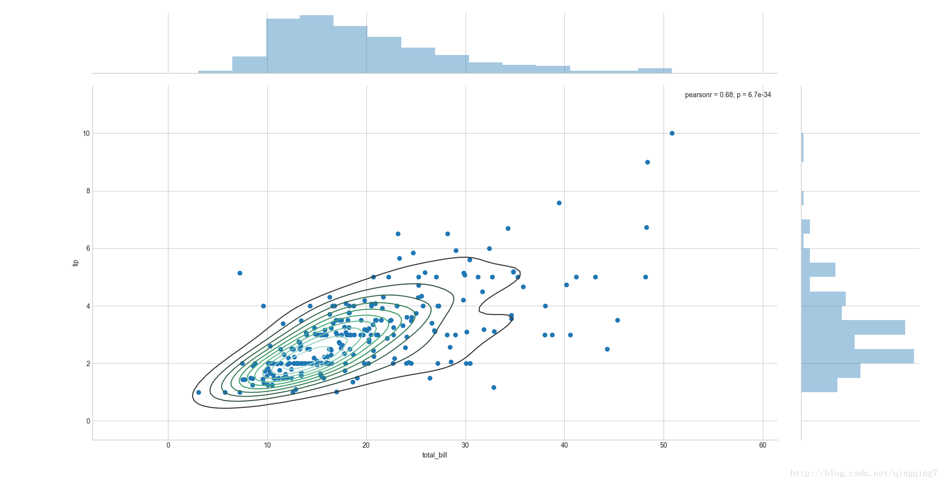
joint,就是联合呀,将多种统计效果在一张图上反映 kind参数可以使用不同的图形反应两变量的关系,比如点图,线图,核密度图。 **jointplot(x, y, data=None, kind=‘scatter’, stat_func=, color=None, size=6, ratio=5, space=0.2, dropna=True, xlim=None, ylim=None, joint_kws=None, marginal_kws=None, annot_kws=None, kwargs)#画一个最简单的组合图ax=sns.jointplot(x="total_bill",y="tip",data=tips)#中间画的是散点图,边上画着对应变量的频率直方图plt.show()
结果如下:
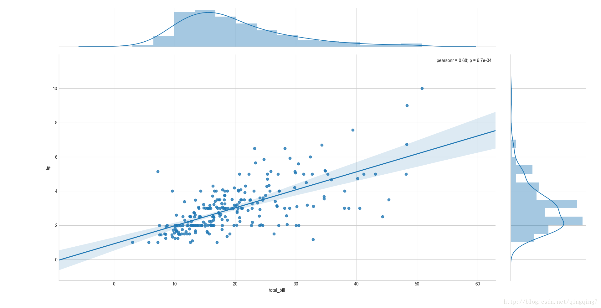
#通过kind="reg"加上回归线和密度线ax=sns.jointplot(x="total_bill",y="tip",data=tips,kind="reg")plt.show()
结果如下:
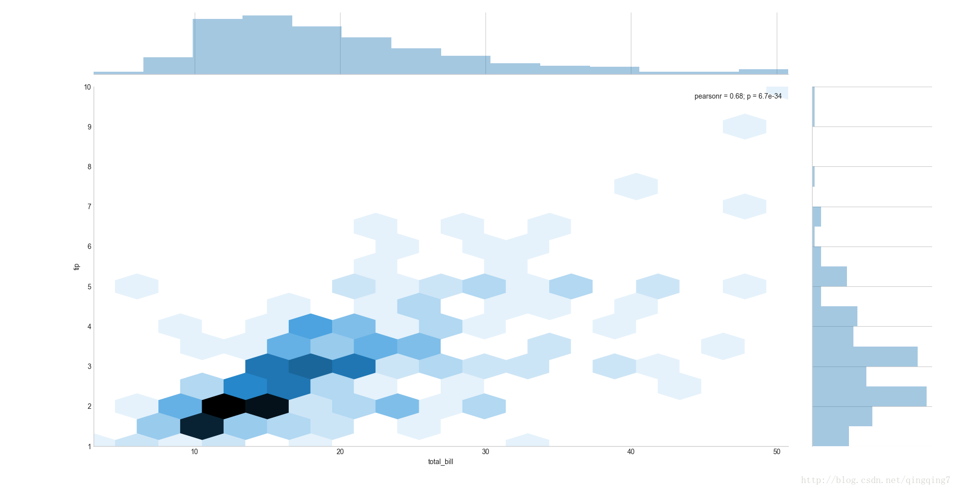
#换其他样式ax=sns.jointplot(x="total_bill",y="tip",data=tips,kind="hex")plt.show()
结果如下:
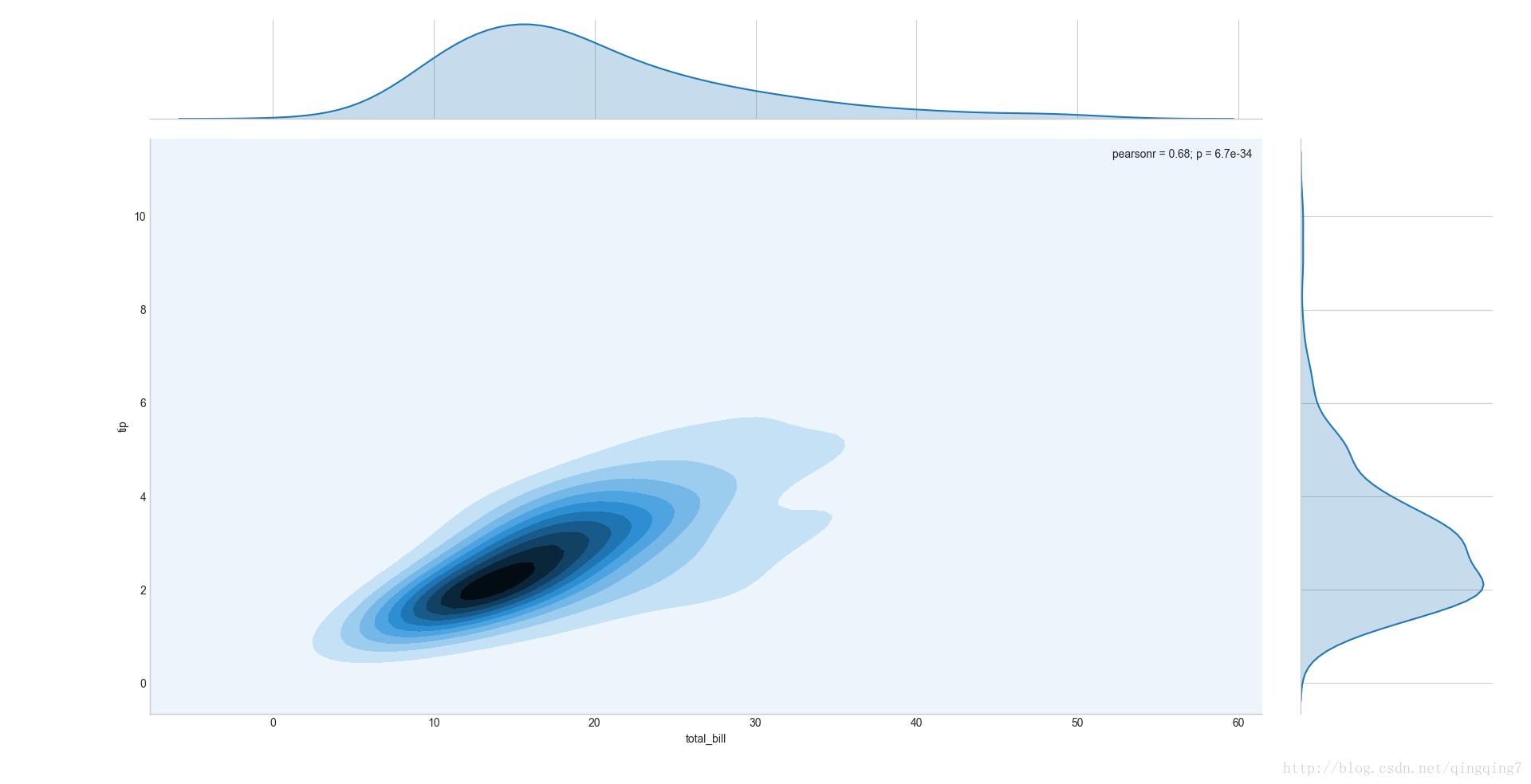
#换密度图ax=sns.jointplot(x="total_bill",y="tip",data=tips,kind="kde")plt.show()
结果如下:
#主图中默认会标绘两变量之间的皮尔逊相关系数和p值,可以通过参数stat_func进行更改from scipy.stats import spearmanrax=sns.jointplot(x="total_bill",y="tip",data=tips,stat_func=spearmanr)plt.show()
结果如下:
#在原有图形上添加密度曲线ax=sns.jointplot(x="total_bill",y="tip",data=tips).plot_joint(sns.kdeplot)#这意味着其他图形也可以通过这种操作得到更复杂的图形plt.show()
结果如下:
其他更复杂情形请参考官网
五、 JointGrid(x, y, data=None, size=6, ratio=5, space=0.2, dropna=True, xlim=None, ylim=None) JointGrid可以实现jointplot类似的功能,只不过它本身只能画一个界面,如下,但可以配合matplotlib.pyplot的功能进行复杂绘图。#绘制成对变量界面ax=sns.JointGrid(x="total_bill", y="tip", data=tips)plt.show()
#配合其他函数绘图ax=sns.JointGrid(x="total_bill",y="tip",data=tips)ax=ax.plot(sns.regplot,sns.distplot)plt.show()
更复杂绘图参考官网
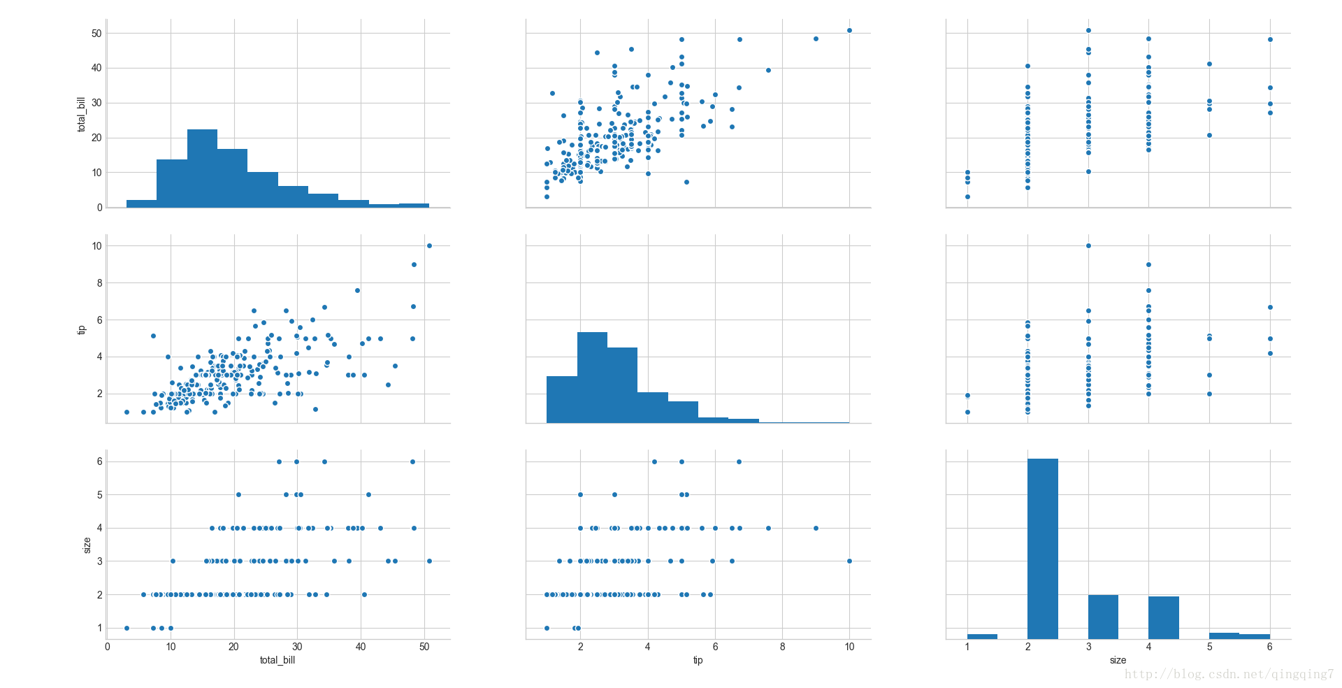
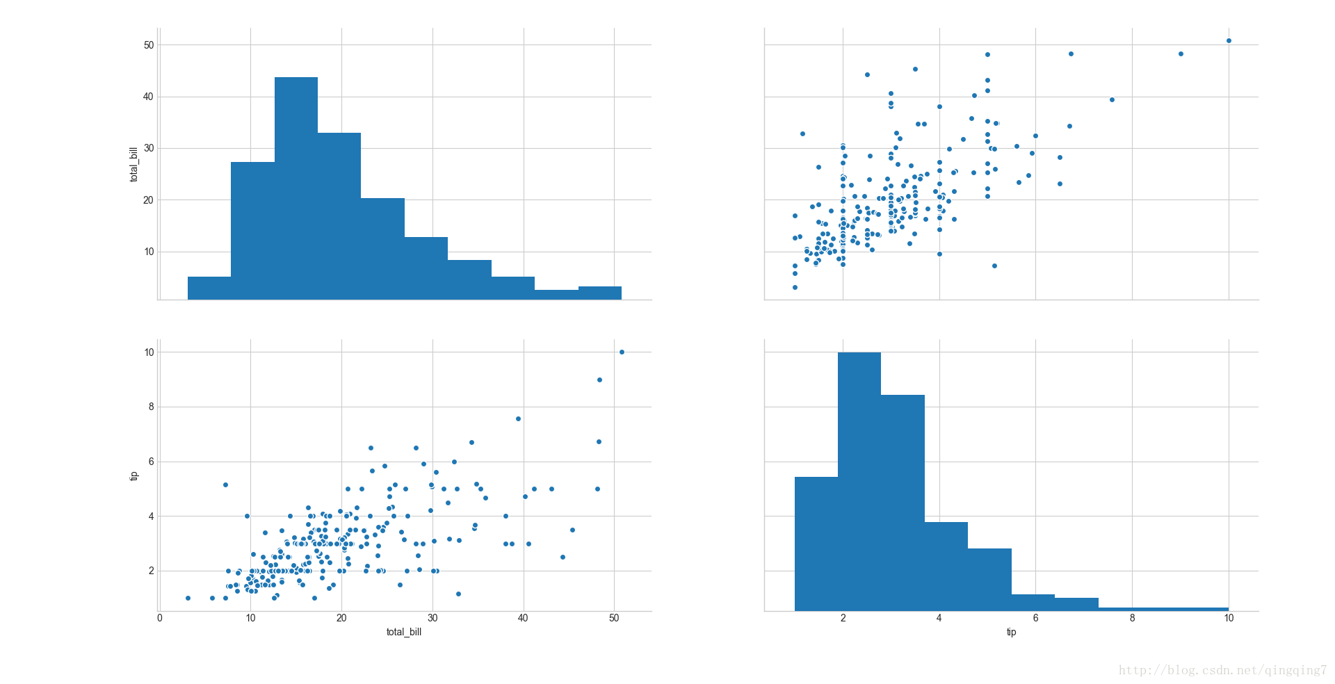
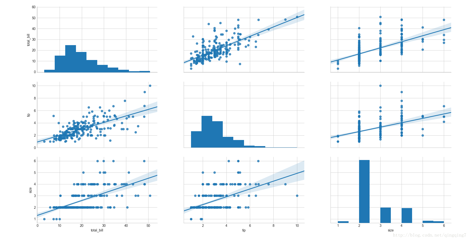
六、 就是绘制dataframe中各个变量两两之间的关系图,如果是自己与自己则画频率直方图。 在变量关系图中,最常见的就是 x-y的线图,x-y的散点图,x-y的回归图。其实这三者都可以通过lmplot绘制,只是控制不同的参数而已。x-y的线图,其实就是时间序列图。 这里又说一遍散点图,是为了和前面的因子变量散点图相区分,前面的因子变量散点图,讲的是不同因子水平的值绘制的散点图,而这里是两个数值变量值散点图关系。为什么要用lmplot呢,说白了就是,先将这些散点画出来,然后在根据散点的 分布情况拟合出一条直线。 pairplot(data, hue=None, hue_order=None, palette=None, vars=None, x_vars=None, y_vars=None, kind=‘scatter’, diag_kind=‘hist’, markers=None, size=2.5, aspect=1, dropna=True, plot_kws=None, diag_kws=None, grid_kws=None)#画两两之间的散点图ax=sns.pairplot(tips)plt.show()
结果如下:
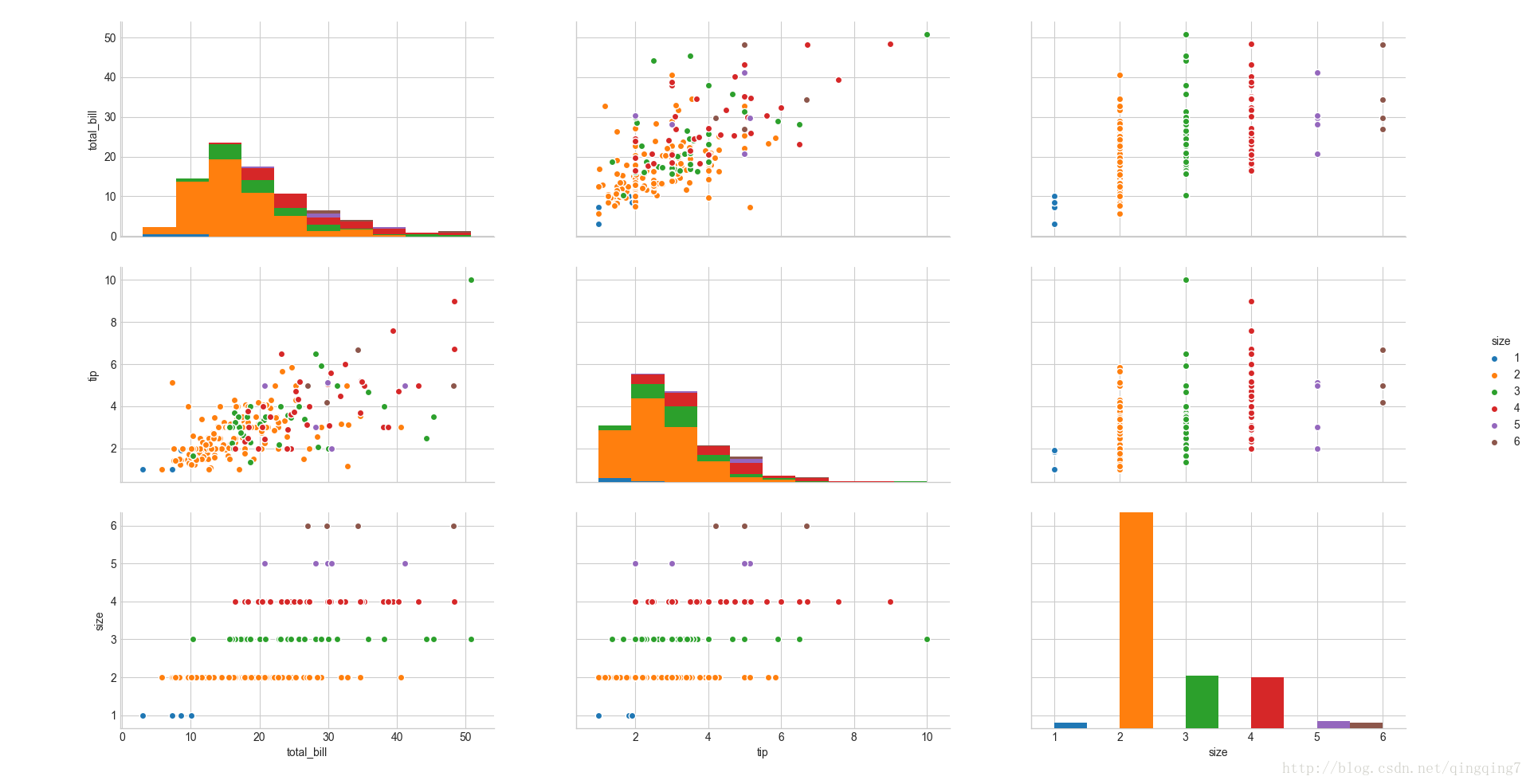
#加上hue可以对不同组进行区分,默认以颜色区分ax=sns.pairplot(tips,hue="size")plt.show()
结果如下:
#也可以画子图ax=sns.pairplot(tips,vars=["total_bill","tip"])plt.show()
结果如下:
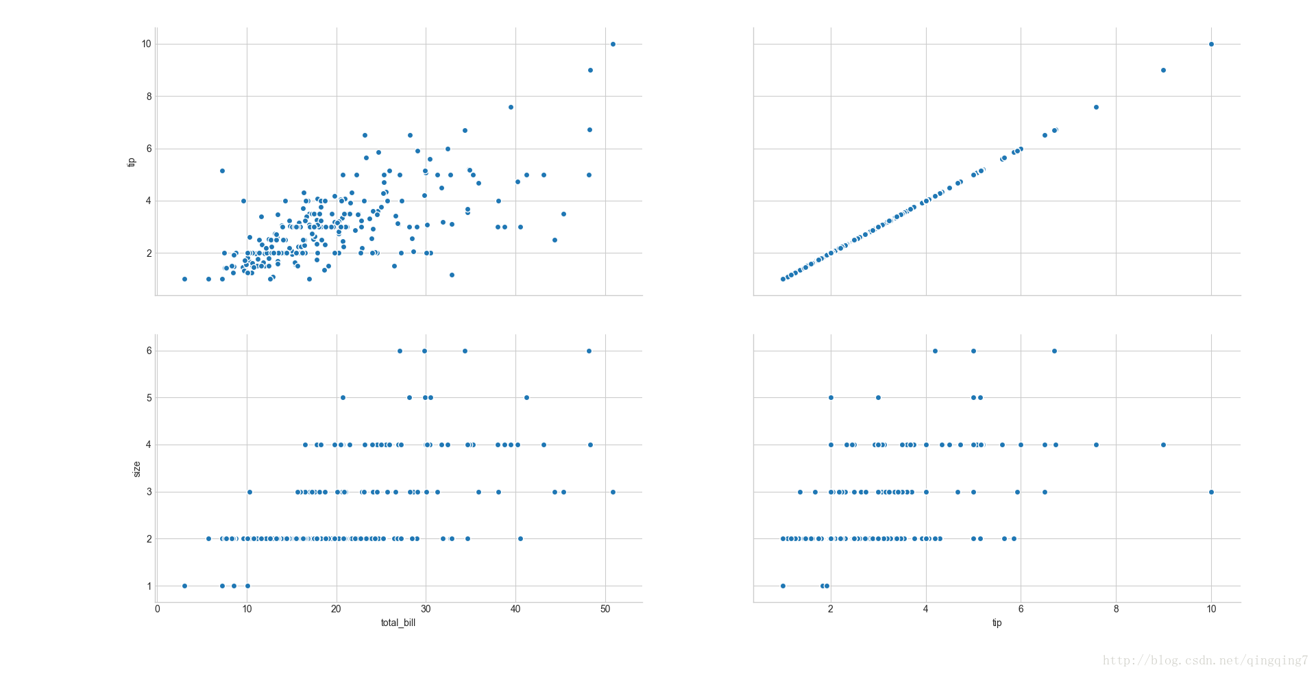
#可以单独设置x和y轴上的变量ax=sns.pairplot(tips,x_vars=["total_bill","tip"],y_vars=["tip","size"])plt.show()
结果如下:
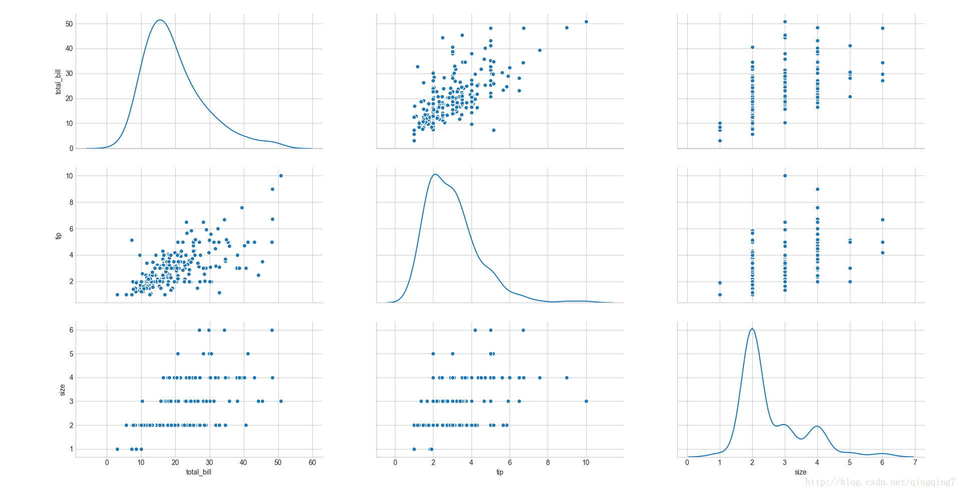
#diag_kind设置对角线的统计类型ax=sns.pairplot(tips,diag_kind="kde")plt.show()
结果如下:
#设置非对角线的统计内容ax=sns.pairplot(tips,kind="reg")plt.show()
结果如下:
矩阵图
一、
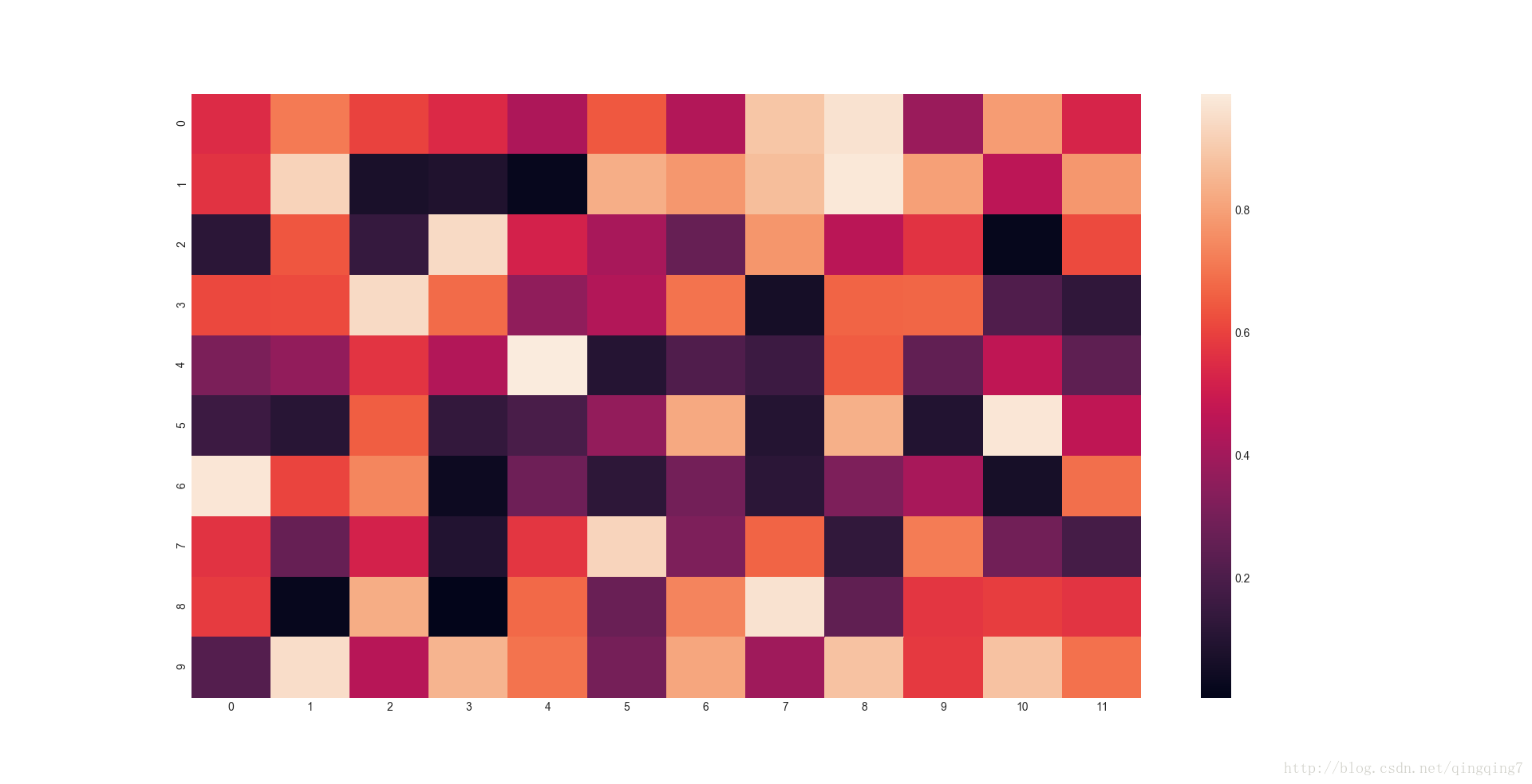
**heatmap(data, vmin=None, vmax=None, cmap=None, center=None, robust=False, annot=None, fmt=’.2g’, annot_kws=None, linewidths=0, linecolor=‘white’, cbar=True, cbar_kws=None, cbar_ax=None, square=False, xticklabels=‘auto’, yticklabels=‘auto’, mask=None, ax=None, kwargs) 热力图是对二维矩阵数据进行颜色标注的,二维矩阵行列索引自然就能定位,就可以根据对应的值来进行颜色标注。如果再配合相关系数等的计算,我们直接看颜色深浅就可以看到不同变量之间相关系数的大小。#热力图np.random.seed(0)uniform_data = np.random.rand(10, 12)ax=sns.heatmap(uniform_data)plt.show()
结果如下:
#限定标注值的范围,如果超出这个范围,就按边界值进行颜色标绘ax=sns.heatmap(uniform_data,vmin=0,vmax=1)plt.show()
结果如下:
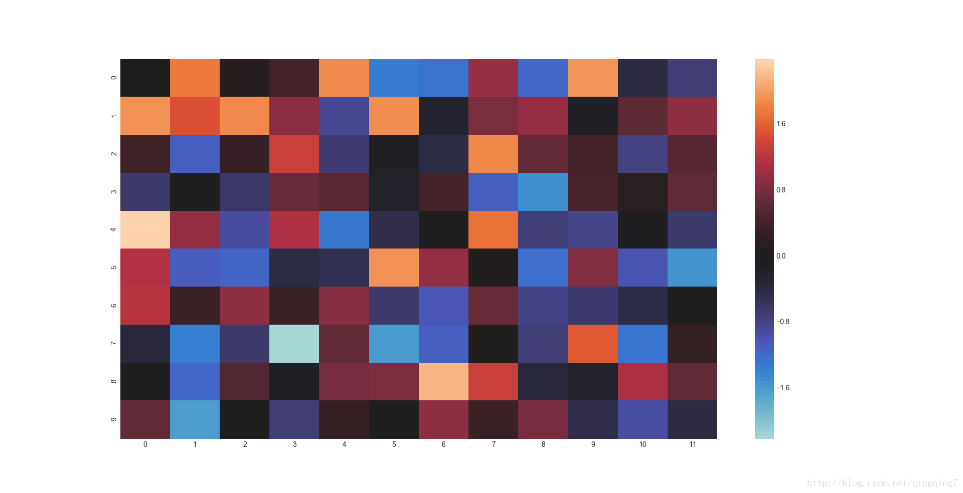
#将颜色范围的中心对应的值设置为0,很明显这种绘图方法适合于中心化后的数据或者数据是以0为中心波动的。normal_data = np.random.randn(10, 12)ax=sns.heatmap(normal_data,center=0)plt.show()
结果如下:
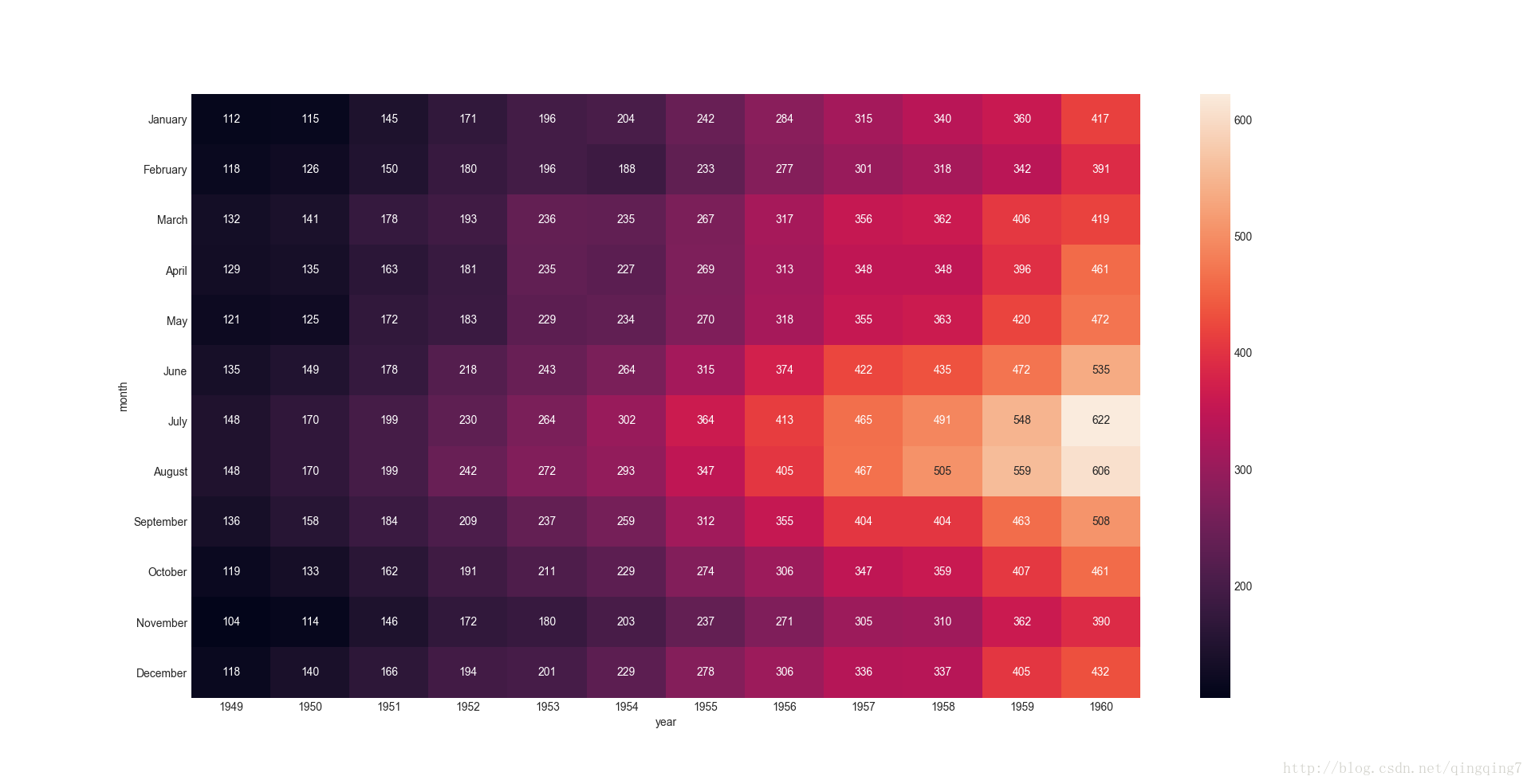
#行列标签用行列名称来标注,关键看数据的结构如何,对于数据框行列标注自然有对应行列名flights = sns.load_dataset("flights")flights=flights.pivot("month","year","passengers")#pivot函数的功能就是构造行列为month\year,值为passengers的数据框ax=sns.heatmap(flights)plt.show()结果如下:
#在每一个元素位置上标上相应的值ax=sns.heatmap(flights,annot=True,fmt="d")#annot参数表示进行标注,fmt参数进行标注数据的格式,默认是指数形式,这里d表示十进制plt.show()
结果如下:
更复杂热力图请参考官网
二、
**clustermap( data, pivot_kws=None, method=‘average’,metric=‘euclidean’, z_score=None, standard_scale=None, figsize=None,cbar_kws=None, row_cluster=True, col_cluster=True, row_linkage=None,col_linkage=None, row_colors=None, col_colors=None, mask=None, kwargs ) Plot a matrix dataset as a hierarchically-clustered heatmap.时间序列图
一、
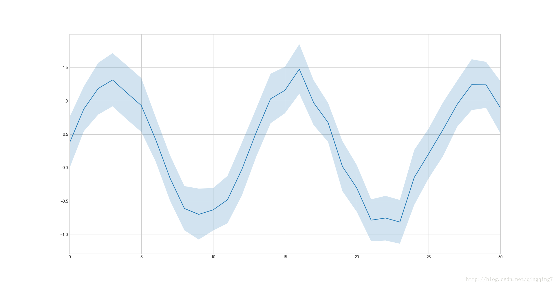
tsplot函数说是绘制时间序列图,还不如说是绘制简单的线图更加合适,绘制带timestap时间索引的pandas.Series时,并没有自动升采样绘图,只是数据有有什么数据就画什么,这在时间序列上应该是不对的。 **tsplot( data, time=None, unit=None, condition=None, value=None,err_style=‘ci_band’, ci=68, interpolate=True, color=None, estimator=, n_boot=5000, err_palette=None, err_kws=None, legend=True, ax=None,kwargs )#时间序列图x = np.linspace(0, 15, 31)data = np.sin(x) + np.random.rand(10, 31) + np.random.randn(10,1)ax=sns.tsplot(data=data)plt.show()
结果如下:
gammas = sns.load_dataset("gammas")ax = sns.tsplot(time="timepoint", value="BOLD signal",unit="subject", condition="ROI",data=gammas)plt.show()结果如下:
时序等以后要用再来仔细摸索下,关键是把输入的数据格式搞清楚 二、panda线图 pandas的dataframe本身也有绘图函数,对于常见的分析图形还是很方便的,而且可以在plot函数中指定title等
三、采样的时序图
这里重点讲一下。如果时序中每天的数据都有还好说,如果没有,就需要采样了。四、pandas分组的线图
主要注意的是,尽量给dataframe或者series建立时间索引,不然x轴很难看的。分面子图绘图
一、
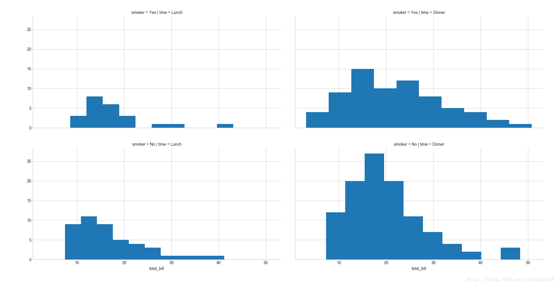
FacetGrid( data, row=None, col=None, hue=None,col_wrap=None, sharex=True, sharey=True, size=3, aspect=1, palette=None,row_order=None, col_order=None, hue_order=None, hue_kws=None, dropna=True,legend_out=True, despine=True, margin_titles=False, xlim=None, ylim=None,subplot_kws=None, gridspec_kws=None )#FaceGrid可以当成是一个半成品,绘制子图的界面,如下所示ax=sns.FacetGrid(tips,col="time",row="smoker")plt.show()
结果如下:
#如果要画某种图可借助其他函数进一步操作ax=sns.FacetGrid(tips,col="time",row="smoker")ax=ax.map(plt.hist,"total_bill")#注意这里借助了matplotlib.pyplot.hist来画图,要得到一种统计结果,我们要设置的东西更多,但也使得能够满足一些个性比的需求plt.show()
结果如下:
更复杂的图像参考官网
二、PairGrid成对分面图
PairGrid与FaceGrid类似,只是画出变量对之间的界面,至于界面上展示什么样的统计内容需要自己进行设置。双坐标轴图
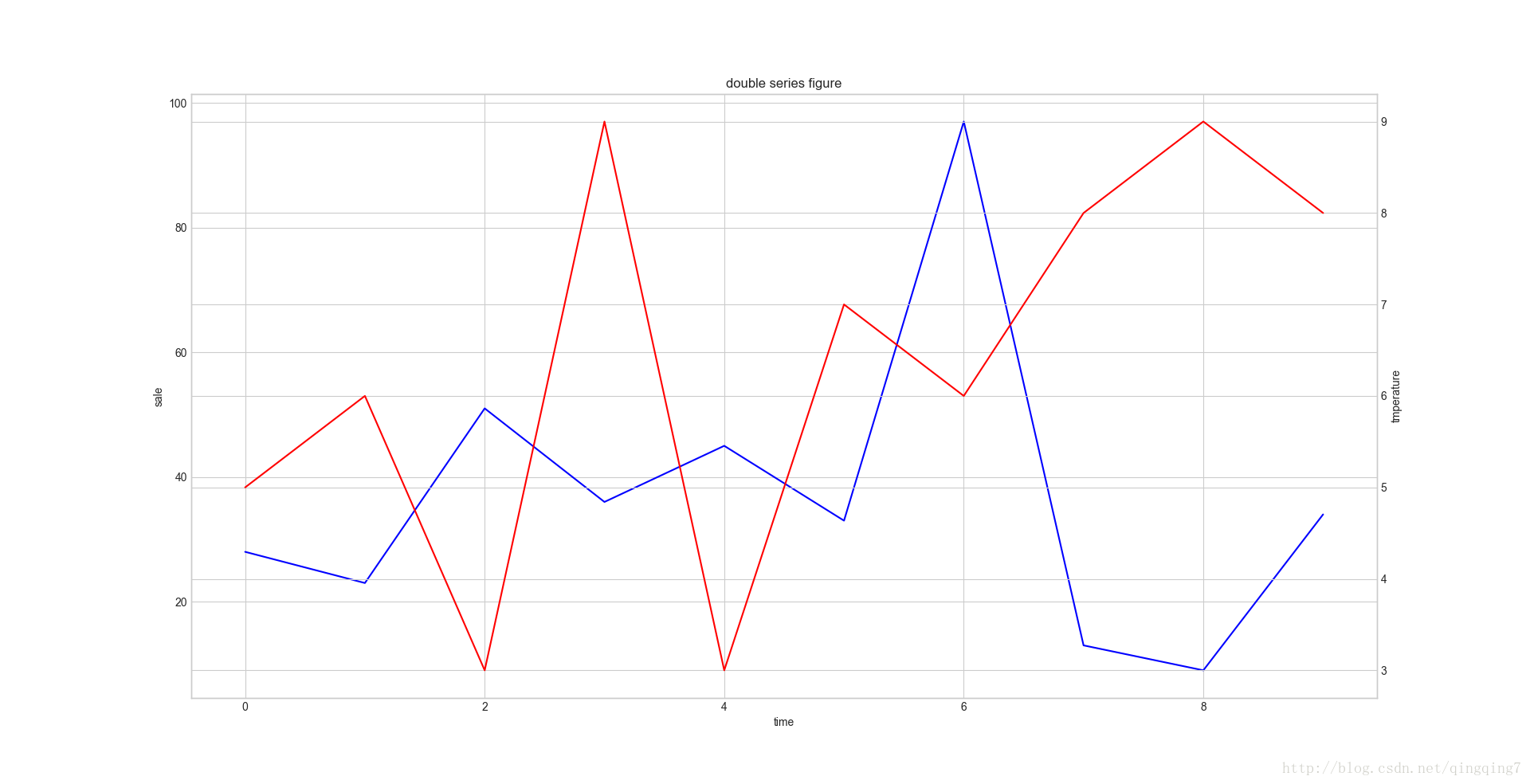
将不同尺度的数据画在一块就可能用到双坐标轴图
sale=pd.Series(np.random.random(10)*100).map(int)tmperature=pd.Series(np.random.random(10)*10).map(int)ax=plt.subplot(111)sale.plot(ax=ax,color='b')ax.set_xlabel('time')ax.set_ylabel('sale')# 重点来了,twinx 或者 twiny 函数ax2 = ax.twinx()tmperature.plot(ax=ax2,color='r')ax2.set_ylabel('tmperature')plt.title('double series figure')plt.show()结果如下:
分段统计绘图
颜色主题
set_palette(palette[, n_colors, desat, …])
Set the matplotlib color cycle using a seaborn palette.color_palette([palette, n_colors, desat])
Return a list of colors defining a color palette.husl_palette([n_colors, h, s, l])
Get a set of evenly spaced colors in HUSL hue space.hls_palette([n_colors, h, l, s])
Get a set of evenly spaced colors in HLS hue space.cubehelix_palette([n_colors, start, rot, …])
Make a sequential palette from the cubehelix system.dark_palette(color[, n_colors, reverse, …])
Make a sequential palette that blends from dark to color .light_palette(color[, n_colors, reverse, …])
Make a sequential palette that blends from light to color .diverging_palette(h_neg, h_pos[, s, l, sep, …])
Make a diverging palette between two HUSL colors.blend_palette(colors[, n_colors, as_cmap, input])
Make a palette that blends between a list of colors.xkcd_palette(colors)
Make a palette with color names from the xkcd color survey.crayon_palette(colors)
Make a palette with color names from Crayola crayons.mpl_palette(name[, n_colors])
Return discrete colors from a matplotlib palette.choose_colorbrewer_palette(data_type[, as_cmap])
Select a palette from the ColorBrewer set.choose_cubehelix_palette([as_cmap])
Launch an interactive widget to create a sequential cubehelix palette.choose_light_palette([input, as_cmap])
Launch an interactive widget to create a light sequential palette.choose_dark_palette([input, as_cmap])
Launch an interactive widget to create a dark sequential palette.choose_diverging_palette([as_cmap])
Launch an interactive widget to choose a diverging color palette.despine([fig, ax, top, right, left, bottom, …])
Remove the top and right spines from plot(s).desaturate(color, prop)
Decrease the saturation channel of a color by some percent.saturate(color)
Return a fully saturated color with the same hue.set_hls_values(color[, h, l, s])
Independently manipulate the h, l, or s channels of a color.样式设置类
set([context, style, palette, font, …])
Set aesthetic parameters in one step.axes_style([style, rc])
Return a parameter dict for the aesthetic style of the plots.set_style([style, rc])
Set the aesthetic style of the plots.**plotting_context([context, font_scale, rc]) **
Return a parameter dict to scale elements of the figure.set_context([context, font_scale, rc])
Set the plotting context parameters.set_color_codes([palette])
Change how matplotlib color shorthands are interpreted.reset_defaults()
Restore all RC params to default settings.reset_orig()
Restore all RC params to original settings (respects custom rc).图像颜色和尺寸设置Miscellaneous plots
palplot(pal[, size])
Plot the values in a color palette as a horizontal array.图形格式选项
图形参数 style
图形的属性 1.color:颜色 1.1 r:红色 1.2 b:蓝色 1.3 g:绿色 1.3 y:⻩色 2.数据标记markder 2.1 o:圆圈 2.2 .:圆点 2.3 d:棱形 3.线型linestyle 3.1 没有参数的话就是默认画点图 3.2 --:虚线 3.3 -:实线 4.透明度 alpha 5.大小 size一些技巧
一、批量保存图片
二、显示中文问题
图像 - 灰度化、灰度反转、二值化
参考http://www.cnblogs.com/DuanLaoYe/p/5386146.html
大数据呈现为可视化的图和动画
百度可视化组件Echarts或其他组件
tensorflow学习过程的可视化
这个可视化与数据展示的可视化不一样,这里是对学习的节点,不同参数下的结果,效果评估曲线等的展示,都是围绕学习训练过程来的。
https://segmentfault.com/a/1190000008302430 https://blog.csdn.net/jerry81333/article/details/53004903 https://blog.csdn.net/xierhacker/article/details/53697515 http://wiki.jikexueyuan.com/project/tensorflow-zh/how_tos/graph_viz.html基于Zeppelin 的数据分析可视化
FineReport的数据可视化
基于tableau 的数据可视化
基于superset的数据可视化
基于lumina 的数据可视化
可视化应用案例


转载地址:https://blog.csdn.net/qingqing7/article/details/78758731 如侵犯您的版权,请留言回复原文章的地址,我们会给您删除此文章,给您带来不便请您谅解!
发表评论
最新留言
关于作者