本文共 7705 字,大约阅读时间需要 25 分钟。
 本文字数:8312,阅读时长大约: 9分钟 导读:比较七个在 Python 中绘图的库和 API,看看哪个最能满足你的需求。https://linux.cn/article-12327-1.html 作者:Shaun Taylor-morgan 译者:Xingyu.Wang
 比较七个在 Python 中绘图的库和 API,看看哪个最能满足你的需求。
“如何在 Python 中绘图?”曾经这个问题有一个简单的答案:Matplotlib 是唯一的办法。如今,Python 作为数据科学的语言,有着更多的选择。你应该用什么呢?
本指南将帮助你决定。
它将向你展示如何使用四个最流行的 Python 绘图库:Matplotlib、Seaborn、Plotly 和 Bokeh,再加上两个值得考虑的优秀的后起之秀:Altair,拥有丰富的 API;Pygal,拥有漂亮的 SVG 输出。我还会看看 Pandas 提供的非常方便的绘图 API。
对于每一个库,我都包含了源代码片段,以及一个使用 Anvil 的完整的基于 Web 的例子。Anvil 是我们的平台,除了 Python 之外,什么都不用做就可以构建网络应用。让我们一起来看看。

示例绘图
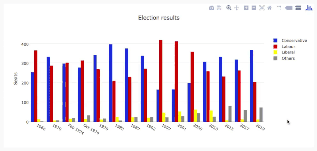
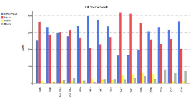
每个库都采取了稍微不同的方法来绘制数据。为了比较它们,我将用每个库绘制同样的图,并给你展示源代码。对于示例数据,我选择了这张 1966 年以来英国大选结果的分组柱状图。
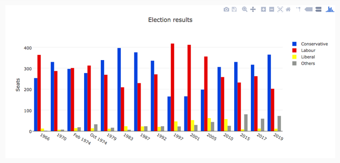
Bar chart of British election data
我从维基百科上整理了英国选举史的数据集:从 1966 年到 2019 年,保守党、工党和自由党(广义)在每次选举中赢得的英国议会席位数,加上“其他”赢得的席位数。你可以以 CSV 文件格式下载它。
Matplotlib
Matplotlib 是最古老的 Python 绘图库,现在仍然是最流行的。它创建于 2003 年,是 SciPy Stack 的一部分,SciPy Stack 是一个类似于 Matlab 的开源科学计算库。
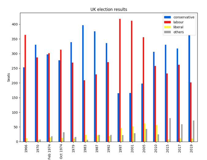
Matplotlib 为你提供了对绘制的精确控制。例如,你可以在你的条形图中定义每个条形图的单独的 X 位置。下面是绘制这个图表的代码(你可以在这里运行):
import matplotlib.pyplot as plt import numpy as np from votes import wide as df # Initialise a figure. subplots() with no args gives one plot. fig, ax = plt.subplots() # A little data preparation years = df['year'] x = np.arange(len(years)) # Plot each bar plot. Note: manually calculating the 'dodges' of the bars ax.bar(x - 3*width/2, df['conservative'], width, label='Conservative', color='#0343df') ax.bar(x - width/2, df['labour'], width, label='Labour', color='#e50000') ax.bar(x + width/2, df['liberal'], width, label='Liberal', color='#ffff14') ax.bar(x + 3*width/2, df['others'], width, label='Others', color='#929591') # Customise some display properties ax.set_ylabel('Seats') ax.set_title('UK election results') ax.set_xticks(x) # This ensures we have one tick per year, otherwise we get fewer ax.set_xticklabels(years.astype(str).values, rotation='vertical') ax.legend() # Ask Matplotlib to show the plot plt.show()这是用 Matplotlib 绘制的选举结果:
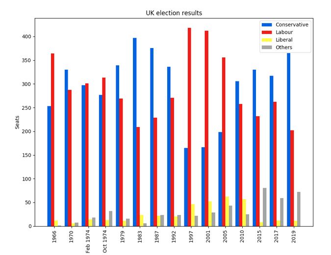
Matplotlib plot of British election data
Seaborn
Seaborn 是 Matplotlib 之上的一个抽象层;它提供了一个非常整洁的界面,让你可以非常容易地制作出各种类型的有用绘图。
不过,它并没有在能力上有所妥协!Seaborn 提供了访问底层 Matplotlib 对象的逃生舱口,所以你仍然可以进行完全控制。
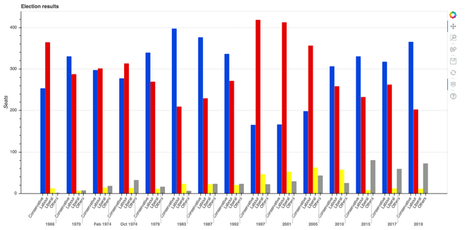
Seaborn 的代码比原始的 Matplotlib 更简单(可在此处运行):
import seaborn as sns from votes import long as df # Some boilerplate to initialise things sns.set() plt.figure() # This is where the actual plot gets made ax = sns.barplot(data=df, x="year", y="seats", hue="party", palette=['blue', 'red', 'yellow', 'grey'], saturation=0.6) # Customise some display properties ax.set_title('UK election results') ax.grid(color='#cccccc') ax.set_ylabel('Seats') ax.set_xlabel(None) ax.set_xticklabels(df["year"].unique().astype(str), rotation='vertical') # Ask Matplotlib to show it plt.show()并生成这样的图表:
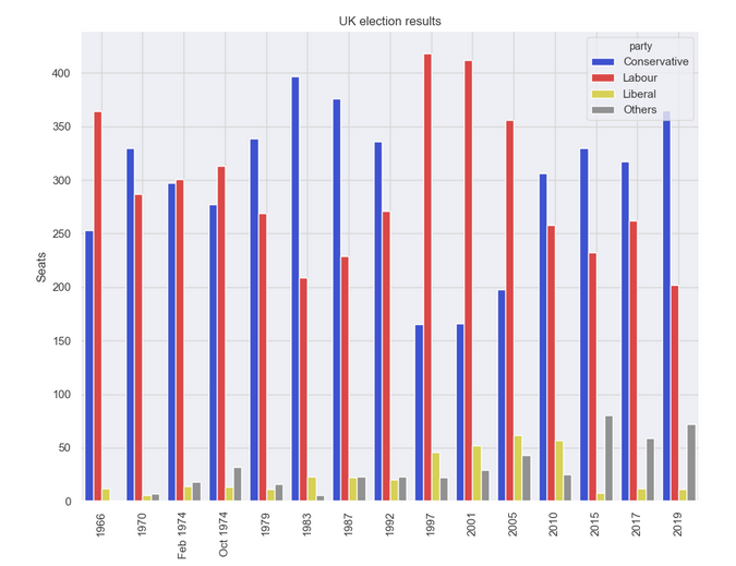
Seaborn plot of British election data
Plotly
Plotly 是一个绘图生态系统,它包括一个 Python 绘图库。它有三个不同的接口:
1. 一个面向对象的接口。2. 一个命令式接口,允许你使用类似 JSON 的数据结构来指定你的绘图。3. 类似于 Seaborn 的高级接口,称为 Plotly Express。Plotly 绘图被设计成嵌入到 Web 应用程序中。Plotly 的核心其实是一个 JavaScript 库!它使用 D3 和 stack.gl 来绘制图表。
你可以通过向该 JavaScript 库传递 JSON 来构建其他语言的 Plotly 库。官方的 Python 和 R 库就是这样做的。在 Anvil,我们将 Python Plotly API 移植到了 Web 浏览器中运行。
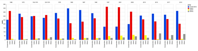
这是使用 Plotly 的源代码(你可以在这里运行):
import plotly.graph_objects as go from votes import wide as df # Get a convenient list of x-values years = df['year'] x = list(range(len(years))) # Specify the plots bar_plots = [ go.Bar(x=x, y=df['conservative'], name='Conservative', marker=go.bar.Marker(color='#0343df')), go.Bar(x=x, y=df['labour'], name='Labour', marker=go.bar.Marker(color='#e50000')), go.Bar(x=x, y=df['liberal'], name='Liberal', marker=go.bar.Marker(color='#ffff14')), go.Bar(x=x, y=df['others'], name='Others', marker=go.bar.Marker(color='#929591')), ] # Customise some display properties layout = go.Layout( title=go.layout.Title(text="Election results", x=0.5), yaxis_title="Seats", xaxis_tickmode="array", xaxis_tickvals=list(range(27)), xaxis_ticktext=tuple(df['year'].values), ) # Make the multi-bar plot fig = go.Figure(data=bar_plots, layout=layout) # Tell Plotly to render it fig.show()选举结果图表:
Plotly plot of British election data
Bokeh
Bokeh(发音为 “BOE-kay”)擅长构建交互式绘图,所以这个标准的例子并没有将其展现其最好的一面。和 Plotly 一样,Bokeh 的绘图也是为了嵌入到 Web 应用中,它以 HTML 文件的形式输出绘图。
下面是使用 Bokeh 的代码(你可以在这里运行):
from bokeh.io import show, output_file from bokeh.models import ColumnDataSource, FactorRange, HoverTool from bokeh.plotting import figure from bokeh.transform import factor_cmap from votes import long as df # Specify a file to write the plot to output_file("elections.html") # Tuples of groups (year, party) x = [(str(r[1]['year']), r[1]['party']) for r in df.iterrows()] y = df['seats'] # Bokeh wraps your data in its own objects to support interactivity source = ColumnDataSource(data=dict(x=x, y=y)) # Create a colourmap cmap = { 'Conservative': '#0343df', 'Labour': '#e50000', 'Liberal': '#ffff14', 'Others': '#929591', } fill_color = factor_cmap('x', palette=list(cmap.values()), factors=list(cmap.keys()), start=1, end=2) # Make the plot p = figure(x_range=FactorRange(*x), width=1200, title="Election results") p.vbar(x='x', top='y', width=0.9, source=source, fill_color=fill_color, line_color=fill_color) # Customise some display properties p.y_range.start = 0 p.x_range.range_padding = 0.1 p.yaxis.axis_label = 'Seats' p.xaxis.major_label_orientation = 1 p.xgrid.grid_line_color = None图表如下:
Bokeh plot of British election data
Altair
Altair 是基于一种名为 Vega 的声明式绘图语言(或“可视化语法”)。这意味着它具有经过深思熟虑的 API,可以很好地扩展复杂的绘图,使你不至于在嵌套循环的地狱中迷失方向。
与 Bokeh 一样,Altair 将其图形输出为 HTML 文件。这是代码(你可以在这里运行):
import altair as alt from votes import long as df # Set up the colourmap cmap = { 'Conservative': '#0343df', 'Labour': '#e50000', 'Liberal': '#ffff14', 'Others': '#929591', } # Cast years to strings df['year'] = df['year'].astype(str) # Here's where we make the plot chart = alt.Chart(df).mark_bar().encode( x=alt.X('party', title=None), y='seats', column=alt.Column('year', sort=list(df['year']), title=None), color=alt.Color('party', scale=alt.Scale(domain=list(cmap.keys()), range=list(cmap.values()))) ) # Save it as an HTML file. chart.save('altair-elections.html')结果图表:
Altair plot of British election data
↓向生活低下了头的广告位↓
↑向生活低下了头的广告位↑
Pygal
Pygal 专注于视觉外观。它默认生成 SVG 图,所以你可以无限放大它们或打印出来,而不会被像素化。Pygal 绘图还内置了一些很好的交互性功能,如果你想在 Web 应用中嵌入绘图,Pygal 是另一个被低估了的候选者。
代码是这样的(你可以在这里运行它):
import pygal from pygal.style import Style from votes import wide as df # Define the style custom_style = Style( colors=('#0343df', '#e50000', '#ffff14', '#929591') font_family='Roboto,Helvetica,Arial,sans-serif', background='transparent', label_font_size=14, ) # Set up the bar plot, ready for data c = pygal.Bar( title="UK Election Results", style=custom_style, y_title='Seats', width=1200, x_label_rotation=270, ) # Add four data sets to the bar plot c.add('Conservative', df['conservative']) c.add('Labour', df['labour']) c.add('Liberal', df['liberal']) c.add('Others', df['others']) # Define the X-labels c.x_labels = df['year'] # Write this to an SVG file c.render_to_file('pygal.svg')绘制结果:
Pygal plot of British election data
Pandas
Pandas 是 Python 的一个极其流行的数据科学库。它允许你做各种可扩展的数据处理,但它也有一个方便的绘图 API。因为它直接在数据帧上操作,所以 Pandas 的例子是本文中最简洁的代码片段,甚至比 Seaborn 的代码还要短!
Pandas API 是 Matplotlib 的一个封装器,所以你也可以使用底层的 Matplotlib API 来对你的绘图进行精细的控制。
这是 Pandas 中的选举结果图表。代码精美简洁!
from matplotlib.colors import ListedColormap from votes import wide as df cmap = ListedColormap(['#0343df', '#e50000', '#ffff14', '#929591']) ax = df.plot.bar(x='year', colormap=cmap) ax.set_xlabel(None) ax.set_ylabel('Seats') ax.set_title('UK election results') plt.show()绘图结果:
Pandas plot of British election data
要运行这个例子,请看这里。
以你的方式绘制
Python 提供了许多绘制数据的方法,无需太多的代码。虽然你可以通过这些方法快速开始创建你的绘图,但它们确实需要一些本地配置。如果需要,Anvil 为 Python 开发提供了精美的 Web 体验。祝你绘制愉快!
via: https://opensource.com/article/20/4/plot-data-python
作者:Shaun Taylor-Morgan 译者:wxy 校对:wxy
本文由 LCTT 原创编译,Linux中国 荣誉推出

转载地址:https://blog.csdn.net/weixin_32825467/article/details/113038252 如侵犯您的版权,请留言回复原文章的地址,我们会给您删除此文章,给您带来不便请您谅解!
发表评论
最新留言
关于作者