如何使用R语言在SAP Analytics Cloud里绘制各种统计图表

发布日期:2021-06-30 14:18:06
浏览次数:3
分类:技术文章
本文共 1545 字,大约阅读时间需要 5 分钟。
插入一个R visualization:
一定要确保图形出现这个model的小图标,代表这个R visualization的模型数据成功绑定之后才能进行下一步操作:
模型绑定成功后,在R script编辑器Environment标签页的Data下拉菜单里能看到模型数据。
使用这个SAP Analytics Cloud官方教程里提供的excel文件作为数据源:
https://www.sapanalytics.cloud/tutorial-r-visualization/
该excel内容如下:
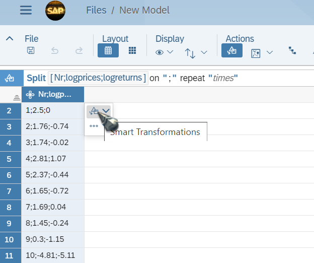
excel系统导入SAP Analytics Cloud后,需要使用simple transformation,将;分号分隔的值拆分成三列:
逐一拆分:
拆分完毕之后,生成Model. 将这个url里包含的R脚本复制粘贴到R编辑器里:
https://www.sapanalytics.cloud/wp-content/uploads/2019/09/R-Script-Plot.txt# Discription:# Creating a histogram of the log returns, adding the kernel density of the log returns# and the normal density as reference distribution ## Requirements: # ggplot requires a data frame# # Output:# Histogram Plot# library(ggplot2)Simulated_data <- data.frame(Simulated_data)histgg <- ggplot(data = Simulated_data, aes(logreturns))histgg + geom_histogram(aes(y = ..density..),fill = "lightblue",color = "black", alpha = 0.8, position = "identity") + geom_density(aes(color = "Kernel Density"), size = 1) + stat_function(aes(color = "Normal Distribution"), fun = dnorm, args = list(mean = mean(Simulated_data$logreturns), sd = sd(Simulated_data$logreturns)), size = 1) + ggtitle("Histogram") + theme(panel.grid = element_line(linetype = "dashed", color = "lightgrey"), panel.background = element_rect(fill = "white"), panel.border = element_rect(colour = "black", fill=NA), plot.title = element_text(hjust = 0.5)) + scale_colour_manual("Density", values = c("red", "darkgreen")) + xlab(" ")+ ylab("Frequency") 点击Execute按钮,就可以看到R脚本绘制出来的图形了:
要获取更多Jerry的原创文章,请关注公众号"汪子熙":
转载地址:https://jerry.blog.csdn.net/article/details/105427442 如侵犯您的版权,请留言回复原文章的地址,我们会给您删除此文章,给您带来不便请您谅解!
发表评论
最新留言
感谢大佬
[***.8.128.20]2024年05月04日 17时51分58秒
关于作者

喝酒易醉,品茶养心,人生如梦,品茶悟道,何以解忧?唯有杜康!
-- 愿君每日到此一游!
推荐文章
PHP之 使用PHPMailer插件实现邮件发送功能
2019-05-01
《增长黑客》(肖恩·艾利斯)学习笔记——第二部分 实战
2019-05-01
python使用HTMLTestRunner查看运行函数
2019-05-01
fiddler 抓取手机接口
2019-05-01
python的ImportError
2019-05-01
linux下安装jenkins+git+python
2019-05-01
windows10家庭版开启组策略
2019-05-01
解决uiautomatorviewer中添加xpath的方法
2019-05-01
性能测试的必要性评估以及评估方法
2019-05-01
使用Spark读写外部存储介质(Mysql、Hbase、Redis)
2019-05-01
Spark学习——利用Mleap部署spark pipeline模型
2019-05-01
手写LogisticRegression
2019-05-01
Oracle创建表,修改表(添加列、修改列、删除列、修改表的名称以及修改列名)
2019-05-01
nested exception is org.springframework.beans.BeanInstantiationException: Failed to instantiate 报错
2019-05-01
最后一台,i7+6核电脑
2019-05-01
使用redis实现订阅功能
2019-05-01
Redis哨兵机制
2019-05-01
URL特殊字符转码
2019-05-01
对称加密整个过程
2019-05-01
白红宇的个人博客 - 记录点点滴滴的事 - 您是第 311412795 位访客
访问时间: 2024-05-06 15:13:35
访问IP: 3.143.168.172
Copyright © 2020 - 2023 blog.css8.cn 京ICP备2021015314号-1
手机版